iPod’s circular apps
iPhone’s home button and then the swipe up home gesture are so important and well done that they probably need to be covered as Unsung Heroes, but I wanted to mention something else today as we’re revisiting the whole “app icons in squircles” story (my most recent post + Louie Mantia’s post).
The first iPhone in 2007 put apps as squircles on the home screen, and it also put a matching shape on the home button:
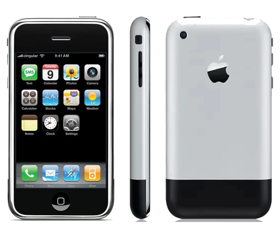
The shape on the button didn’t survive very long. It was removed starting with iPhone 5S in 2013, which introduced Touch ID – I guess it wasn’t possible to print the icon atop the button without sacrificing the finger detection accuracy. Then, in 2017, the button itself disappeared with the iPhone X.
The iPod Touch was the iPhone without the cellular radio – it was made from 2007 to 2019, supported all the same apps as the iPhone, and sported a home button with a squircle up until the end. (Ironically, despite its name, it never got a Touch ID.)
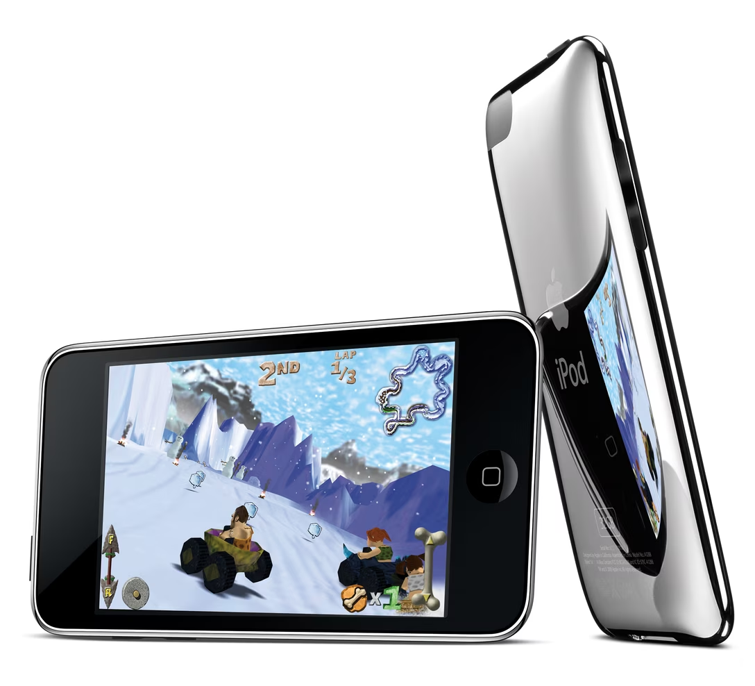
But there was another iPod that entered the app fray. It was the iPod Nano, whose last edition from 2012 had a home button – except it looked slightly different:
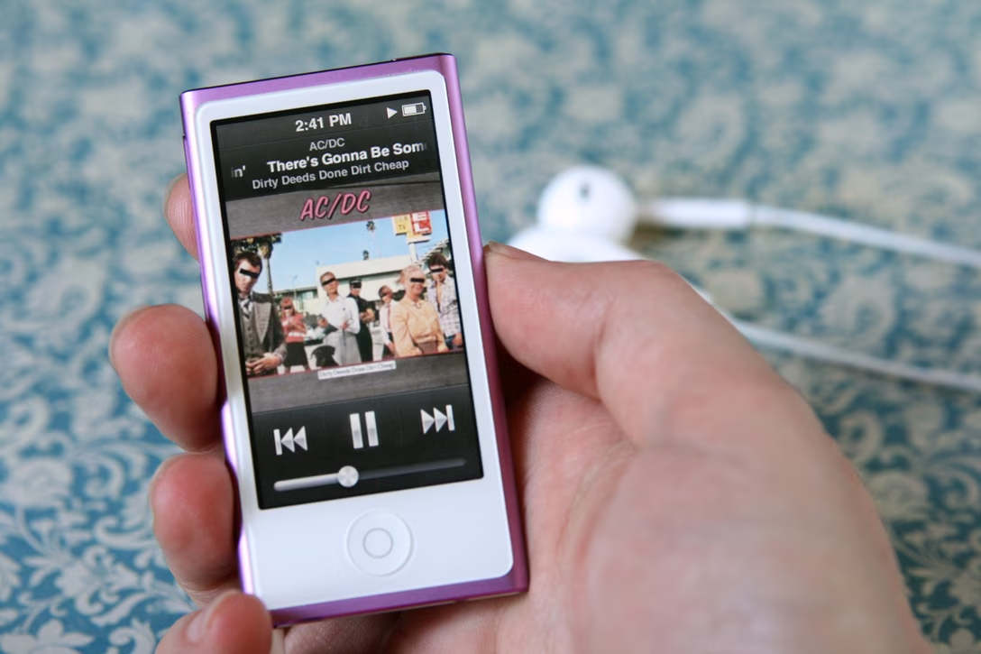
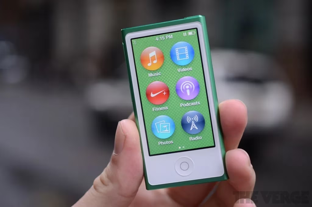
What was the reason? I don’t know if Apple ever explained it, but I believe the idea was that this iPod did not have downloadable apps, nor the App Store, nor even iOS. Those were all built-in apps, and I imagine Apple wanted to indicate visually that they’re different. Because it wasn’t just home button. The apps – eight of them, across 2 pages, although you could rearrange them! – all sported circular icons:
I don’t know if this approach was in any way effective, but I found it a funny little footnote.