“Publishers aren’t evil, but they are desperate.”
A meandering and messy, but otherwise an absolutely worthwhile essay from Shubham Bose about the bloat and hostile behaviours on news sites:
I went to the New York Times to glimpse at four headlines and was greeted with 422 network requests and 49 megabytes of data. […]
Almost all modern news websites are guilty of some variation of anti-user patterns. As a reminder, the NNgroup defines interaction cost as the sum of mental and physical efforts a user must exert to reach their goal. In the physical world, hostile architecture refers to a park bench with spikes that prevent people from sleeping. In the digital world, we can call it a system carefully engineered to extract metrics at the expense of human cognitive load. Let’s also cover some popular user-hostile design choices that have gone mainstream.
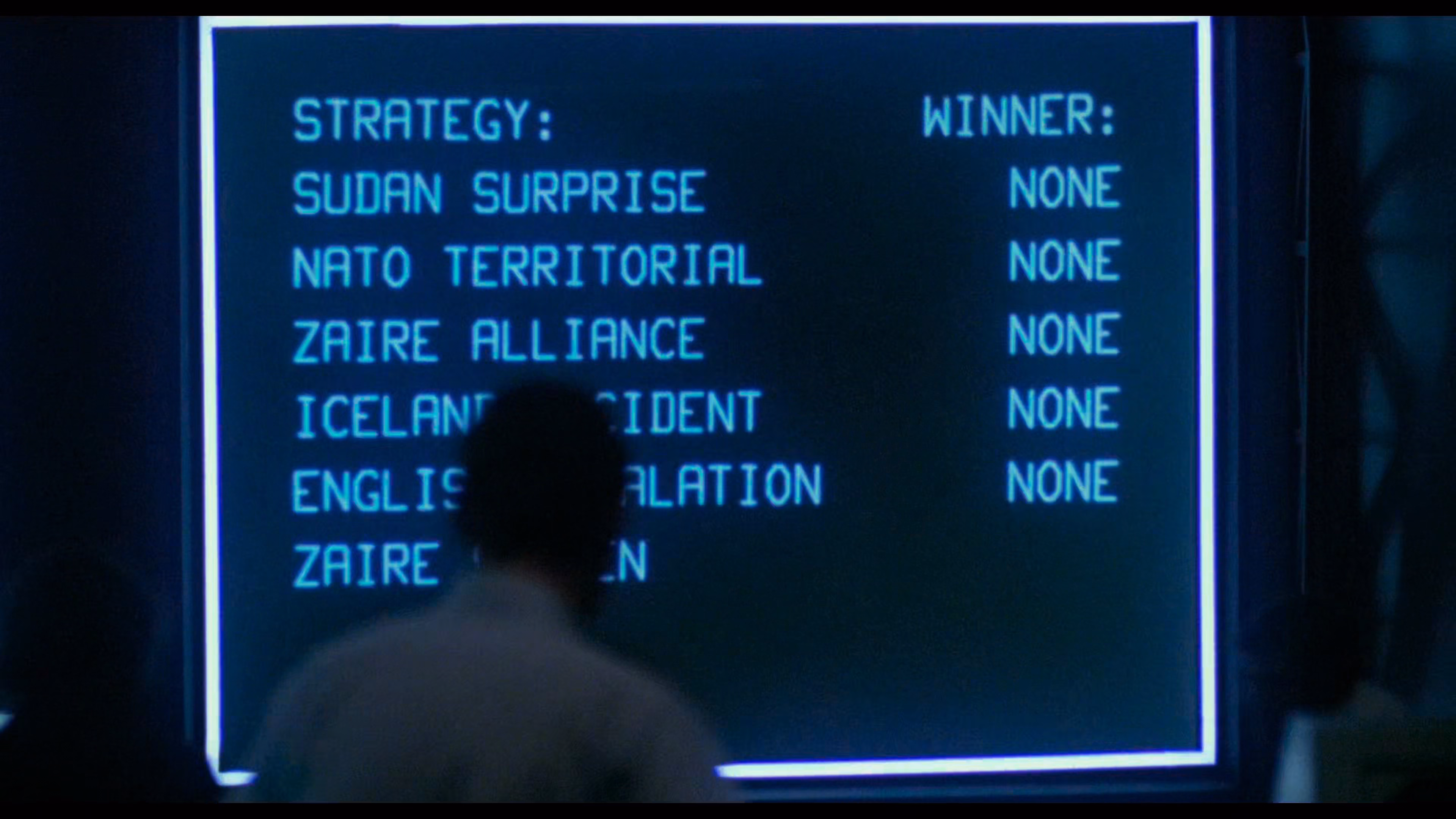
Bose has a knack for naming some of these hostile patterns: The Pre-Read Ambush stands for distracting you even before you start reading, Z-Index Warfare is about multiple pop-ups competing with each other, and Viewport Suffocation is about covering so much screen with crap you can barely see the content. You can almost see those names fly by on the massive screens in the final scenes of WarGames:
By the way, I didn’t know that the ad bidding is actually happening on my computer, using my CPU, and clobbering my interface speed:
Before the user finishes reading the headline, the browser is forced to process dozens of concurrent bidding requests to exchanges like Rubicon Project […] and Amazon Ad Systems. While these requests are asynchronous over the network, their payloads are incredibly hostile to the browser’s main thread. To facilitate this, the browser must download, parse and compile megabytes of JS. As a publisher, you shouldn’t run compute cycles to calculate ad yields before rendering the actual journalism.
The essay ends on a call to action:
No individual engineer at the Times decided to make reading miserable. This architecture emerged from a thousand small incentive decisions, each locally rational yet collectively catastrophic.
They built a system that treats your attention as an extractable resource. The most radical thing you can do is refuse to be extracted. Close the tab. Use RSS. Let the bounce rate speak for itself.
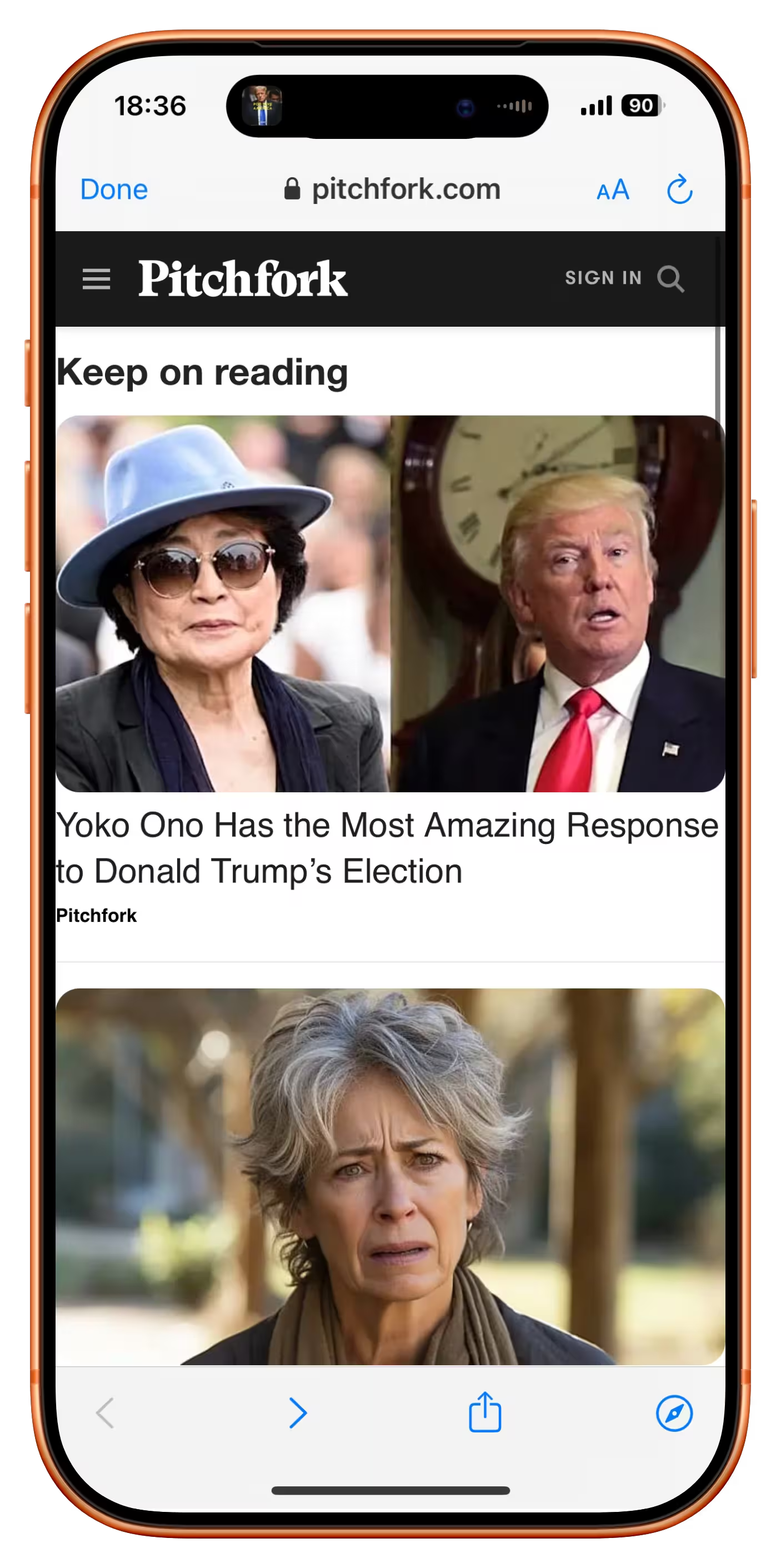
Funny you should say that. There is another user-hostile pattern not mentioned in the article, as it happens on the other side; the swiping back gesture on the mobile phone is hijacked to insert a frustrating “Keep on reading” page, rather than getting you where you came from:
It’s there on many sites, from Slate to Ars Technica.
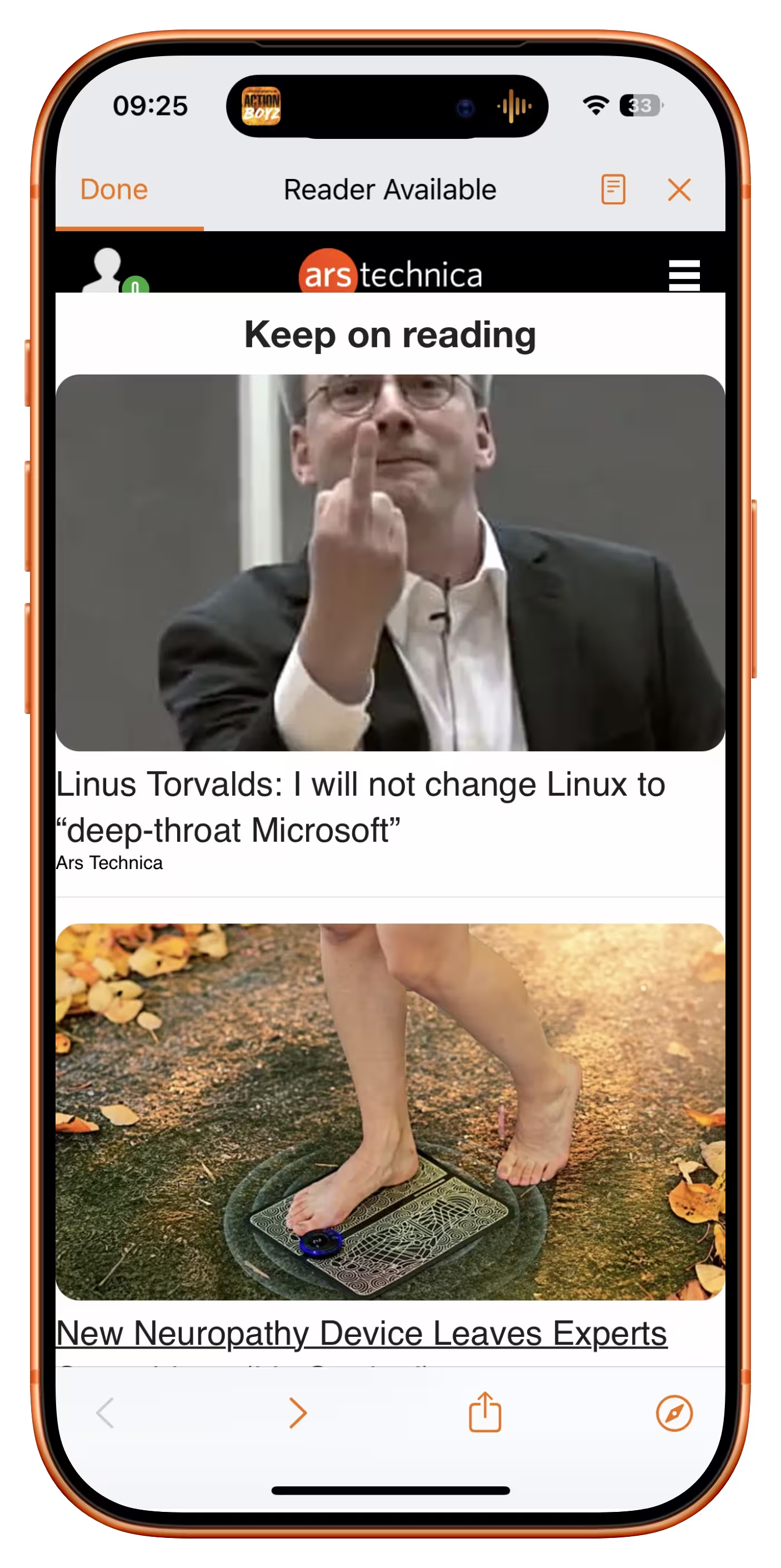
It usually shows cheap, attention-grabbing headlines (in the case of Ars Technica, the Linus Torvalds article was over a decade old!). I originally thought this was just a last-ditch attempt to keep me on the site, but when I asked on social, a reader suggested there is another reason:
It’s an SEO play. If you land on a site because of a Google search and swipe back to Google, it sends a signal to Google that it wasn’t the result you were looking for. So by forcing users to click a link on the page to read more than two paragraphs, it means the user is unable to swipe back to Google and send that negative SEO signal.
Even the bounce rate is not allowed to speak for itself.