Recency bias (non-derogatory)
I am a huge fan of all sorts of “recent” features in software; I think they’re extremely helpful in removing tedium, and thoroughly undervalued. A lot of our work is repetitive, even if it’s sad to admit.
I shared one example previously, and here’s five more.
1.
My bank’s website not only shows me the last payment I made, but also allows me to click to use the same number again:
2.
The app Transit has a nice list of recent destinations just below the main options:
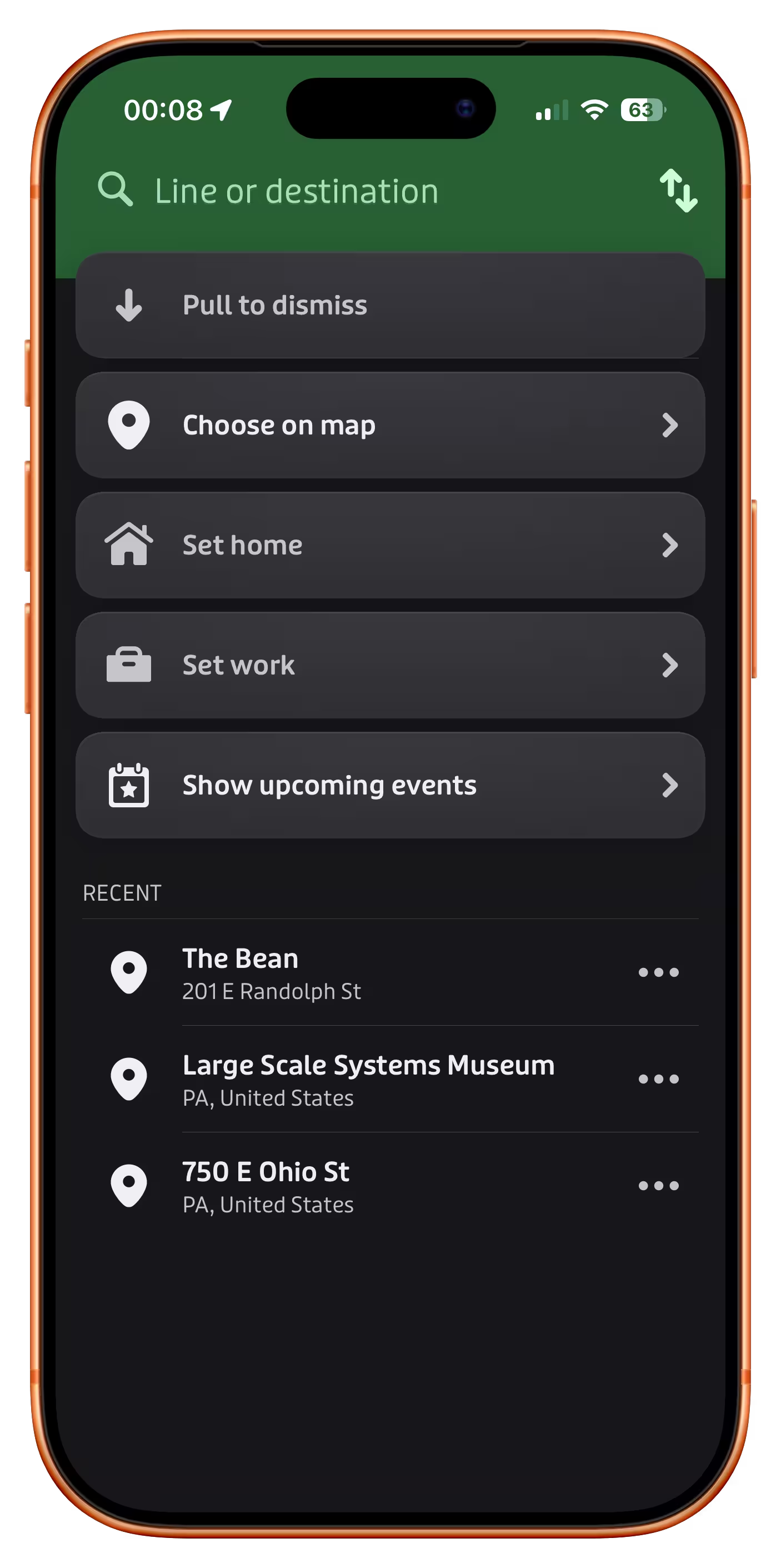
3.
Google Maps promotes recently tapped-on items to be more visible than they would normally be:
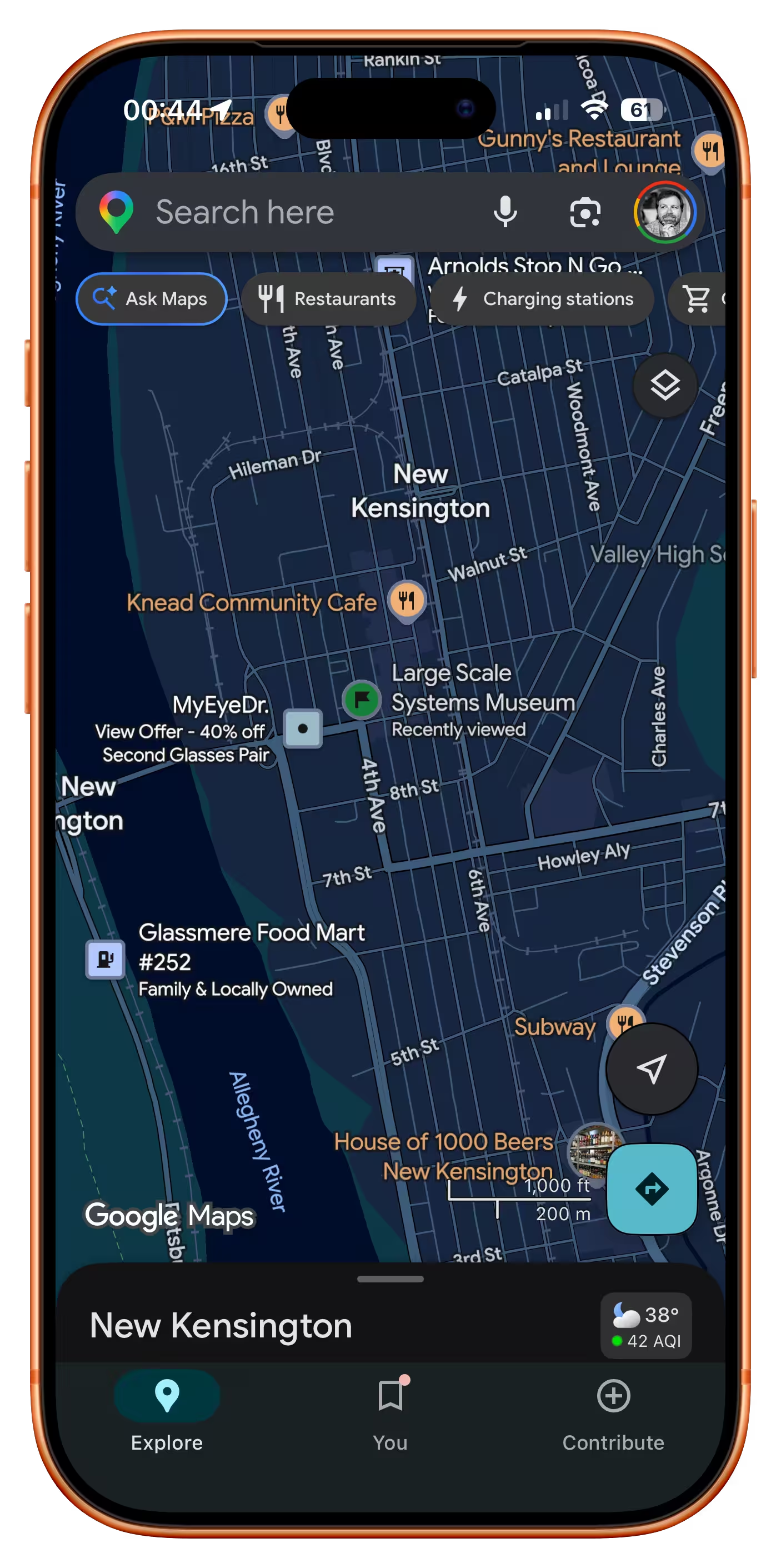
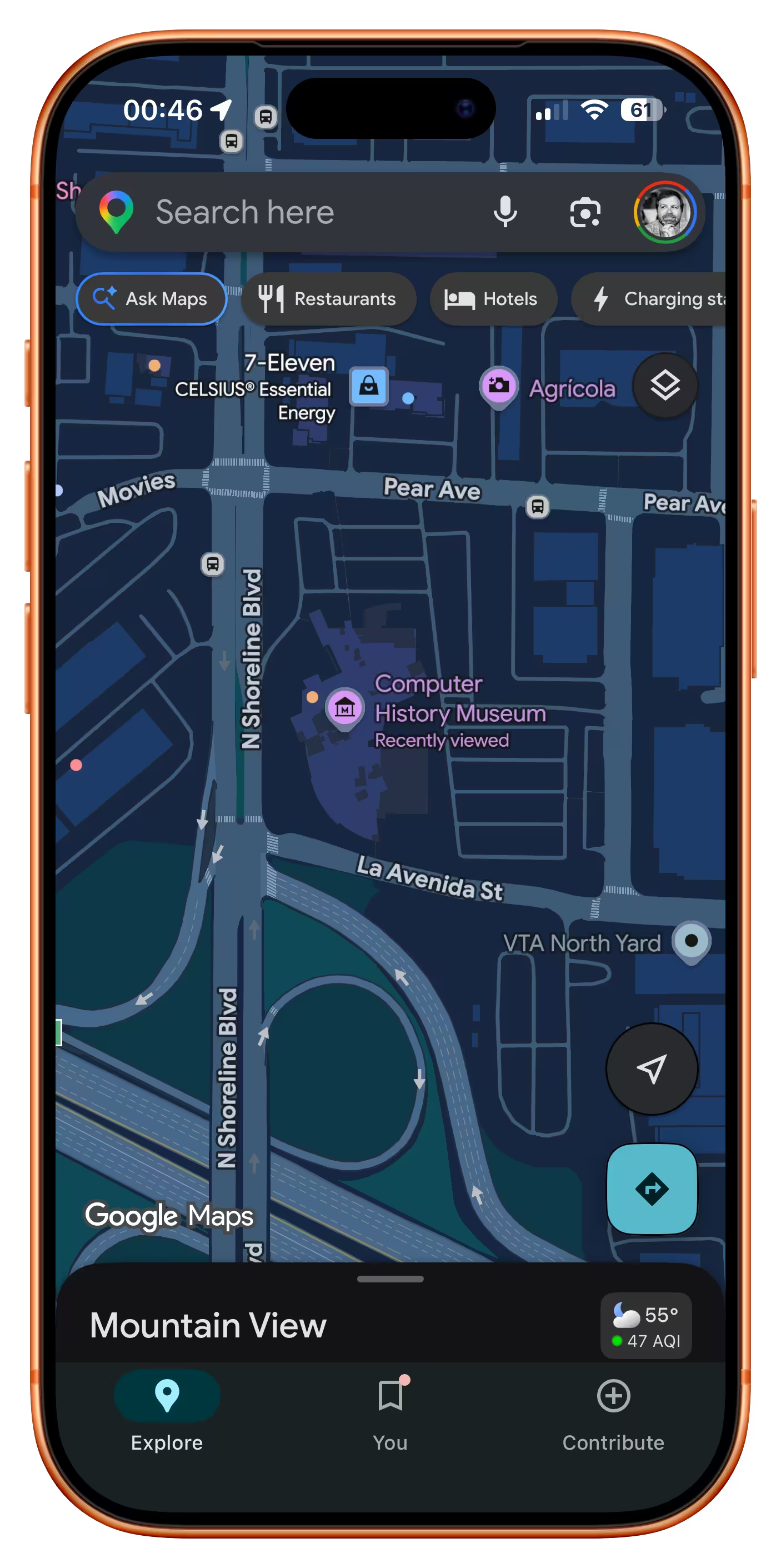
4.
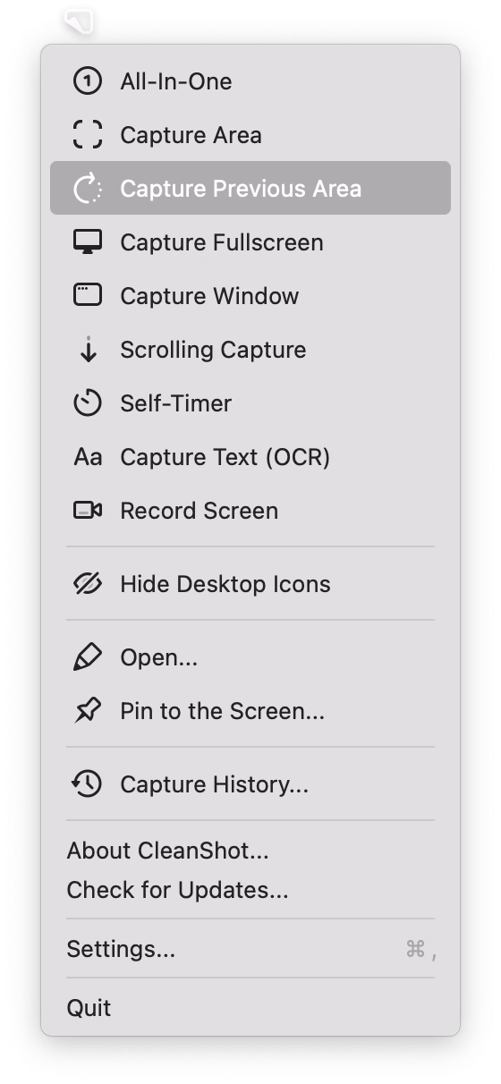
CleanShot X offers something I have always wanted from built-in macOS screenshotting – being able to capture with one keystroke the same area as I delineated last time:
5.
Google Pixel allows you to swap the current wallpaper and three previously chosen wallpapers easily:
What unifies all of these is that “recent” doesn’t live in a submenu somewhere, treated as a second-tier pathway. No, in all of these “recent” is embedded in the fabric of normal interactions, side by side with forward-facing options. I believe this is necessary for any sort of feature like this to be truly successful.
That last Google Pixel example also shows that “recent” isn’t only for repeating something faster – here, it becomes more of a “soft setting,” without introducing a lot more complex UI and interactions that a “real” setting might require.