It’s Halloween Week on Unsung, where we’re sharing scary, spooky, and creepy stories.
There aren’t very many YouTube videos that talk about user interfaces of specific programs. I shared one long ago covering the Apple Music app, and this review by Tantacrul (a.k.a. Martin Keary) of music notation software Finale is so much better and more fun, and I wish there were more like it:
It’s not just a cutting critique of the user interface of a badly-aged app. It’s also a great introduction to the whole space, and a thought-provoking case study that goes beyond just UI, but also into business context and market changes. (Finale was released in 1988 and discontinued in 2024.)
While I would love to see productions like this for other niches (Blender! CAD! screenwriting software! design tools…?), this video already feels like a must watch to anyone working on complex software – even if it’s far away from music. It is a cautionary tale, and it covers the issues of an aging codebase, complexity, evolving system conventions, user habits, deferred maintenance, plugin ecosystems, innovator’s dilemma, and so on. It will make you think.
From the beginning of the video:
I want to look at how Finale got started, what was happening behind the scenes and how it got swept away due to larger external forces that its creators could not have predicted. And ultimately, how, when the writing was on the wall – when it was clear that big improvements were needed – it found itself stuck, unable to change. This is a case study in how creative software dies.
The video itself is also more creative than you might expect. As a matter of fact, toward the end, it can get a little… unhinged. You’ll know when that happens.
And that seems like a perfect transition into Halloween Week on Unsung! Let’s spend an entire week talking about scary and weird stories. It’s going to be fun!
On his channel about new and old hi-fi equipment, Techmoan profiles a modern Fosi Audio Neo player.
Techmoan’s video was originally linked here, but I failed to notice it was an unreleased, patron-only video. If you want to see it, subscribe to Techmoan’s Patreon – it’s worth it! – or wait until Saturday when the video is released to the public. I will re-link it here then. I’m sorry about that.
Fosi Audio Neo apes the iPod. At first glance, it looks exactly the same – a deck-of-cards-sized device with a wheel, and above it a screen showing either the currently playing track, or a hierarchical, textual menu:
But the reviewer quickly discovers that the iPod copycat is a disaster in use, its creators accidentally highlighting two important rules:
“simple” does not mean “fewer things,”
simplicity cannot happen without a lot of small details done well.
To the first point: iPod actually had five main buttons, not just one. This is most visible in the third generation, which put most of the commands above the wheel:
In all the other models, the buttons were integrated around, or even within the wheel:
But the modern product only has one button, and that’s too few for all the necessary functionality. Now “going back” means an unnatural long press. The other necessary commands – like pausing, next track, and previous track – are offloaded to an onscreen menu, which means extra modes and focus states that the original iPod didn’t have. By trying to be simple in a naïve way, the creators of the Neo made their device more complicated.
As for the details? The new player has no acceleration curve when you scroll fast, which would help you traverse long lists as quickly as short ones. It has no scrollbar to give you a sense of how long the list is. It has no haptic-like beeps to help mesh the fluid rotation with discrete item jumps (your mouse wheel is doing the same thing!). It has no side-to-side transitions to help you orient yourself in the hierarchy. And, the reaction to every click seemed so slow that it made even me, the viewer, anxious.
This second aspect is similar to Photoshop vandalizing its dialogs, or CleanShot bulldozing its settings. Here, the new player also underestimates the sophistication and thoughtfulness of the things it aims to copy. The difficult truth is that while software needs to be simple to the user, that simplicity is nothing but complicated to people designing it.
I tried to find a good iPod click wheel explainer, but I couldn’t find any. (There have been a few web approximations over the years, but they also get a lot of nuances wrong.) I wonder if I should create an online iPod simulator, walking designers through all of its important interface details.
On the most recent episode of the Waveform podcast, the hosts talk about two new announcements in the MMORPG world (relevant bit starts at 1:21 and goes on for 14 minutes):
each game already had a “relaunch”: RuneScape via Old School RuneScape in 2013, and World of WarCraft with its Classic edition in 2019 – both revisiting and perhaps straight replaying the respective original game, but with some new improvements.
The new announcements are yet another revisit for each universe:
RuneScape announced RuneScape 4 – an old game engine but with more modern graphics,
World of WarCraft announced World of WarCraft: Forever, which feels like a cross between “reboot” and “rewind” – going back to the original, but creating brand new events and universes within.
I haven’t played either game, but the segment made me think: why have we never seen non-game software do this kind of stuff? I can think of multiple reasons, but at the same time I am surprised I can’t come up with even just one example of a software company doing something similar – I mean, rewinding the clock – with one of their bloated apps.
I think that kind of push and pull is important, especially today. I don’t love using Google Sheets, but my favourite spreadsheet is not Excel 97, either. My favourite spreadsheet is some hypothetical anachronistic version of Excel 97 that also has modern high-dpi typography, and a ⌘K command palette, and today’s trackpad gestures, and support for AVIF and HEIC.
…and I still think I would love to see “Excel 97 Revisited” today. But I’m not sure I’ve ever seen anything like it.
Please let me know if I am missing something obvious!
The first is the concept of “zone of proximal development.” The idea, as I understand it, is that possible tasks you face span a few categories:
stuff you already know how to do,
stuff you can learn to do on your own,
stuff you can learn to do with assistance (e.g. from a teacher),
stuff you simply cannot do or imagine doing.
The space between these things is a zone. A good book or a teacher would help you navigate the zone, by giving you tasks hard enough that they will expand the zone, or even teach you how to expand it on your own – but not too hard so that you give up in failure and frustration.
Woods argues that this doesn’t just apply to traditional classroom teaching, but also software, where the role of the teacher is taken by things like:
But most people learned the basics when it was simple, so they don’t notice that it got complicated.
I think this is brilliant and spot on. I always knew the creators of an app would have a problem of not seeing complexity creep in, but this made me consider that the app’s early users might also be biased the same way, and not exert much pressure.
If you are familiar with an app, armed with your desire paths and motor memory, you have a lot of capacity to just ignore new menu items, new panels, and new complexity – provided it doesn’t get in your way. New AI option? Turn it off. New tab? Never click on it. New alternate way of doing things? Just continue with the old way.
But as a new user, you don’t have that history, or that experience-backed confidence that a bunch of stuff can simply be ignored as it’s not crucial to everyday operation. Add to this the industry’s perverse incentives that often present new additions as the most important ones, and it’s much harder to make a sense of it all as a newcomer. And all the while, the creators and existing users might not see the problems you do.
The Max variant of the 737 was redesigned to allow larger, more efficient engines, but this made it less predictable, which the company decided to paper over in software:
The airframe, the hardware, should get it right the first time and not need a lot of added bells and whistles to fly predictably. This has been an aviation canon from the day the Wright brothers first flew at Kitty Hawk.
Apparently the 737 Max pitched up a bit too much for comfort on power application as well as at already-high angles of attack. It violated that most ancient of aviation canons and probably violated the certification criteria of the U.S. Federal Aviation Administration. But instead of going back to the drawing board and getting the airframe hardware right (more on that below), Boeing relied on something called the “Maneuvering Characteristics Augmentation System,” or MCAS.
Boeing’s solution to its hardware problem was software.
This feels like an interesting extension to the fly-by-wire story of Air France Flight 447, where Boeing seemed to be on the other side of the fence to the Airbus. Perhaps no more:
[…] It seems that with the 737 Max, Boeing has changed philosophies about human/machine interaction as quietly as they’ve changed their aircraft operating manuals.
Travis argues that people building the software did not fully understand the shift, and particularly didn’t really understand how pilots fly the airplane during more challenging moments:
Those lines of code were no doubt created by people at the direction of managers. Neither such coders nor their managers are as in touch with the particular culture and mores of the aviation world as much as the people who are down on the factory floor, riveting wings on, designing control yokes, and fitting landing gears. Those people have decades of institutional memory about what has worked in the past and what has not worked. Software people do not.
The real reason? Money.
MCAS is certainly much less expensive than extensively modifying the airframe to accommodate the larger engines. […] What’s worse, those changes could be extensive enough to require not only that the FAA recertify the 737 but that Boeing build an entirely new aircraft. Now we’re talking real money, both for the manufacturer as well as the manufacturer’s customers.
That’s because the major selling point of the 737 Max is that it is just a 737, and any pilot who has flown other 737s can fly a 737 Max without expensive training, without recertification, without another type of rating. Airlines—Southwest is a prominent example—tend to go for one “standard” airplane. They want to have one airplane that all their pilots can fly because that makes both pilots and airplanes fungible, maximizing flexibility and minimizing costs.
It all comes down to money, and in this case, MCAS was the way for both Boeing and its customers to keep the money flowing in the right direction. The necessity to insist that the 737 Max was no different in flying characteristics, no different in systems, from any other 737 was the key to the 737 Max’s fleet fungibility. That’s probably also the reason why the documentation about the MCAS system was kept on the down-low.
Put in a change with too much visibility, particularly a change to the aircraft’s operating handbook or to pilot training, and someone—probably a pilot—would have piped up and said, “Hey. This doesn’t look like a 737 anymore.” And then the money would flow the wrong way.
There are some harsh words toward the entire software industry toward the end. This feels directionally accurate to me, and resonated even before the arrival of generative AI:
I believe the relative ease—not to mention the lack of tangible cost—of software updates has created a cultural laziness within the software engineering community. Moreover, because more and more of the hardware that we create is monitored and controlled by software, that cultural laziness is now creeping into hardware engineering—like building airliners. Less thought is now given to getting a design correct and simple up front because it’s so easy to fix what you didn’t get right later.
I’m curious if you know of this pattern that existed for as long as I remember.
On a Mac, you can hold an ⌥ key (Option) whenever any menu is open, and often see more powerful, advanced, or faster variants of existing commands, helpful for a power user. Here’s Audio Hijack and Forklift:
And in the Finder’s File menu, both ⇧ and ⌥, and even the rare ⌃ (Ctrl) get to play:
This feels like a nice, thoughtful extension of the command system. It’s clever, too – the key to reveal secret things is the same key you would use for their shortcuts, so you can make the connection either cerebrally or in your fingers.
There are menus that treat it slightly differently, though. Here in Finder and Safari, you can see commands themselves changing when you press ⌥, no shortcut in sight:
(By the way, a nice touch in the entire system: Once the menu gets wider to accommodate longer strings, it doesn’t shrink on key release.)
And in other places, the modifier key only reveals an alternative shortcut for the same command:
I have mixed feelings about this feature.
On one hand, it has felt like dying art for a while now. Apple has never invested in the discoverability here, which I think kneecapped it. As far as I know, there is no hint these exist, and no way to see all of these options easily by clicking something on the screen. Even if you know the alternate name and you search for it, it doesn’t always reveal the key to press to see it natively:
It’s not as much fun to keep pressing all the modifier keys in every menu to find out what might be hiding in there. I wonder if an alternate version where any modifier key reveals all would be better? (And more compatible with commands without modifiers changing anyway.)
On the other hand, I really want this to spread its wings. In theory, the feature makes it possible to build up good motor memory habits, and understand some of the modifier key patterns: ⇧ often means “more,” and ⌥ (ironically) often means “alternate” (try ⌥ while selecting text on a Mac if you haven’t ever done it). It is also a clever way to accommodate power users without blowing up the menus for everyone else.
And, once in a while, I have a truly glorious moment – like what happened to me last year.
I scan a lot of documents, and merge them into PDFs using a database application called DevonThink. The process usually goes like this: I drag individual page files, select them, right click, and choose Merge:
But at the end of that process, I am left with the extra original files I no longer need, so I have to select these, and then delete them:
Not a big deal, but any “not a big deal” becomes a big deal if you have to do it dozens of times a month.
Yet, only after years of doing it this way, I had a thought. More precisely, my fingers had a thought. Surely, more people must be facing this issue? So, on a lark, I pressed ⌥ with the menu open, and saw this:
The precise option I needed was there all along, with a perfect label, hiding exactly in a place and under a key combination that was the first thing my fingers naturally tried.
I smiled so much. It’s a really great feeling when you’re rewarded for learning a pattern, when your motor memory does the job for you, and when you sense you’re on the same wavelength as software’s creators. Someone was there ahead of me and cleaned up this rare path for me.
I mentioned Atari’s Pong recently, a game often considered to be the first videogame ever. It wasn’t, and as a matter of fact, it was a clone of one of the games from the first home console Magnavox Odyssey, released earlier in 1972:
I found it a very interesting case study. The Odyssey had a version of Pong before Pong – but it also had many other games that could be charitably described as “Pongs in disguise.”
It all feels very, very convoluted for such a simple concept. You have to insert the right cart, tape an overlay to your TV of a certain size (the roll of tape is included), and understand the complex and poorly written instructions in the manual. Then, during the play time, you’d have to master the very strange controllers (left dial – horizontal movement, right dial – vertical movement), often do a lot of work that the console didn’t do (keeping track of collisions, or even scoring!), and deal will all sorts of accessories in the real world, like included cards, dice, stickers, and so on.
You can admire the scope of this all – when life gives you Pong, you make a pongolade – but it all feels so clunky and convoluted, which the video catalogs in detail. But, in hindsight, it doesn’t matter if the included Pong (here, called Table Tennis) is good, right?
Reader, Table Tennis wasn’t good at all. It wasn’t just the strange controllers, but also the really weird logic where you could twist the ball already in flight:
Only looking at this made me realize, some 50+ years too late, the true power of Pong.
Pong didn’t bother with many games, with complicated rules, with the breadth of it all. It just did one thing really, really well.
For the Odyssey, it seemed like a lot of games were about mastering the controller. For Pong, it was only ever about mastering the game. The interface was simple: you have one dial, so rotate it. The game was fun to play, with its logic both challenging and predictable. The instructions were sparse and barely needed anyway. There was automatic scoring, which Odyssey didn’t have. There were also sounds – turns out, people really liked sounds.
The Odyssey was clearly an in-betweener, a complicated hybrid device weighed down by its well-intentioned maximalism. Pong was simple, attractive, optimized to the bone. I feel that it offers universal lessons, feeling eerily similar to iPod’s release in 2001 – focusing on just the few things that mattered, and doing them really, really well.
On the positive side, here’s a delightful interaction from macOS. I can easily maximize the window to take up half the screen, but the moment I start dragging it, it recalls and nicely restores itself to its original size:
macOS designers correctly figured out that the window being maximized or half-maximized is a state – but it has to be a state dressed up as a size. The button entry point is the “state” version. But on the way in, there is also a more natural “size” version: you can have the window snap and maximize to half screen when you drag it to the right edge. And on the way out? You just saw it. You don’t have to switch the state to “non maximized” first, and you don’t have to restore to the original size by hand.
Here’s a bad example – one of the macOS’s horrible settings pages:
So far, it seems good. Some of the toggles are on, some off. You not only see a position of the switch change, but also the track under the switch is a different color to help you disambiguate. Nice.
But now look what happens when I toggle off the second option, which the third and fourth option rely on:
Processing this dialog visually, does it look like “on, off, disabled off, disabled on,” or does it look like “four toggles, each one inexplicably with a different shade of gray”?
There are many solutions here: some visual, some IA, some systemic. Also, I use the graphite accent color, which somewhat exacerbates the issue, although it’s there with any accent color.
But I wonder if one of the challenges here is that someone thought it’s important to show the state of the toggle even if it’s disabled, and everything else followed from that. This feels similar to the dark mode essay in that there will always be someone making that argument, and that argument will always feel stronger, because it will feel like it’s backed by logic. The system will make sense as a diagram. Each of its parts will come from a logical conclusion. So did the tri-state dark mode toggle. Or the Power/Sleep/Wake keyboard buttons. Or Abort, Retry, Fail in DOS.
Arguments for systemic completeness are always going to be easier to make than arguments for thoughtful simplicity.
I sketched two possible solutions. They’re not the best ones, and you might recoil at them, since either one is a compromise. But that’s the point.
On her blog, Lea Verou makes a case that each user-facing website dark-mode toggle should only ever show two options, but in a smart way.
The challenge is that any dark mode toggle needs to actually accommodate three options: dark, light, and the default “whatever the system says” (which can be always dark, always light, or change with the time of day). Many toggles simply pass that complexity onto the user:
I want to get something out of the way: I don’t think Verou’s articleas an article is fully successful. I feel like it spends a great amount of words to explain something not entirely as complex, and even the interactive playgrounds felt slightly too rigid and altogether confusing. If you care about (interactive) explainers, it might be an interesting case study in and of itself.
But I am very much much on board with the proposal and the line of thinking it represents. Verou suggests a “smart” dual state toggle, which still allows the website to follow the system, but shoves the complexity of the “whatever the system says” branch into the crevices between visible UI. Here’s how I understand it:
The smart toggle only has two options: light and dark. Mechanically, clicking or tapping the toggle brings you to the opposite option. Simple.
If your new option is the opposite of system (e.g. you switch the page to dark mode if your system is in light mode), it will stay in that theme forever, no matter what the system does in the future.
If your new option is one that currently matches the system, it will then continue following the system in perpetuity (e.g. it’s back to the default behaviour).
This toggle will feel compromised, and you might immediately find some rare use case it doesn’t fully support – maybe attached to an imaginary user, or even an internal user giving you feedback in person. But Verou is absolutely correct in her insistence to fight through that:
Tri-state toggles are implementation-driven UI. One of the most common UX mistakes is designing UI around the underlying data model instead of user goals. Good interfaces abstract away the underlying model and expose a model that aligns with user goals (unless of course these happen to coincide, which is rare).
Now, it’s just a dark mode toggle. It might not seem like a difference between a smart dual state toggle and an explicit tri-state toggle is that much. But:
“Whatever the system says” is not just one extra option. It’s also one extra weird option. It doesn’t feel like the other two. It’s seemingly repetitive. It’s often unclear what it does before clicking. It’s not obvious where to put it in order. Verou doesn’t mention this in her post, but even just seeing the word System next to Light and Dark feels complicated. (Auto is slightly better.) The cognitive load here might be larger than it seems.
What is an interface if not a collection of a million challenges, each one seemingly insignificant on its own? Trivial things add up. One compromise here and one cheap decision there, and soon you’re talking real money.
Thinking deeply about something like this gives one practice for dealing with complexity elsewhere, and facing even more difficult challenges where the stakes are higher and the compromises larger.
A similar example might be that of PC keyboards in the late 1990s, which also exposed system complexity and pestered people with Power/Sleep/Wake keys:
Computers do not do that anymore, simply having a smarter singular power button, piped to a more sophisticated logic underneath.
From Marton Barcza at TechAltar, a good 12-minute video analyzing what went wrong with the famed Live Tiles that Microsoft was pushing throughout most of the 2010s:
Now, among Windows Phone fans the pervasive opinion is that Live Tiles have failed because Microsoft did a poor job with them, which I think is at least partially true – after all, even many key Microsoft apps like Skype had broken Live Tiles half the time, the Windows 10 start menu was filled by Microsoft with Live Tiles that were clearly just animated ads rather than showing you something actually useful, and the company of course never built out any of their advanced interactive concepts either.
But while all of that might be true, the fact that every major company has walked away from this idea and nobody else has picked it up since, means that there probably are more fundamental problems with this idea. And I can think of three distinct ones:
user experience,
form factors,
and horizontal integration.
Barcza goes on to talk about some specific interactions and problems, and arrives at the conclusion that Live Tiles ended up at this unpleasant intersection where they’re tried to be icons, widgets, and notifications all at once, not doing a particularly great job at either task. That, and there were also challenges with the design primarily being mobile-first, and struggling surviving a jump to a large screen. (Live Tiles were abandoned in 2017, at which point desktop Windows reverted back to what it was before, and the mobile/tablet lines were altogether disbanded.)
What I found interesting in watching this today is that it feels Apple has made some similar mistakes in their Liquid Glass approach and wider platform unification desires (see: macOS Settings). Both these and Live Tiles attempted to create A System Of Systems, and both ended up occasionally feeling like they awkwardly crowbarred some wider concepts into places where they didn’t truly belong.
If it helps with your further research, I understand Live Tiles were part of a bigger UI effort called Metro and started in earnest with Windows Phone.
Sopwith is a 1984 videogame made by David L. Clark for the original, seminal IBM PC model 5150. It sports the distinctive 4-color CGA palette and an equally distinctive PC speaker soundtrack.
It’s also one of the oldest videogames still in active development, and I was surprised how enthralled I was learning about it.
(First of all, you can play Sopwith in a browser. Choose “single player” and then “novice” first for the game to tell you about its unusual keyboard control scheme.)
The current maintainer of the effort is Simon Howard. He wrote about Sopwith’s interesting history; I appreciate this kind of approachable and caring preservation of obscure titles. The history is worth a read.
From that, I learned a fascinating factoid. The game was intended as a demo for networking hardware, and the original author didn’t realize the game was “in circulation” for many years:
Intended as a trade-show demo, it’s unclear how Sopwith escaped to the general public. David L. Clark didn’t even discover until around 2000 that it had “gotten out”. Little did he know, Sopwith had been circulating for years in collections of early games for the IBM PC. Only a couple of years after the first version was released, ads were appearing in magazines like PC Magazine advertising Sopwith for sale as part of collections of games for the IBM PC
The modern edition started by Howard is called SDL Sopwith (SDL being a cross-platform graphics library):
SDL Sopwith is directly derived from the source code to the original DOS versions, and still includes changelog comments that date all the way back to 1984.
What I particularly liked about the contemporary Sopwith is its guiding document/philosophy page, also worth checking out in full. Here are some choice principles:
Sopwith has a long history that deserves to be honored and preserved. By default, the game should always play like the original DOS version. That means the gameplay in particular should be the same, without any significant differences. Someone who has just discovered the project should find it to be a delightfully accurate recreation of the game they may have played when they were younger. […]
Some new features can be enabled by default, as long as they are subtle, unintrusive, carefully considered and can be turned off. An example is the medals feature.
The game will never try to be “something it’s not”. This means that it will always have four color CGA graphics, PC speaker sound effects and a low resolution display. It will never add (for example) hi-res sprites or 3D models, digital sound effects or MP3 music. The goal is to be “a great old game” rather than “a mediocre modern game”.
New features should be fun and recognize the comical aspects of the game. Features should be carefully considered before being incorporated, not just added arbitrarily and thoughtlessly.
There is something in all this that I feel a lot of software could learn from – not just vintage games. I appreciated Howard being thoughtful about growing Sopwith without forgetting its roots, but also with understanding that some things have changed since 1984. You could imagine remixing “The goal is to be a great old game rather than a mediocre modern game” to something like:
Better be a great focused app than a mediocre sprawling app.
I’ve enjoyed John Gruber’s posts about ads appearing on an increasing number of Apple surfaces: the App Store, Apple News, and – soon, perhaps – Apple Maps. (Just for reference, here’s an example of such an ad.)
In a post earlier this week, Gruber likened ads to stickers on laptops, and shared a fun Steve Jobs story:
That’s what those stickers on PCs are: they’re ads. Intel pays for the “Intel Inside” stickers that booger up PC laptop palm rests. Longtime readers will recall that back in August 2007, Apple held a Town Hall event to introduce new iMacs and some iLife and iWork software updates. In a post-event Q&A (imagine that), Bob Keefe of Cox Newspapers asked “Can you say why you all are not participating in the Intel Inside program, putting the stickers on your new or previous Macs?” This question was so absurd from the perspective of those who covered Apple closely that it prompted outright laughter. […]
The 2007 exchange went as follows:
Keefe: Why are you not participating in Intel Inside program and not putting stickers on your Macs?
Jobs: Uh… what can I say? We like our own stickers better.
(In case it’s not clear, this was a joke; Apple didn’t and doesn’t put any such stickers on their products. They instead used to include Apple logo stickers in boxes.)
I feel like a variation of Zero-One-Infinity is a good rule of thumb for ads, too. From the perspective of users — and probably developers — zero was the best number of ads for Apple to show in App Store search results. One was worse but acceptable. But now that they’re showing more than one, they’re on their way to infinity. They’ve started down the slippery slope. Remember when Google only showed one ad in search results?
“Slippery slope” is a perfect term. But I wanted to add something here. In my experience, in the realm of UI, there is no middle notch. I’ve seen it time and time again… the moment you open the door to One, Infinity starts exerting its pull:
adding just one setting will send a message that We Do Settings Now and more settings will follow,
one uncomfortable exception followed by weeks of deliberations will inevitably open the door to subsequent mindless exceptions,
one cheap or lazy approach can spread through the interface like rust, subconsciously telling people “cheap and lazy solutions are okay here.”
Here are two examples I’ve been thinking about recently:
This right click menu in Chrome started with just one fork (new window or new tab) – now there are three alts that I have to choose between, every single time, even if I only ever use one option:
This – screenshotting in iOS – was originally just one fork: Save or Delete. Now it’s a staggering five options I have to choose from, every time, even if I never touch four of them:
Once you wedge one thing in the door, it’s really hard to stop. My theory is that this is because digital interfaces are pretty much all infinitely extensible. There will always be a way to add one more button, one more link, one more setting, one more ad. If something doesn’t fit, you make it smaller. If making it smaller looks bad, you add a scrollbar. If a scrollbar doesn’t feel right, there’s always overflow.
Not only is it very hard to create interfaces that have limitations, but a bad decision is not just precedent – it’s code that can be copied and reused. Existing code always had tons of… well, gravity, even before LLMs.
And so, products grow complex without anyone intending them to; a new team adds just one more thing, which in isolation always feels like nothing to worry about. The Hick’s Law, the extra mental load, the weirdness all grow in between those moments, in a no-man’s land no team typically feels responsible for. The logic is always circular: Why would the team adding a third option have to do something a team adding a second option didn’t have to do? Why would the team adding the second option worry in advance about option number 5?
This is why it’s important to hire and recognize people who will understand that those limitations have to be imposed arbitrarily, and empower them to be able to say, “Let‘s not add this. We like our own stickers better.”
My MacBook does have a sticker, which I bought and put on it since for some reason I find it really funny.
Bear (a notetaking tool) has simple image resizing, with one extra nicety – if your images are near each other, resizing one will snap to the width of the other:
In the Finder, columns snap to the width necessary to keep all the names untruncated – and not one pixel more:
(Sidebar: This is also the only place I’m mentioning today that nicely uses the trackpad’s haptic feedback at the snap moment. I tried to indicate it in the video; this is not the final visual treatment I’m thinking of, but let me know if this kind of visualization of haptics feels useful to you!)
macOS does something really interesting when you get its windows close to each other. Instead of typical snapping – pulling the thing you hold toward the other item like a magnet – it instead prevents you from going further for a while, in either direction. Perhaps the right analog here would be glue:
If initially feels a bit funny, but I think I like it. It’s less aggressive and avoids needing some sort of cancellation (an option or a modifier key) if you don’t want it, because it never feels in a way.
It also works for matching heights, like in Bear:
In Figma, building atop regular snapping, we introduced something I awkwardly called “self-snapping”: if your objects are inside a container, the container will snap its padding to whatever it sees on the other side, without any explicit auto layout/flexbox:
I am sharing these five examples (and one from before) because I think they exemplify a nice thing: precision without bureaucracy. In each case you could imagine an explicit heavy option somewhere in the menu…
Bear: Set Image Width…
macOS: Match Window Heights
Finder: Restore Column Width
Figma: Unify Padding
…that would feel slow and cumbersome.
Instead, these take the freedom of direct manipulation and sprinkle just enough almost-invisible structure in a moment where that structure is undeniably useful. (Of course, you still might want explicit options somewhere in the menu or your command palette, if only for accessibility reasons.)
I like that these quiet features have your back and make you look good, and that their creators understand that something almost aligned can feel worse than something completely misaligned.
If you want to record the screen from your iPhone on your Mac, open the QuickTime Player app but ignore New Screen Recording, and click on New Movie Recording instead.
This instruction is a fever dream of three weird things in sequence:
What on earth is “QuickTime”?
I am recording with a player?
Why can’t I choose the option that describes exactly what I want to do?
It’s interesting to me to think how we got here:
QuickTime is a 1990s brand, an offshoot of QuickDraw. Instead of QuickAnimate or QuickPlay, Apple called it QuickTime because it felt cute: time is what separates static images from video. The branding was much more prominent in the 1990s and 2000s, but mostly fell out of use – searching for “quicktime” in system settings today, for example, yields zero results.
Long ago, the Player was the only free, consumer-facing part of QuickTime, so it needed special branding. You could purchase QuickTime Pro – you would even get aggressive ad banners for it inside Mac OS! – and its encoding and saving capabilities would then be sprinkled across the entire system.
“New Movie Recording” originally offered recording from external video cameras (like iSight, another cute name). “New Screen Recording” was added later, for recording from internal screens. My guess is that technically, architecturally, or both, it was easier to treat external screens (like iPhone or Apple TV) as external video cameras since the UI and affordances matched them more closely. So that’s why screen recording from external devices ended up under “New Movie Recording.”
As a UX historian, this is fun and fascinating! I love tracing back that kind of stuff and learning how certain strange things came to be.
As a user… not so much.
“If you want to record the screen from your iPhone on your Mac, open the QuickTime Player app but ignore New Screen Recording, and click on New Movie Recording instead.”
This feels thrice arbitrary, closer to a magical incantation than a computer command, requiring you to hold a bunch of counterintuitive things in your head, or look them up every time. “Wait, what was the strange name?“ “Yeah, it’s called a player, but that’s ok.” “Hmm, I remember something about not choosing the obvious command.“
I have this internal rule that a flow or a space in the UI should have at most one weird thing. I can’t prove it to you mathematically, and I would be the first to find exceptions to my own rule. But one weird thing makes me nervous, and two or more weird things in concert raise the hair at the back of my neck. Two weird things is when the “launch blocking” bulb lights up in my head. Work needs to happen to bring the weirdness count back to 1 or 0.
This is one example of what I dragged Apple earlier for: it’s not just speed that matters. It’s noticing this kind of complexity, places where an easy way was chosen, design debt accumulated, and things got simply too weird. Apple allowed three weird things to accumulate here.
(By the way, delightfulweird doesn’t count! But it’s hard for me to imagine anyone defending these three things above as delightful or positive in any way.)
“If you want to record the screen from your iPhone on your Mac, open the QuickTime Player app but ignore New Screen Recording, and click on New Movie Recording instead.”
“If you want to record the screen from your iPhone on your Mac, open the Recorder app and click on New Screen Recording.”
It’s not trivial to get to this or something similar, but it’s also not really hard. You can get rid of weird things, but you need to want it.
Collier talks about why physicists prefer LaTeX to Word. LaTeX is sort of a nerdy HTML that predates HTML. It looks like this…
…and given how nerdy HTML already is, you might imagine this is a power-user tool that’s chiefly about power and control. But Collier makes the argument that there are some things that LaTeX makes much easier:
there is absolutely no need (or peer pressure) to spend time styling the document by choosing fonts, colors, etc.,
there is no “live preview,” and making a PDF is a separate step similar to compilation in coding – which means it doesn’t constantly occupy your mind,
GUIs can slow you down because the keyboard is faster than the mouse,
(Of course, there is also the issue of typographical craft of LaTeX documents set in Computer Modern, but let’s save this for another time.)
Also, the video starts with Collier apologizing for potentially making the audience feel dumb in a prior video. I don’t think it’s a joke, and I found it thoughtful and refreshing.
In 2021 and 2022, product manager Steven Sinofsky wrote a…
…first-person account of what I saw at the PC revolution from the perspective of joining Microsoft as a newly hired software design engineer fresh from graduate school working on developer tools, through my time as a program manager and ultimately leading Office, and then moving to Windows, and everything in between.
The first part covers the challenge of the team in 2007, taking stock of Office after almost 25 years of its evolution. (Number of toolbars in 1983: one. Number of toolbars in 2003: 31.) The second part shows great screenshots of all the Office versions from 1.0 until then, and the remaining four cover the Ribbon redesign process.
Regardless of how you feel about Microsoft Office today, and whether you consider the Ribbon interface a success, it’s a perfect weekend read as it covers universal challenges of software complexity and change management.
It’s such a potent series I’m sure we’ll come back to it. It covers a lot, including – in the first part – wrestling with a definition of bloat or complexity, which in the context of Office was less about the number of functions available, and more about mastery:
[…] In practice, bloat comes from the fact […] that Office does so many things that customers just assume the product can do whatever they need it to do. Despite that fact, customers have no idea how to make the product do what they need. This feeling of helplessness that leads to frustration. […]
Bloat is owning a product that you cannot master.
This below is a great observation about the perils of an idea of a “simple mode,” which Sinofsky argues is always a leaky abstraction:
We tried reducing bloat by hiding features […], but that only added to the mystery of the product. Mac, Windows, and Office all went through periods of “simple means fewer” and tried mechanisms such as short menus, simple mode, or adaptive toolbars. But that frustrated or confused people. No one really wanted to use a simple mode and there was always one command missing that was needed, so simple mode became a complicated way to do that one thing that made someone’s work unique.
It was great to see this argument for a broad definition of a bug, as it slides exactly into my post from a while back:
Ages ago in ancient Microsoft history there was a debate on the original apps team about what it means for something to be a bug. Is it a crash? Is it data loss? Is it a typo in an error message and so on? Out of that was created a notion of bug severity, a measure for how serious a bug might be from losing all data all the way to simple cosmetic issues. However, when it came to talking about bugs with product support or ultimately customers the definition of a bug was very simple “a bug is any time the software does not do what a customer expects”. This definition created a discipline of documenting everything reported about the product and always making sure every issue was looked at, even if a code change did not result. The key lesson was how helpful an expansive definition was.
There are also observations and research about how users “debug” the product to make it achieve something they know is possible, but they don’t know how:
We called the futzing document debugging, and it created a frustration that the product was powerful yet overwhelming. People believed a specific result was achievable but getting from point A to B seemed impossible or unlearnable.
And some about the challenges of figuring out what features people use:
[…] Most people didn’t know or care what buttons they clicked on or menus they chose so long as it was working for them—and that meant when asked, “Did you use X?” most people couldn’t recall. To a skeptical press or IT manager (and they all were) that meant unused features.
I should stop quoting and let you read in peace. But, check this out. Lisa wasn’t the only one having linguistic fun:
Early keyboard shortcuts were simple, like using Ins(ert) key to copy text from the scrap (clipboard).
If there was one go-to example of an impenetrable error message in the 1980s, it must have been this – popping up, for example, if your disk drive was dirty:
On some technical level, the options made sense: “Abort” would stop whatever you were doing, “Retry” would try to repeat the action, and “Ignore” would proceed as if there was no error. But in the heat of a moment, or seeing it for the first time, this was a puzzling choice to be asked to make. Not only were the words weighted improperly (the seemingly most innocuous action here, “Ignore,” was actually the only one that could do actual lasting damage), but it also wasn’t entirely clear what’s the safe thing to do to get out of the situation.
(The redesign of “Abort, Retry, Ignore” was “Abort, Retry, Fail,” and it wasn’t really a huge improvement.)
Last night, I installed Google Photos on my iPhone, and the first message that greeted me was this:
This is really a matryoshka doll of bad dialog presentation.
First: any buttons in a dialog should be labeled with enough information to keep me going. Here, both have generic labels, so now I need to pay attention.
Second: Even after reading, I have no idea what is the choice I’m making. I see the pathway marked “yes, keep it the way I had it” and, sure – this would be generally what I want from any given computer on any given Sunday. But what’s the actual alternative?
But the third, and most important one, is this: this dialog has no safe escape hatch. By now, in UX design, we established quite a few canonical escape hatches:
a Cancel button,
a × close box,
a “No, thanks” link,
a press of an Escape key.
But you can’t × this dialog out. The main button seems positive, but it also feels like I’m taking an action with consequences, and I don’t want to deal with that. There is a “No, thanks,” but it doesn’t feel like the other “No, thankses” I have seen – it’s juxtaposed with copy that makes it seem… a dangerous thing to choose.
And this last bit makes it a pretty serious design offense, because you are now messing with foundational stuff. You need to protect those escape hatches for the future; the moment you introduce hesitation into the mix and taint “No, thanks” as a concept, really bad things will start happening all across your product.
In real life, fire doors have to open outwards when pushed with body weight, aircraft stick shakers are impossible to ignore, and anti-lock braking systems do smart things even after your brain turns off its smart parts.
I know seeing a dialog like this would never happen in a moment of true panic, but sometimes I think of the user in their most absent-minded moment: trying to get their kids to hurry up for school, on hold with an annoying cable provider, with a cat looking like it’s about to jump up directly into a running toaster. A dialog on their phone pops up. If that dialog absolutely has to happen, what is the escape hatch it can offer so they can dismiss it safely if they cannot think about it at all?
This Google Photos screen needs a lot more rethinking and rewriting, but in its current incarnation, it desperately needs a clear and trustworthy escape hatch I can tap absentmindedly, just so I can get to my photos.
I am a huge fan of all sorts of “recent” features in software; I think they’re extremely helpful in removing tedium, and thoroughly undervalued. A lot of our work is repetitive, even if it’s sad to admit.
My bank’s website not only shows me the last payment I made, but also allows me to click to use the same number again:
2.
The app Transit has a nice list of recent destinations just below the main options:
3.
Google Maps promotes recently tapped-on items to be more visible than they would normally be:
4.
CleanShot X offers something I have always wanted from built-in macOS screenshotting – being able to capture with one keystroke the same area as I delineated last time:
5.
Google Pixel allows you to swap the current wallpaper and three previously chosen wallpapers easily:
What unifies all of these is that “recent” doesn’t live in a submenu somewhere, treated as a second-tier pathway. No, in all of these “recent” is embedded in the fabric of normal interactions, side by side with forward-facing options. I believe this is necessary for any sort of feature like this to be truly successful.
That last Google Pixel example also shows that “recent” isn’t only for repeating something faster – here, it becomes more of a “soft setting,” without introducing a lot more complex UI and interactions that a “real” setting might require.
Right next to the generic function to delete photos by going through them one by one, my camera has a specific version – Delete All With This Date:
Below the actions to close the tab, and close all other tabs, Chrome has a specific version called Close Tabs To The Right:
In After Effects, next to typical save options, there is this – Increment And Save – which saves a file and changes the number at the end to be one notch higher (Project 2 → Project 3, and so on):
I’m mildly fascinated by these strangely specific accelerators.
The one in the camera is genuinely useful. Photo projects are often day-long affairs where you download the photos at the end of workday, but might still keep them on the card just in case. Allowing to quickly delete a day’s worth of photos makes a lot of sense, saving you from having to go through them one by one in an interface not suited for that kind of operation.
Chrome’s “Close Tabs to the Right” takes a bit of figuring out, but I believe it’s meant to make it easy to clean up after a fruitful research session where you kept ⌘-clicking and opening tabs to learn more, and those tabs now fulfilled their purpose. (Curiously, Firefox also has “Close Tabs To Left” which I don’t understand.)
After Effects’s “Increment and Save” is… I don’t know. Maybe it’s cheap? Maybe it’s honest? A proper version history would be nicer, but that’s a tall order. This is simple and, most importantly, reliable. I still often do the “poor man’s version control” elsewhere…
…so this works for me.
It’s always interesting to me to think whether these kinds of oddly-specific examples are nice gestures toward the user, or treating symptoms in lieu of fixing actual problems. Either way, I don’t think an interface can survive too many of these, as their obscurity and weirdness add up and can contaminate the entire UI.
Would love if you sent me more of these kinds of commands from the apps you use!
While I am sympathetic to the notion that sound pollution is a thing we need to be concerned with, the choice between silence and sound pollution is a false choice. There’s a lot of those happening these days, probably because we’re so stuck in binary thinking. But as airplanes show us, we can design sounds which aren’t obtrusive, but which are helpful. And when you get yourself out of binary thinking, you can do things like make your most obnoxious apps be silent while your important ones make themselves known, and in ways which are meaningful to you and pleasant to everyone else.
It is an interesting parallel to the post about syntax highlighting from a while back, and one of the posts about cartography design I shared recently; they all explore how you can create a richer space capable of conveying more information without overwhelming people, by being intentional about the design.
While both of these services changed a lot since the essays, they are still worth reading. They might be the closest to modern reviews of software as I can think of, and the way the essays are done also teaches us storytelling lessons – from nice visualizations and comparisons, to rich footnotes. There is also a great balance of high-level overview, and then jumping into specifics that reinforce it.
Here’s one example of cool tooling O’Beirne used to make his points more sticky:
I wrote a script that takes monthly screenshots of Google and Apple Maps. And thirteen months later, we now have a year’s worth of images:
The result is informative and mesmerizing:
Among the essays, I’d particularly recommend these:
The back-and-forth of Google Maps’s Moat and New Apple Maps: Reverse engineering areas of interest, thinking of how the slow changes in visuals lead up to strategy, good visual comparison of competition, and small fascinating anecdotes of places like Parkfield, California. (And a great example of the old adage: don’t get into the business of predicting the future as this will age your writing the most.)
What you just learned is that complexity impresses people. The simple answer wasn’t wrong. It just wasn’t interesting enough. And you might carry that lesson with you into your career. […]
It also shows up in design reviews. An engineer proposes a clean, simple approach and gets hit with “shouldn’t we future-proof this?” So they go back and add layers they don’t need yet, abstractions for problems that might never materialize, flexibility for requirements nobody has asked for. Not because the problem demanded it, but because the room expected it.
I nodded to a lot of it. There’s some parallels to design, too. Perhaps in design, “future-proofed” gets replaced by “bespoke” – everyone wants a custom interface with a novel thing that doesn’t exist anywhere else in the app. That feels better. Tailor-made. Special. It’s hard to resist that, and go back to making your UI out of reusable parts, consistent, and boring in all the best possible ways.
This advice about how to talk about simplicity feels eminently universal:
If you’re an engineer, learn that simplicity needs to be made visible. The work doesn’t speak for itself; not because it’s not good, but because most systems aren’t designed to hear it. […] The decision not to build something is a decision, an important one! Document it accordingly. […]
If you’re an engineering leader, this one’s on you more than anyone else. You set the incentives, whether you realize it or not. And the problem is that most promotion criteria are basically designed to reward complexity, even when they don’t intend to. “Impact” gets measured by the size and scope of what someone built, which more often than not matters! But what they avoided should also matter.
One more thing: pay attention to what you celebrate publicly. If every shout-out in your team channel is for the big, complex project, that’s what people will optimize for. Start recognizing the engineer who deleted code. The one who said “we don’t need this yet” and was right.
Nice, clear, simple copy in ClarisWorks from 1997:
No “Maybe later.” No “Not now.” Thirteen characters. Now, Later, Never.
(Can’t help but notice that Esc and ⌘. – the classic Mac’s equivalent of Esc – still map to Later, however. Also, this breaks the rule of button copy being fully comprehensible without having to read the surrounding strings first, perhaps most well-known as the “avoid «click here»” rule. Never Register/Register Later/Register Now would solve that problem, but wouldn’t look so neat.)
In short, the way I think about software quality is the amount of meaningful problems. […]
There are problems in Finder — resizing columns, renaming or deleting files synced with a FileProvider-based app, and different views not reflecting immediate reality. There are problems with resizing windows. AirPlay randomly drops its connection. AirDrop and other “continuity” services do not always work or, in an interesting twist I experienced a couple days ago, work fine but display an error anyway. The AirPlay and AirDrop menus shuffle options just in time for you to tap the wrong one. […]
These are the products and features I actually use. There are plenty others I do not. I assume syncing my music collection over iCloud remains untrustworthy. Shortcuts seems largely forgotten. Meanwhile, any app augmented by one of Apple’s paid services — Fitness, News, TV — has turned into an upselling experience.
As I’m reading this and thinking about my own Apple usage patterns and a similar litany of problems, I keep returning to Apple TV, which feels by far like the most stable and least troubled platform. I wish I had a better explanation for it: Is Apple magically really good at TV interfaces? Are their benefitting from it being a “hobby project”? But I think the Occam’s Razor here is this: tvOS is just a lot simpler.
And just like that, a thought appears: Is what we’re seeing overall is really just Apple losing the battle with complexity?
Apple won once, in the late 1990s, when on the hardware side all the Performas and Newtons and LaserWriters were cut ruthlessly, and on the software front Mac OS X pushed Classic away as the operating system. The situation was different then, however, because there was no other choice. Today, Apple seems successful on paper, so the pressure needs to come from inside, from someone high up enough to recognize that what Apple is doing vis-a-vis software quality is not sustainable and hasn’t been for some time now. That the bill already came due on all of the decisions where systems thinking and deep testing and focus and preventative maintenance and paying off design debt have been deprioritized in favour of another shiny launch event that stretches the teams and platforms even thinner.
When thinking about complexity, a different go-to framework I have is “can I explain a situation in a short paragraph?” This can help separate regular bugs (where the explanation is typically: I am doing the thing that used to work and it’s no longer working, so something broke), from bigger problems that require some serious long-term system-thinking approach. Off the top of my head, there are many things I can no longer explain:
I cannot explain Apple’s widget strategy
I cannot explain what is going on with the Fn/Globe key
I cannot explain the long-term thinking surrounding icons in Tahoe menus
Of course, it’s not me who should be explaining those things. And I haven’t done this exercise before so I don’t know for sure if things are getting worse here. It feels like it, though. I wonder if Apple just hit a limit of some sort of being able to deal with complex things, and first course of action should be: don’t throw even more complex things on your plate.
It’s probably impossible to tell the upper echelon of Apple that it’s breaking revenue records in spite of its software design, not because of it. I hope the next regime knows better.
Over the past few years, I’ve found myself relying on TextEdit more as every other app has grown more complicated, adding cloud uploads, collaborative editing, and now generative A.I. TextEdit is not connected to the internet, like Google Docs. It is not part of a larger suite of workplace software, like Microsoft Word. You can write in TextEdit, and you can format your writing with a bare minimum of fonts and styling. […]
I trust in TextEdit. It doesn’t redesign its interface without warning, the way Spotify does; it doesn’t hawk new features, and it doesn’t demand I update the app every other week, as Google Chrome does.
But I get the feeling that Chayka would be better served switching from TextEdit to Apple Notes for most of these things he’s creating. Saving a whole pile of notes to yourself as text files on your desktop, with no organization into sub-folders, isn’t wrong. The whole point of “just put it on the desktop” is to absolve yourself of thinking about where to file something properly. That’s friction, and if you face a bit of friction every time you want to jot something down, it increases the likelihood that you won’t jot it down because you didn’t want to deal with the friction.
Part of me agrees with this vehemently – for casual text wrangling, Notes is by far the best iteration of what both the old Stickies app and TextEdit attempted.
But Notes are still evolving. The UI keeps changing. I’ve had a note shared by a friend hanging alongside my own notes for years, without me asking for it. I remember the moment when tags were introduced, and suddenly copy/paste from Slack started populating things in the sidebar. Then there was this scary asterisked dialog that slid so well into planned obsolescence worries that it felt like a self-own:
And the attendant warning, ostensibly well-intentioned, adorned my notes for months, just because I had an older Mac Mini I barely touch doing menial things in a dusty closet:
On top of that, the last version of Apple Notes on my macOS occasionally breaks copy/paste (!), which led to some writing loss on my part. (If you cut from one note intending to paste in another, and realize nothing was saved in the clipboard, you lost the text forever.)
These are not show stoppers. But they too are friction that has to be juxtaposed with what Gruber lists in his essay. They’re also friction of the unexpected, new, stochastic flavour. TextEdit’s challenges, on the other hand, are known knowns. In this context, TextEdit is in that rare – and maybe increasingly treasured – place where it no longer gets updates, but it doesn’t feel abandoned, or falling apart, or at the risk of outright cancellation. (I think on the inside of tech companies this is called being “maintenanced” – not actually staffed to be improved, but still eligible for breaking bug fixes and security updates.)
We need to normalize declaring software as finished. Not everything needs continuous updates to function. In fact, a minority of software needs this. Most software works as it is written. The code does not run out of date. I want more projects that are actually just finished, without the need to be continuously mutated and complexified ad infinitum.
Personally I would be very happy to live in a postcapitalist world where it was 100% FINE that desktop operating systems had “stopped evolving” because they were good enough to meet basically everyones’ needs, and there was no stock price to crash from an old monopoly having clawed its way to the top with nowhere else to go. “Let [certain] software be finished” has always felt to me like oblique pining for humanity to outgrow our current political-economic system.
The fact that in the 10+ years I’ve been using it, there’s only been a single major overhaul update is a feature, not a bug to me.
I have seen this sentiment grow in recent years, as AI is seemingly shoved into every crevice of everything whether or not it even had crevices to begin with. Liquid Glass on the Mac side and incessant ads plus bugs on the Windows side add to the malaise.
But I’ve also been in technology so long that even outside of tensions of capitalism, it’s hard for me to imagine software not changing. Code does run out of date even if you try very hard. So I don’t know yet how to square all this.
Bear is not finished/“maintenanced,” but it seems to not be changing the same way some other software is changing, either. I’m excited reading its blog – even if there are features or updates that do not pertain to me, they don’t bother me, and make me excited for others benefitting. Its innovation feels considered, not reckless.
In a week I’m praising products I didn’t expect to praise, I feel similarly about Lightroom Classic. When Adobe in 2017 forked Lightroom Classic out of the newly-refreshed Lightroom, a lot of us got worried about the “Classic” tag having “dead man’s walking” connotations. But nine years later, and Lightroom Classic is still being lightly updated with fixes, camera presets, and – occasionally – feature changes that largely feel welcome. Lightroom Classic appears, to once again use industry jargon, “stable.”
Maybe the answers are somewhere in this post: celebrate and fund “maintenanced” apps, fork apps into “stable” and “modern” paths, or encourage and practice slow, considered growth. I bet there are other approaches and altogether new ideas to try, too. (There used to be a tradition, when software was physical, to list all the new stuff at the back of the box. What if we started writing out the things we didn’t add?) But I like at least talking about it to begin with. There are apps in my life I want to feel like TextEdit, there are apps that I want to feel like Notes, and there are ones I’m happy to put on the cutting edge/beta/canary path, where bugs are a promise, and motor memory a distant dream.
I yearn for a software ecosystem that allows all of these types of apps to blossom.
This menu in Chrome feels like a surface running away from its creators:
I think cerebrally I understand the subtle difference between Show and Always Show, but is that difference worth it? Because at some point the repetitiveness and heaviness of that top section is casting a huge shadow over the rest of the menu.
I have an internal rule for adding a new menu item that happens to result in the longest string yet: think about the volume – the literal amount of pixels – you’re adding to the whole surface. Big menus are scarier, wide menus separate items from their shortcuts, submenus become harder to jump into, and so on. The economy of words can benefit in more ways than just the obvious ones.
But what made me a little nervous were the two grayed out options. What does it mean for something starting with Always Show to be grayed out here? What does it mean for something to be grayed out and enabled? My guess is that someone wired these without thinking too much about all the states, but it results in a stressful tension. Software should be making it very clear about what is under my control, and what is not.
Lastly, and this is almost funny: Full Screen is either 🌐F or ⌃⌘F, in all standard Mac apps. This alone is already confusing, as is Apple’s entire horrible Globe/Fn strategy (this is a story for another time), and I verified they both work independently in Chrome. How did they get conflated into one shortcut from hell is probably a really interesting bug somewhere – but also a sign no one is seemingly paying attention.
I recently learned of the OG App from 2022, which offered an ad-free, simpler experience to users frustrated with Instagram changes.
The app didn’t last – it couldn’t last – but it was a fascinating statement.
In a different corner of the internet, Michael Leggett, one of the former Gmail designers, created Simplify – an alternative “shell” to Gmail:
Hundreds of improvements (small and large) to streamline, simplify, and enhance Gmail’s design and functionality. Hide the features you don’t use, customize the ones you do including setting the list and message width and fonts.
Bad design can occur for a number of reasons including but not limited to:
Our needs as users are not well understood, prioritized, or aligned with the company’s goals.
Entropy: The natural decline of products over time as the vision decays or blurs and new features are conceived without consideration of the whole and added faster than the system’s overall design and architecture can evolve to support them.
Good design is hard. Good design is more than making a product pretty. It is about having the right capabilities in an intuitive, respectful, and well-crafted offering. I hope to expand on this topic in future posts.
I know ad blockers and “reader modes” exist, but these alternative shells go much further and change the original app’s design. I wonder what other examples of that are out there.
One of the most potent themes in Stanisław Lem’s writing was the fallacy of first contact.
Lem argued that we are just not ready for an actual meeting with something truly alien. That the most open-minded of us are close-minded on a cosmic scale. That sci-fi made us think that aliens will look like human with prosthetics when good, and insect-like creatures when evil, but sci-fi needs to be self-constrained for all the same reasons; showing us something actually inhuman will immediately render it utterly incomprehensible.
He wrote about it in Eden, and Solaris, and The Invincible, and Fiasco. The last of these is a book I was once so angry at that I threw it at the wall.
It also happens to be my most favourite book, ever.
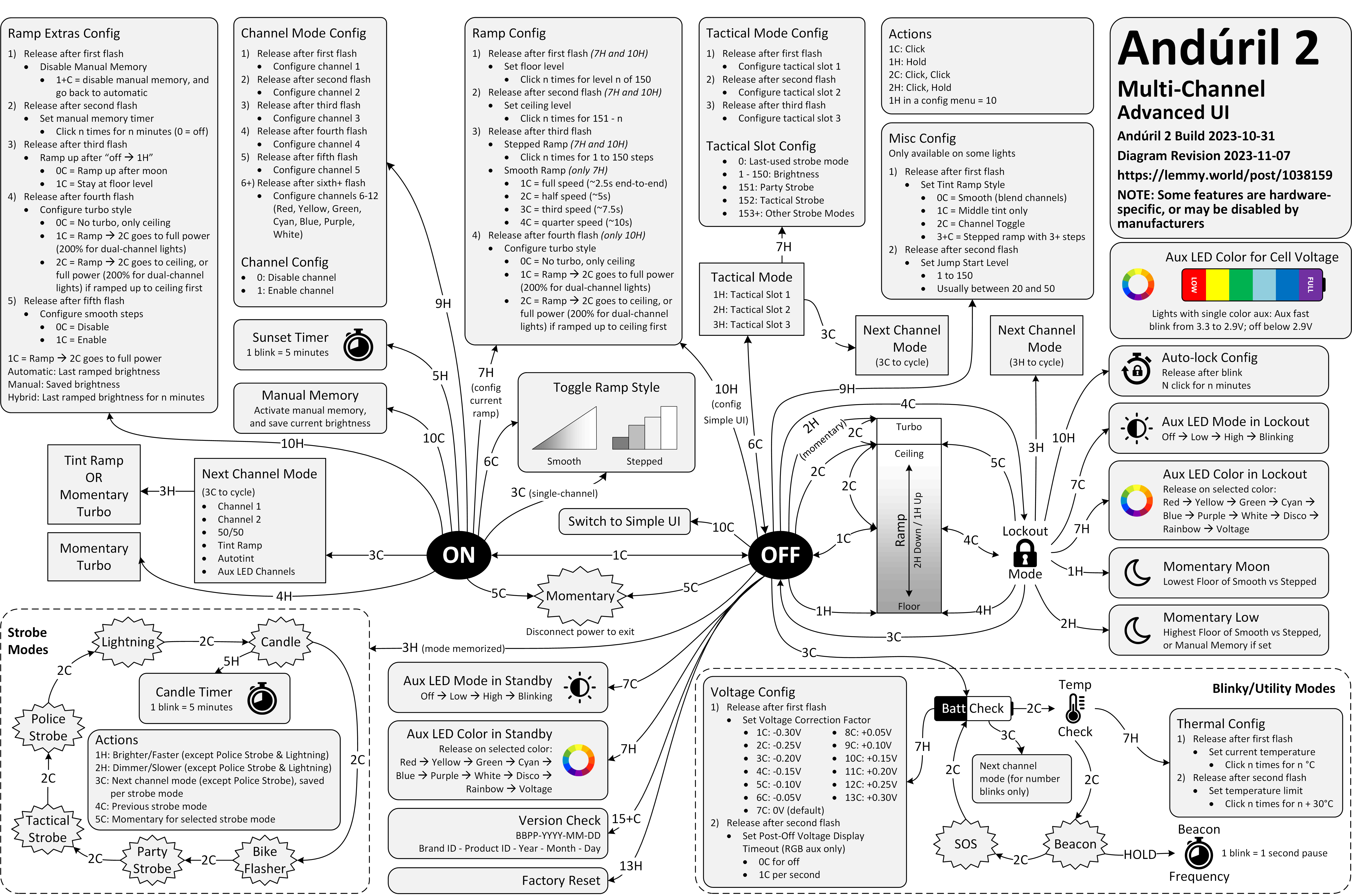
Anyway. This is a diagram for a single-button flashlight called Andúril 2 (larger version):
I saw it for the first time earlier this week. I was speechless. Maybe a little bit in awe. I know I’m supposed to hate this, but this feels so profoundly… alien, that I don’t know if anything I know applies here. I don’t want to judge it by the wrong set of rules. I want to understand the dividing lines between the UI and its explanation. I want to study it more.
Oh, and because I was curious too – this is the flashlight:
I was surprised at this little thing that appeared in my Chrome Canary this morning.
It is rare to see an interface clean up after itself this way. This flew by quickly and wasn’t communicated very well, but I believe this changed my new tab page from this…
…to this:
Now, I said “surprised” and not “delighted” not just because the implementation felt a bit rough. I am also suspicious of the motivations, as Google’s sister iOS app played very fast and loose with this surface, literally moving the search bar from under my thumb in order to create room for features I would never use and could never remove. I suspect this is a preparation for something else that would take the place.
But until that day comes, this was an interesting gesture, and it’s really welcome to see a new tab harking back to the simplicity of Google from days past.
Edward Tufte has this visual rule that 1+1=3: With a single line on the screen, you have just that single object, but adding a second line does something interesting, it adds a third ‘object’ on the screen, the negative space between the two. All good visual designers deeply understand this effect.
In UX design we have a cognitive equivalent. If you have two buttons, there is a third ‘object’ created: the decision a user must make on which button to tap.
But here’s what modern UI design looks like: There’s always a confusing title; it doesn’t quickly tell me what to do or what it wants me to understand; beneath that there’s a subtitle, explaining the title again; beneath that there’s several sentences that restates the title and subtitle but simply jumbles all the words around to make it justify its existence; then the button—there is always a button—and it asks me to “Confirm” or “Apply” but as to what I’m confirming or applying I have absolutely no idea unless I go back to the text and fight my way through it all again.
Kept nodding through this whole essay. I don’t love nervous user interfaces that share their own problems and insecurities with their users. I love confident interfaces that know exactly what to say, and don’t outstay their welcome.