Seeing like a state
The post about the dark mode toggle reminded me of two similar things rattling in my brain.
On the positive side, here’s a delightful interaction from macOS. I can easily maximize the window to take up half the screen, but the moment I start dragging it, it recalls and nicely restores itself to its original size:
macOS designers correctly figured out that the window being maximized or half-maximized is a state – but it has to be a state dressed up as a size. The button entry point is the “state” version. But on the way in, there is also a more natural “size” version: you can have the window snap and maximize to half screen when you drag it to the right edge. And on the way out? You just saw it. You don’t have to switch the state to “non maximized” first, and you don’t have to restore to the original size by hand.
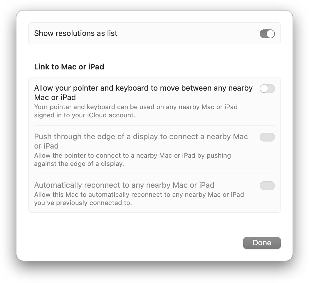
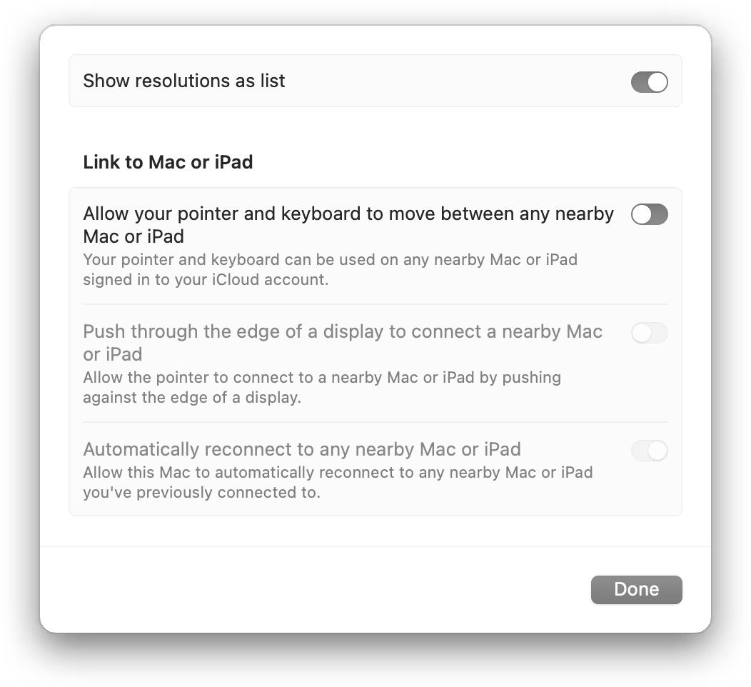
Here’s a bad example – one of the macOS’s horrible settings pages:
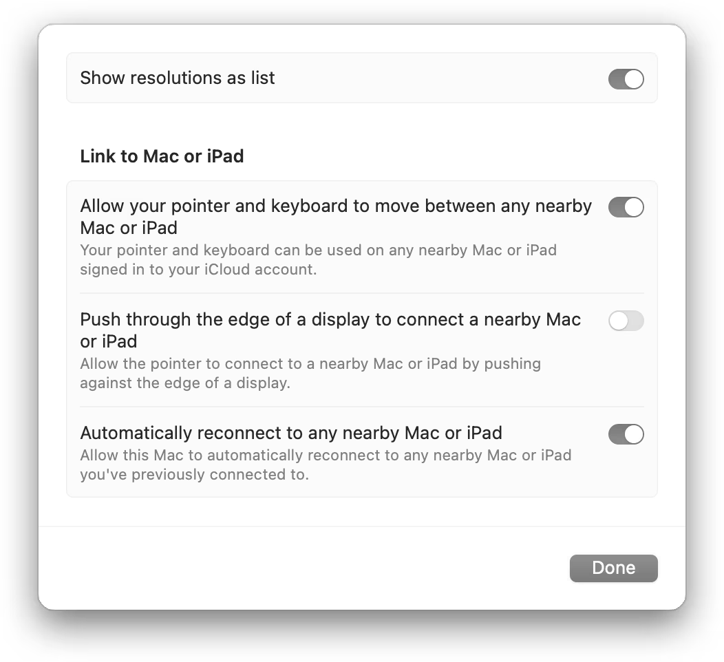
So far, it seems good. Some of the toggles are on, some off. You not only see a position of the switch change, but also the track under the switch is a different color to help you disambiguate. Nice.
But now look what happens when I toggle off the second option, which the third and fourth option rely on:
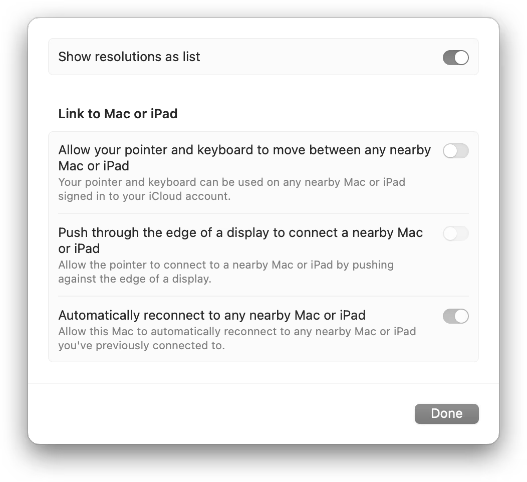
Processing this dialog visually, does it look like “on, off, disabled off, disabled on,” or does it look like “four toggles, each one inexplicably with a different shade of gray”?
There are many solutions here: some visual, some IA, some systemic. Also, I use the graphite accent color, which somewhat exacerbates the issue, although it’s there with any accent color.
But I wonder if one of the challenges here is that someone thought it’s important to show the state of the toggle even if it’s disabled, and everything else followed from that. This feels similar to the dark mode essay in that there will always be someone making that argument, and that argument will always feel stronger, because it will feel like it’s backed by logic. The system will make sense as a diagram. Each of its parts will come from a logical conclusion. So did the tri-state dark mode toggle. Or the Power/Sleep/Wake keyboard buttons. Or Abort, Retry, Fail in DOS.
Arguments for systemic completeness are always going to be easier to make than arguments for thoughtful simplicity.
I sketched two possible solutions. They’re not the best ones, and you might recoil at them, since either one is a compromise. But that’s the point.