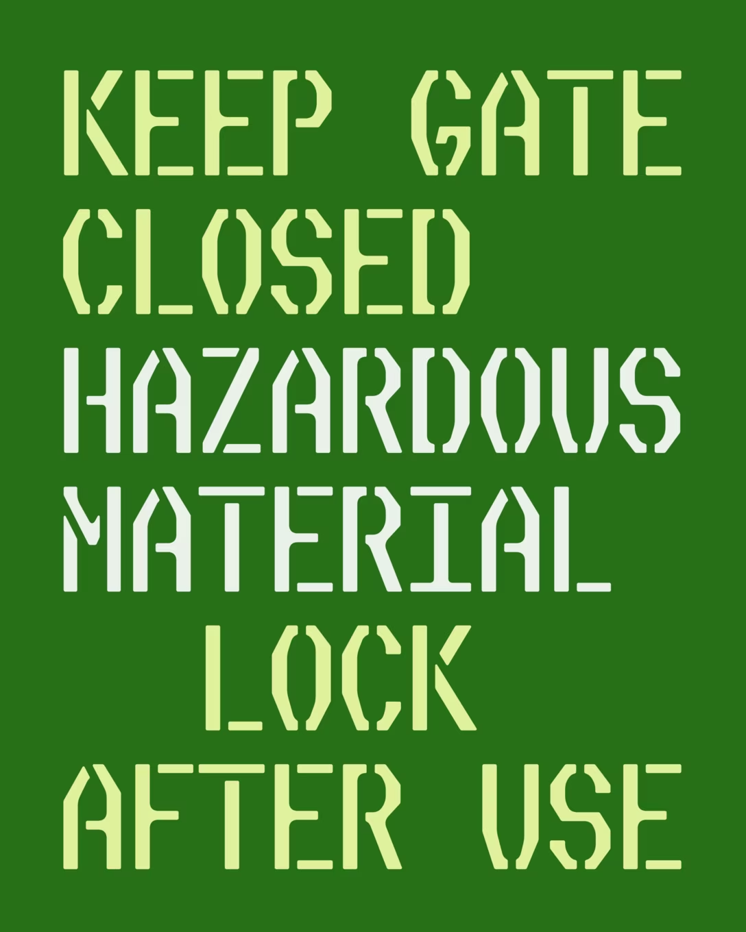
“Signs I would see on metal doors and transformer boxes”
I mentioned David J. Ross’s work more abstractly before, but here’s a great example of a good font announcement: Slight Chance Stencil.
It’s interesting, teaches you new things, clearly talks about and shows its inspirations, and is free of the sort of bloviating, pretentious, nutrition-free language that often accompanies typeface reveals.
At first, I thought I was going to get creative with the positions and angles of the stencil “bridges” that traverse the letterforms. I tried fun diagonal bridges like the ones pictured below, but I found that the fancier I got, the more distracting the gaps became. And it was important to me that the design didn’t feel too clever or self-aware.
So after much experimentation, I ended up sticking with vertical bridges for the vast majority of shapes. (A handful of diagonal bridges are stashed in an OpenType Stylistic Set.)
While Nickel Stencil shifts them to the left or right to reduce the clutter of horizontal branches, Slight Chance’s bridges mostly run right down the center, leaving branches on both sides…it’s more clutter, but it’s also more corners to make soft and worn.
I happily made exceptions when this approach left a distractingly short fragment. Sometimes I shifted the bridge to one side or another (see crossbars like B and a), sometimes I used a diagonal bridge (see K and A), and sometimes I used a horizontal bridge (see T and t).
Plus, the typeface and its origins are really cool.