“Solving a largely imaginary user goal”
On her blog, Lea Verou makes a case that each user-facing website dark-mode toggle should only ever show two options, but in a smart way.
The challenge is that any dark mode toggle needs to actually accommodate three options: dark, light, and the default “whatever the system says” (which can be always dark, always light, or change with the time of day). Many toggles simply pass that complexity onto the user:
I want to get something out of the way: I don’t think Verou’s article as an article is fully successful. I feel like it spends a great amount of words to explain something not entirely as complex, and even the interactive playgrounds felt slightly too rigid and altogether confusing. If you care about (interactive) explainers, it might be an interesting case study in and of itself.
But I am very much much onboard with the proposal and the line of thinking it represents. Verou suggests a “smart” dual state toggle, which still allows the website to follow the system, but shoves the complexity of the “whatever the system says” branch into the crevices between visible UI. Here’s how I understand it:
- The smart toggle only has two options: light and dark. Mechanically, clicking or tapping the toggle brings you to the opposite option. Simple.
- If your new option is the opposite of system (e.g. you switch the page to dark mode if your system is in light mode), it will stay in that theme forever, no matter what the system does in the future.
- If your new option is one that currently matches the system, it will then continue following the system in perpetuity (e.g. it’s back to the default behaviour).
This toggle will feel compromised, and you might immediately find some rare use case it doesn’t fully support – maybe attached to an imaginary user, or even an internal user. But Verou is absolutely correct in her insistence to fight through that:
Tri-state toggles are implementation-driven UI. One of the most common UX mistakes is designing UI around the underlying data model instead of user goals. Good interfaces abstract away the underlying model and expose a model that aligns with user goals (unless of course these happen to coincide, which is rare).
Now, it’s just a dark mode toggle. It might not seem like a difference between a smart dual state toggle and an explicit tri-state toggle is that much. But:
- “Whatever the system says” is not just one extra option. It’s also one extra weird option. It doesn’t feel like the other two. It’s seemingly repetitive. It’s often unclear what it does before clicking. It’s not obvious where to put it in order. Verou doesn’t mention this in her post, but even just seeing the word System next to Light and Dark feels complicated. (Auto is slightly better.) The cognitive load here might be larger than it seems.
- What is an interface if not a collection of a million challenges, each one seemingly insignificant on its own? Trivial things add up. One compromise here and one cheap decision there, and soon you’re talking real money.
- Thinking deeply about something like this gives one practice of dealing with complexity elsewhere, and facing even more difficult challenges where the stakes are higher and the compromises larger.
A similar example might be that of PC keyboards in the late 1990s, which also exposed system complexity and pestered people with Power/Sleep/Wake keys:
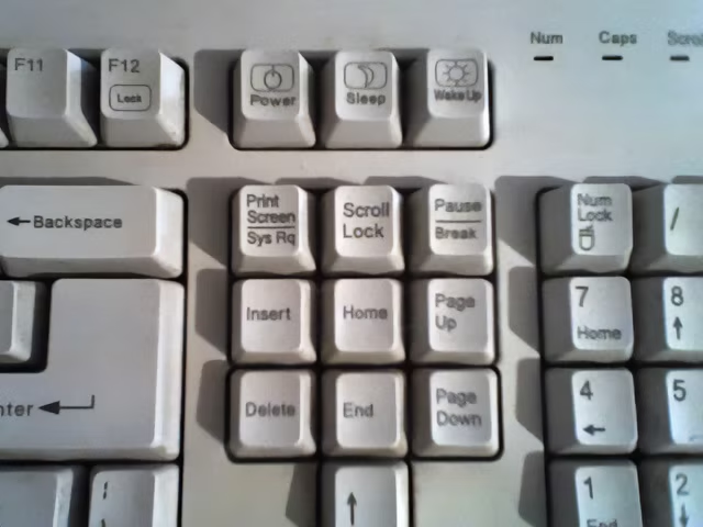
Computers do not do that anymore, simply having a smarter singular power button, piped to a more sophisticated logic underneath.