CleanShot’s bulldozed settings
In a recent post, Jim Nielsen used the term “bulldozing of an interface”:
I’ve found this to be true a lot as of late. Lots of tiny details that were meticulously crafted over years with specific rationales tied to real-world use cases, all completely bulldozed in a giant refactor.
I liked that term and a description, but I didn’t expect I’ll put it to use so soon. Unfortunately, mere months after praising CleanShot’s settings, the new version 5 update bulldozed them into something much worse.
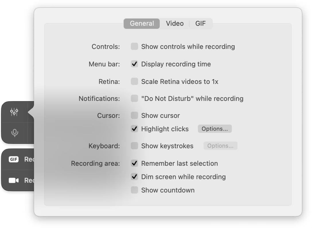
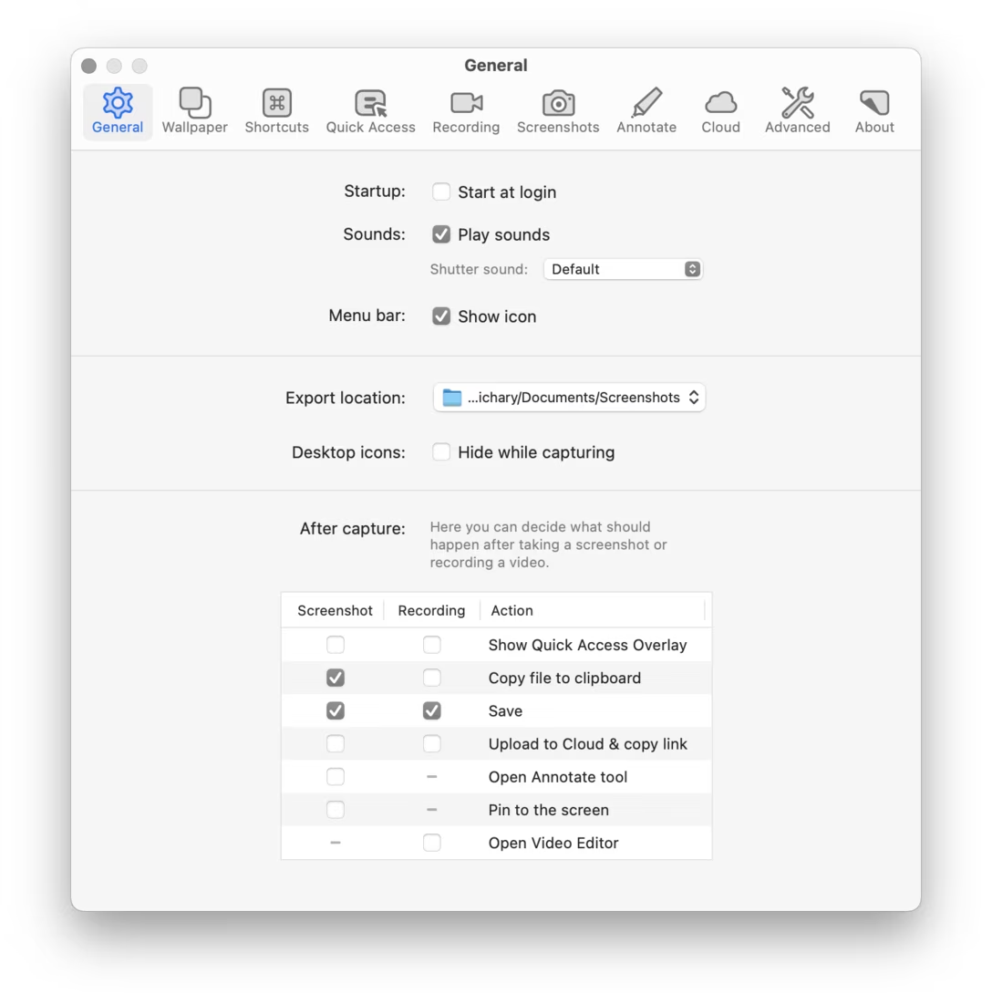
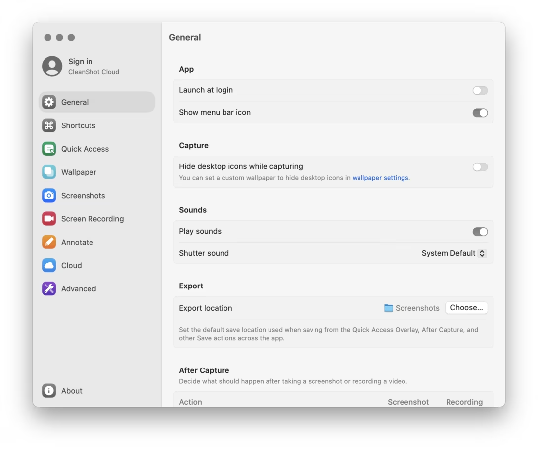
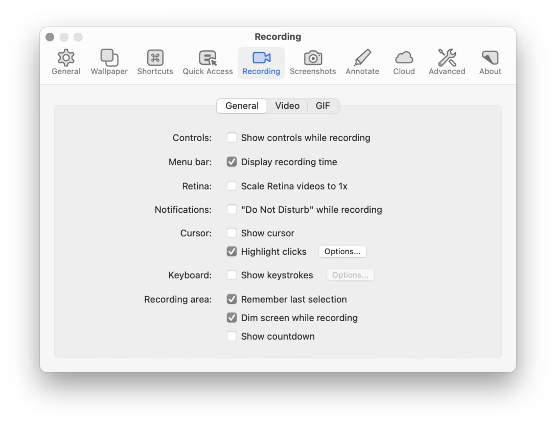
Let me show you first. In the following screenshots, version 4 design is followed by its version 5 equivalent.
Quick recording settings:

General:
Recording:
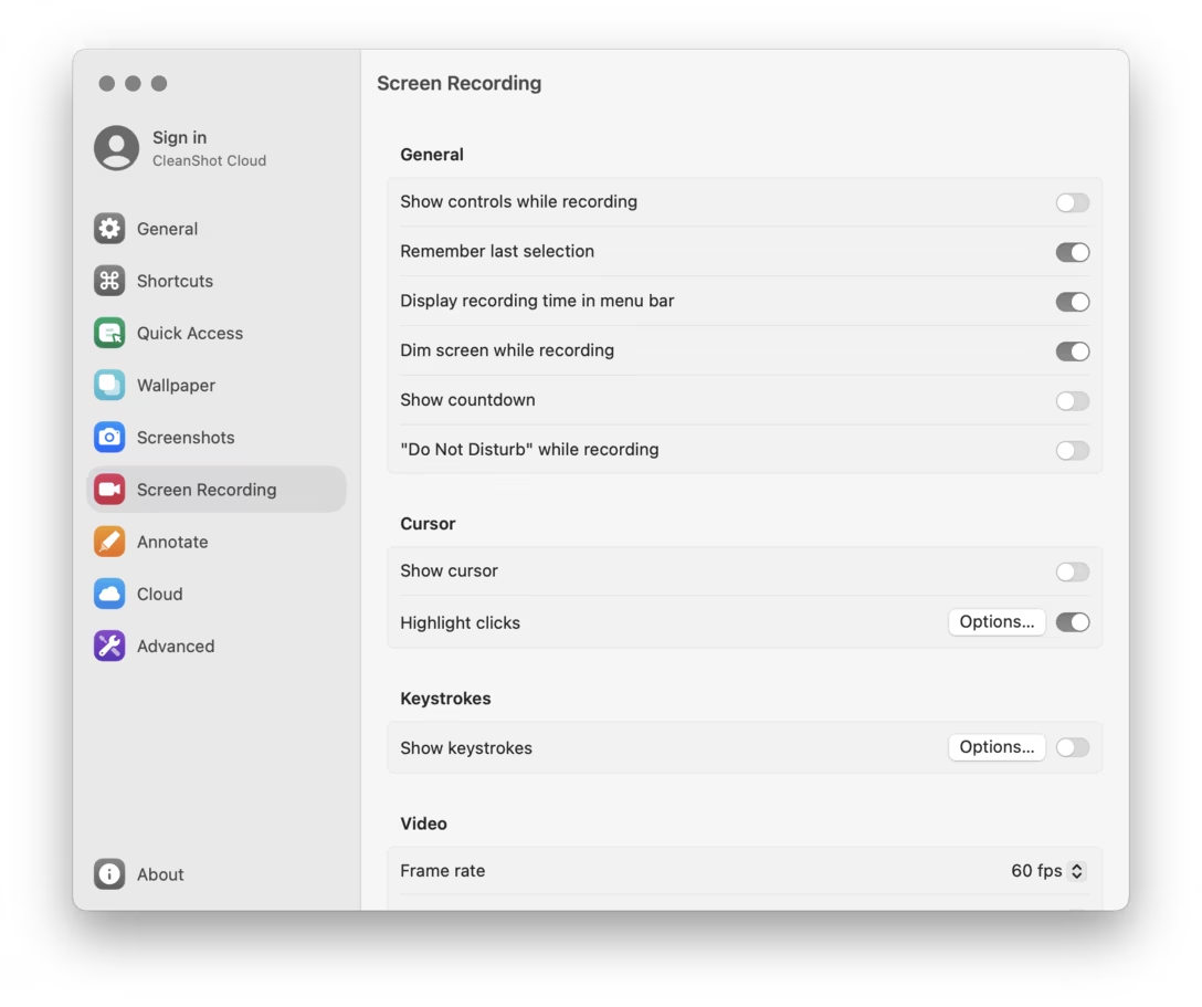
Advanced:
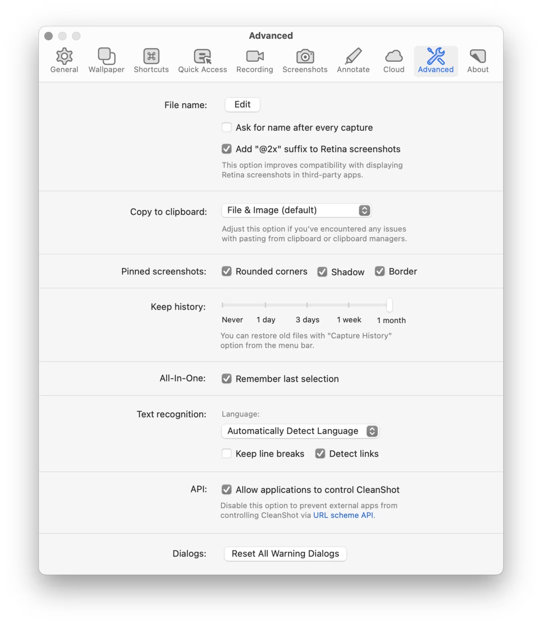
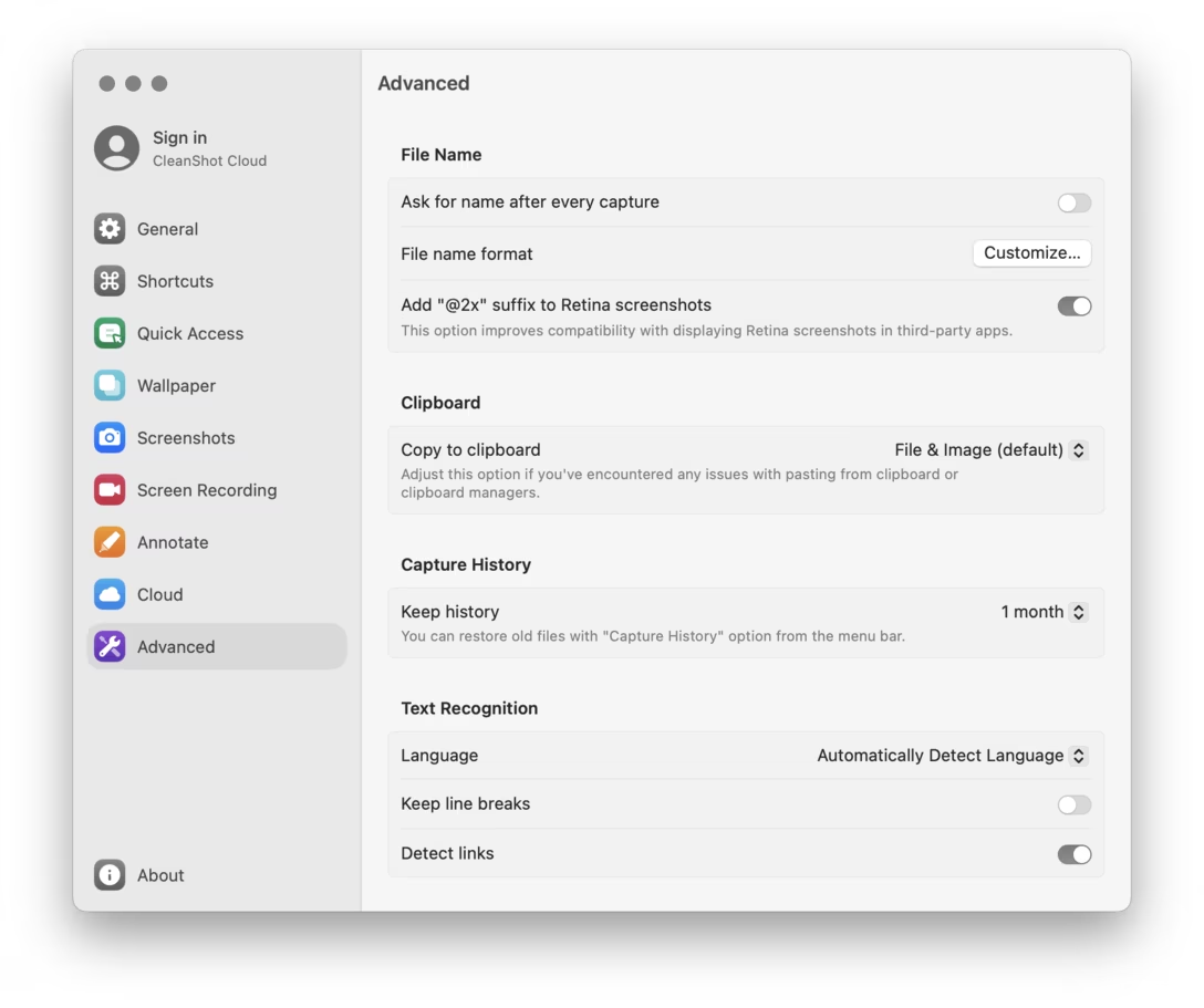
The other panels follow the same pattern. (The screenshots are from macOS Sequoia, but I checked in Tahoe, and things are not materially different there.)
I was taken aback by this – a feeling exacerbated by the fact that the quick settings on a dark background looked even worse – so I shared an early reaction with CleanShot’s support team, and asked how to downgrade to version 4, which luckily remains possible. The support team member said that they actually liked the previous settings themselves, but conveyed they shipped the redesign in order to feel more consistent with the operating system, and more modern.
I followed up with a longer response, which I’m sharing below. I am hoping this can be valuable to others facing a similar situation in the future, or give some specific observations to latch onto – for me, it allowed to put in words the feelings I’ve had about the Ventura Settings redesign that were rattling in my brain since 2022:
Hi,
I don’t think you have to follow the OS if its own designers are making bad decisions – I gather it’s even our responsibility as designers not to – and we know they are bad, if only from how people reacted to the macOS Ventura System Settings redesign.
Here are the problems I see that CleanShot 5 settings now inherit from Apple:
- The two-pane settings layout was originally designed for the first iPhone with its 320px screen width. macOS Settings stretches it to 460px, and in your app you went with 550px. As a result, the settings panes start registering, gestalt-wise, as “left column first, right column second” rather than “first option first, second option second, etc.” This requires eyes to dart around a lot more, as the labels are disconnected from their controls. The shading and lines help, but they’re just a crutch – and they also reduce density. In version 4, your eyes could follow the solitary center spine with more ease.
- The second column is right-aligned, which makes visual processing harder – not just because it further separates the label from the control, but also right alignment is harder to process in a left-to-right language. (In the previous layout, sure, the labels were right aligned, but they were still near the common spine. Plus, the labels are short and simpler visually than Ventura-style right-aligned UI controls.) This also creates attendant problems, like Options… buttons being on the “wrong side,” or Options… and Choose… buttons needing to be in inconsistent positions.
- In version 5, every panel looks much more alike. This doesn’t feel like helpful consistency, as it makes it harder to recognize where you are. Version 4 had a nice variety of silhouettes that felt cohesive as a whole, but still allowed for shape coding to help you orient yourself. We’re all pattern matchers, and varying shapes enter our brains on a deeper level, freeing us from having to consciously process the environment (or even read labels) over and over again, slowing us down.
- Ventura’s settings design does not really allow for radio buttons and struggles with sliders, forcing pop-up buttons for every one-of-many option, which further reduces shape coding, but also is worse for orientation as you can’t see everything – if you just want to find an option like “Plain color” in Wallpaper, it’s no longer immediately visible. You might never, as a matter of fact, learn it’s there. CleanShot 4 really nicely knew when to choose radio buttons and when to reach for pop-up buttons, depending on the importance of the control. (A smaller, but similar argument could be made for subtabs and streamlined checkboxes, both used to a good effect in 4, but missing in 5.)
- The new layout is also less usable as you can no longer click on long labels next to switches to toggle them, which was possible with checkboxes. The pop-up buttons are more narrow, too. This means you have to be a lot more precise in clicking, which adds up over time.
- The previous layout had a nice consistent feeling of “things that are actionable and I can click on are white, everything else is gray.” It was yet another way that aided in scannability and orientation. In the new system, pull-down menus look like (inactive) labels.
- The switches themselves have visibility and contrast problems. This might be particularly prominent in my setup with graphite as the accent color, but I believe it’s not unique to that, as I continue seeing feedback from many people who are always confused about “reading” the switches, whose both states look similar to one another. (The checkbox’s shape doesn’t have that problem.)
It’s not too late to undo this. This reminds me of city planning in the 1970s, where enchanted by the notions of modernism we remade city downtowns to be all identical-looking, clad in concrete, and surrounded by freeways. We look at it with shame and regret today, realizing we made previously alive places basically inhospitable.
You could still keep the modern left nav – that indeed didn’t age well, as screens are wider today – and perhaps left align the version 4 labels to make the gestalt hold better. It’s definitely more work, which I sympathize with; it’s hard when the operating system cedes its responsibilities to provide good design patterns. But you had something really wonderful before, crafted and signposted with care, both a great welcome mat for new CleanShot users and – important here more than for many other apps! – fantastic in repeated use.
(I know this is kind of an intense reply and I hope it doesn’t arrive feeling like concentrated condescension. Part of it is that I am x-posting it to my blog, as I believe it might be helpful for other designers.)
Best,
Marcin