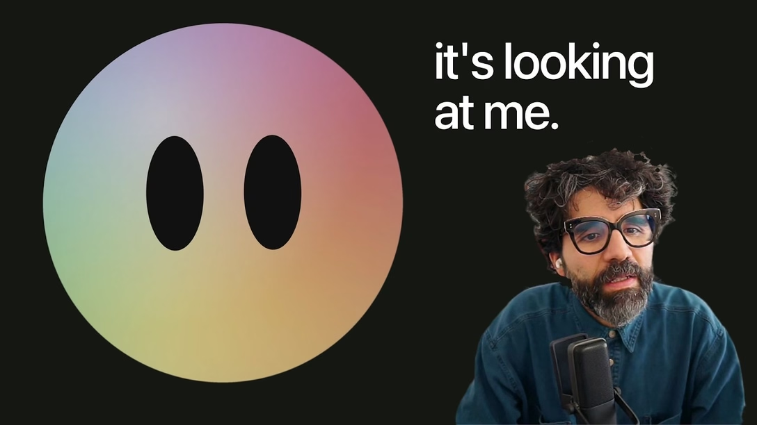
“I’ve spent years on it. Years. On a box.”
Designer Pablo Stanley created a really fun interactive exploration of what it takes to create a seemingly simple “composer” (industry’s jargon for a more sophisticated input field or things like it):
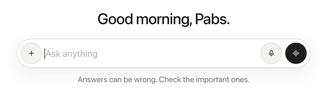
It’s a bit outside of Unsung’s purview since a lot of it is very “sung.” The case study focuses on visual presentation, and doesn’t cover systems design or consistency with other things; I even worried at times it could perpetuate an image of a UX designer being a “lone genius,” overindexing on visuals and tactile experiences over more important things, of which there is a ton in the AI neck of the industry woods.
At the same time, there are also mentions of flow, and a general drive toward reducing complexity that feel worthwhile. Plus, the theme of details that seem minuscule on the surface, but will all ladder up to a lot of friction in repeated use, is something we cover a lot.
Also, I am burying the lede: it’s a really enjoyable and well-crafted experience – don’t miss the sound and music! – and this unique way of talking about interface details could be inspiring in and of itself.
You can also watch the entire thing as a video with Stanley narrating, but I personally liked the interactive version more: