The first notch is magical
Some years ago, the inimitable channel Technology Connections posted a 17-minute video about the peculiar design quirk of ceiling and room fans – they usually order their options Off → High → Medium → Low rather than the more natural Off → Low → Medium → High. The video is a bit off topic for this channel, but check it out if you’re interested how sometimes weird physics considerations influence design in the real world:

In the video, the host also talks about the more natural order that typically looked like this:
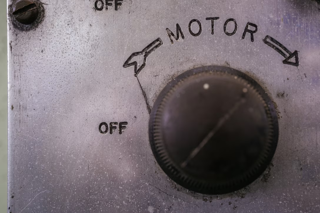
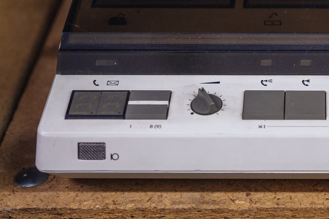
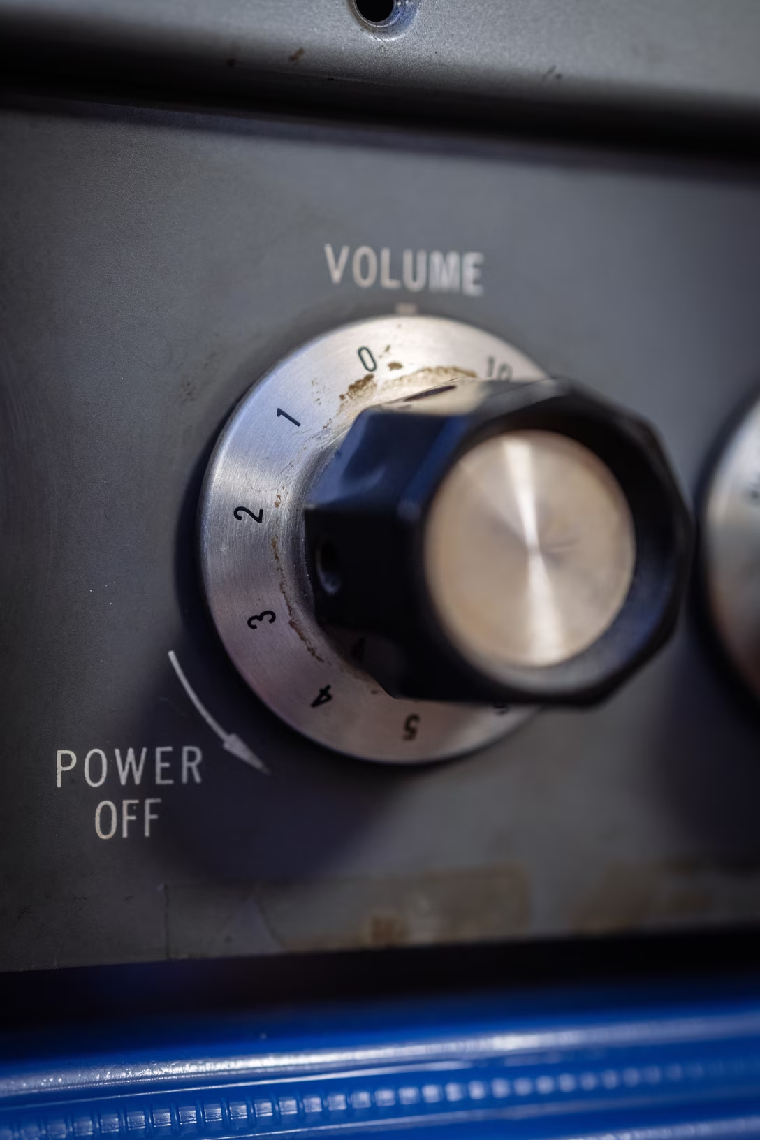

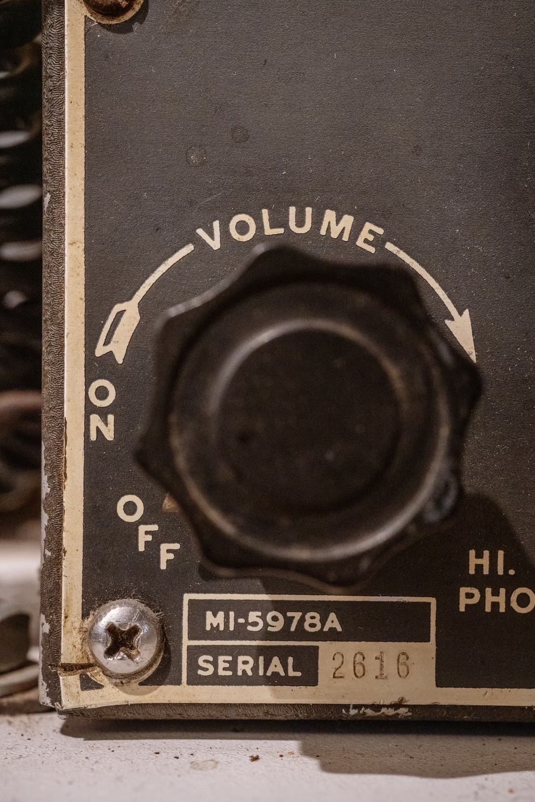
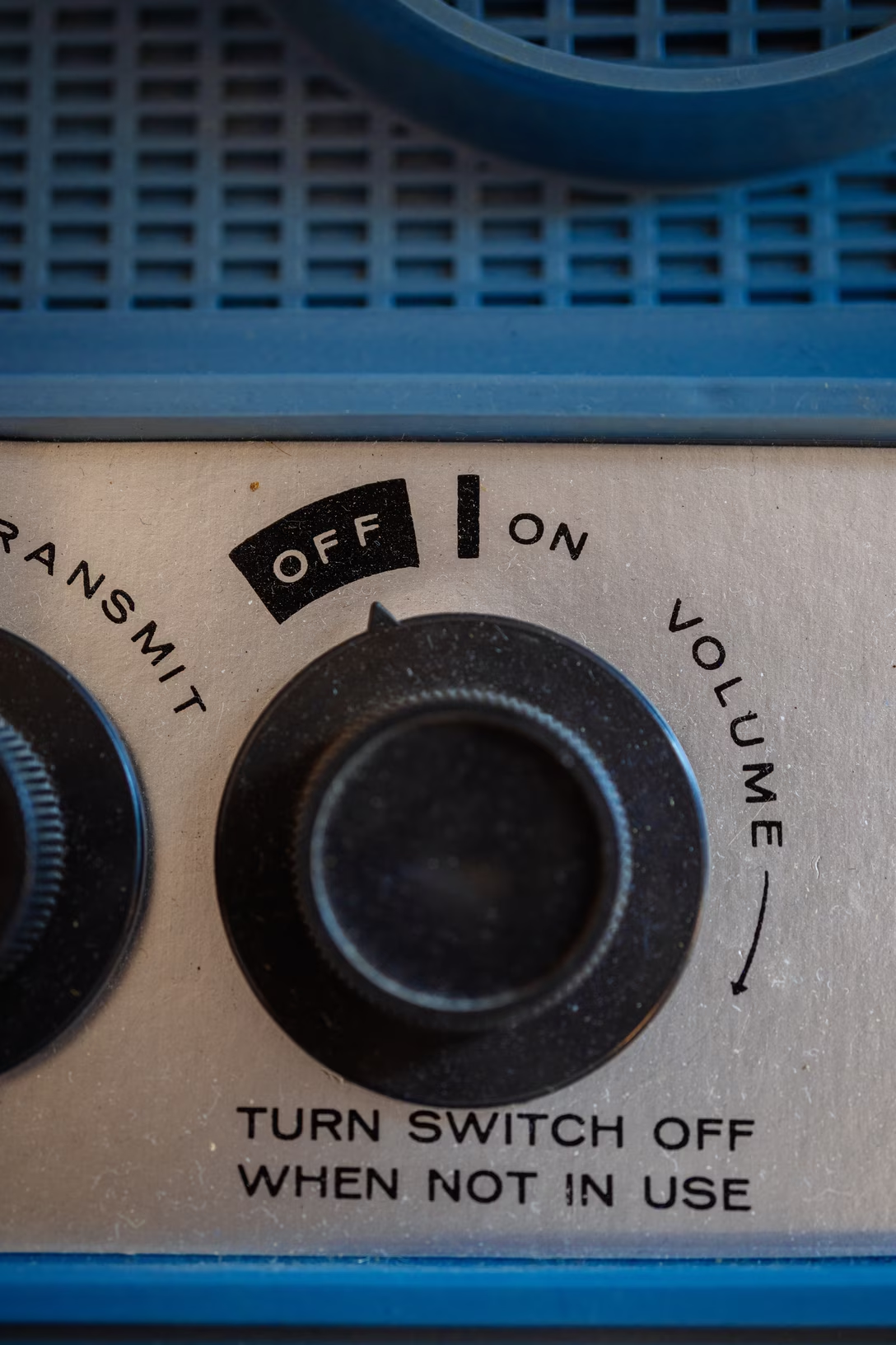
I wonder if you recognize this kind of an interface. I have a distinct memory of it from radios (where “zero volume” would mean “off”) and from TVs/early computer displays (where “zero brightness” meant “off,” too). There was something special about these controls that stuck in my memory, motor and otherwise: this tangible, heavy click when you ventured outside or back into “off,” almost as if you had to break the interface itself.
I thought this, too, was a convention from an old analog time. Yet, I keep occasionally finding the “the first notch is special” interfaces on screen.
Sometimes, they are pretty literal translations of the concept, like when you adjust the key repeat rate in macOS:
Or, similarly, when you choose the dock magnification:
But sometimes they are a bit more conceptual. Here, Nova treats the first notch of the zoom scale as a “list” option:
Or: The new horizontal tabs in Chrome allow you to resize to whatever width you want. Below 125px, however, they snap directly to the minimum 55px width, a one-off “column view” with streamlined and purely iconographic controls:
These all have pros and cons, too.
On the con side, just like the fan or volume controls, they miss any memory since turning them off physically moves the knob away from any “value”; if on/off was a separate button, you could just leave the radio at your preferred volume and never touch it again. They also won’t be as discoverable as a separate onscreen toggle would be. (Here’s an example of a more classic treatment from the Nothing Phone.)
Pros? They are compact. They allow you to change from “off” to a value in one quick gesture, skipping an explicit “on” step. You could even argue they are simpler also in a visual sense.
But also, they are a bit… magical. I don’t know. That’s what to me unifies those old physical controls and their newer digital equivalents – they’re a little extra, a little different, a little special. They break the monotony of a predictable interface built out of boring, identical components. (Although, sadly, not a single onscreen example above uses haptics!)
And I think that’s kind of nice. Not just in the very functional sense of breaking up the UI through shape coding etc., but also in a sense of making UIs more interesting.
Speaking of volume, macOS used to show it as a sort of a HUD, using a treatment that borrowed from both the “first notch is special” radio knobs, and from early onscreen interfaces in TVs:
But after 20+ years, macOS Tahoe changed it so it now looks this way:
I can understand the argument that this is more consistent, and that it even teaches you – by proximity – that Control Center is what these controls call home. Yet I can’t help but think (and it seems I am not alone) that this is so boring and exactly how Windows would approach things – and that this change, just like the squared icons, is how macOS lost one more bit of magic.