“Hindered by its headline feature”
On his channel about new and old hi-fi equipment, Techmoan profiles a modern Fosi Audio Neo player (the relevant segment starts at 17:36):
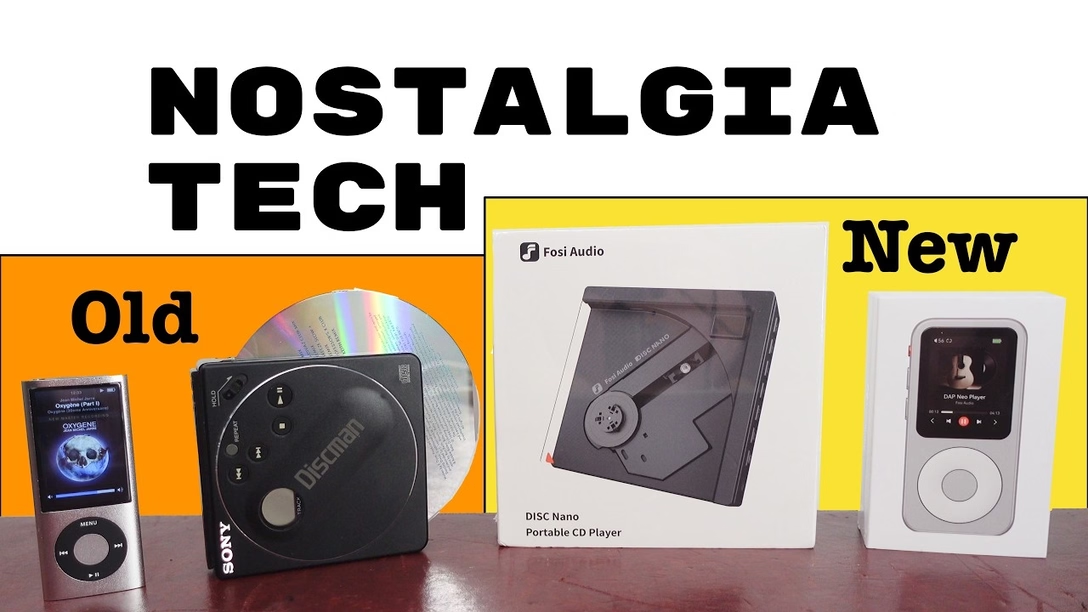
Fosi Audio Neo apes the iPod. At first glance, it looks exactly the same – a deck-of-cards-sized device with a wheel, and above it a screen showing either the currently playing track, or a hierarchical, textual menu:
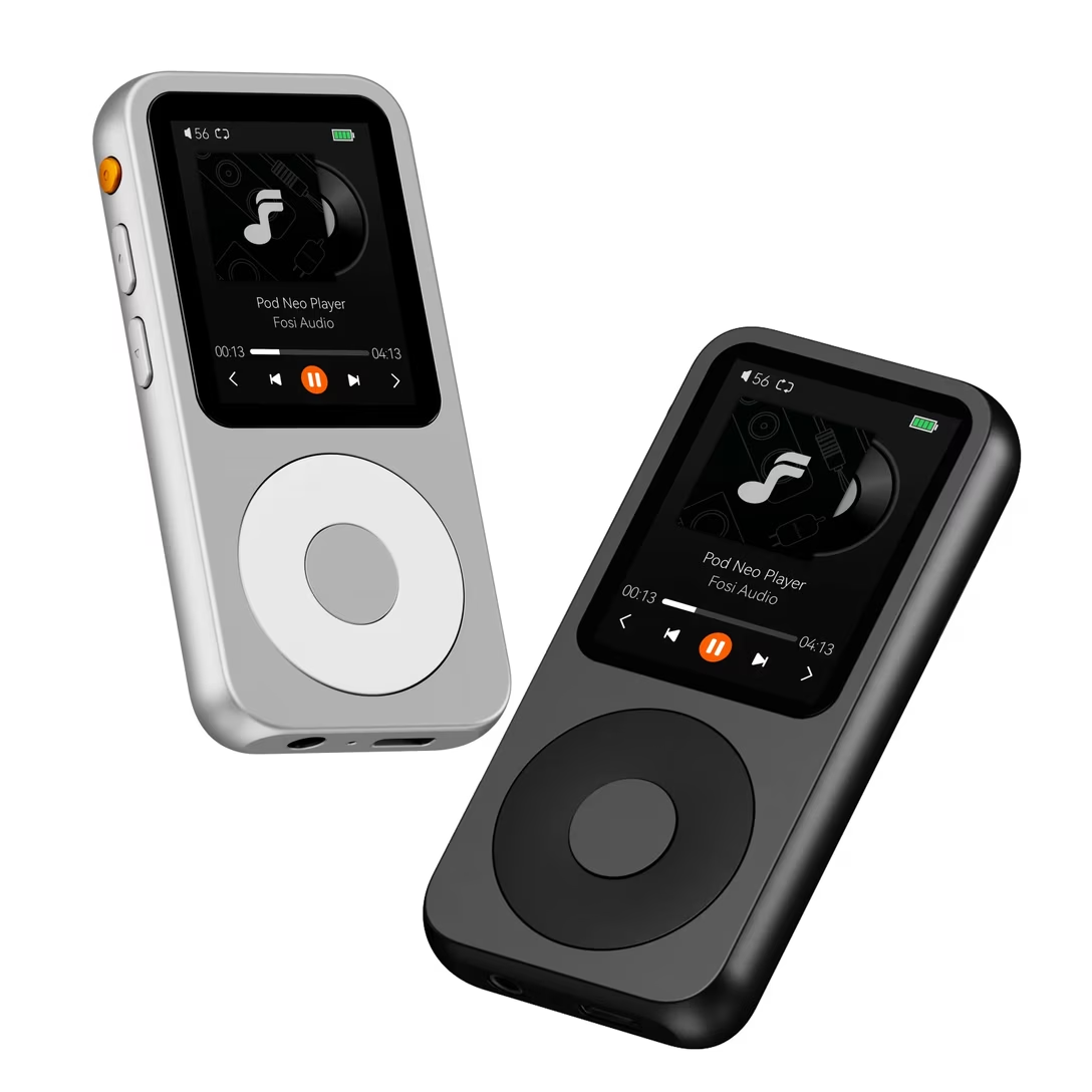
But the reviewer quickly discovers that the iPod copycat is a disaster in use, its creators accidentally highlighting two important rules:
- “simple” does not mean “fewer things,”
- simplicity cannot happen without a lot of small details done well.
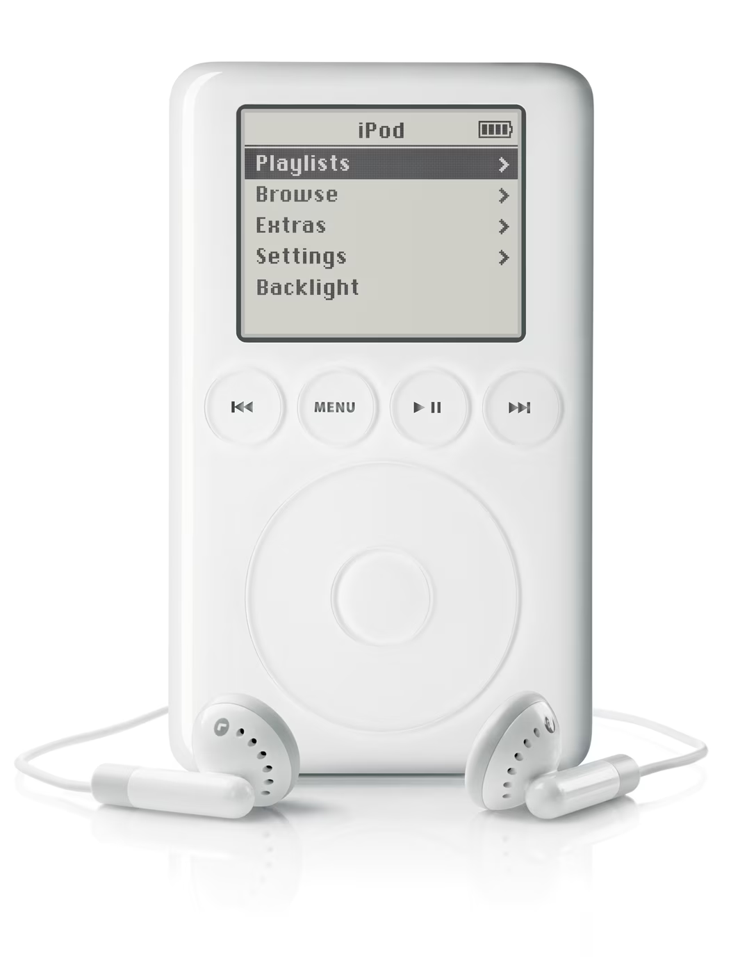
To the first point: iPod actually had five main buttons, not just one. This is most visible in the third generation, which put most of the commands above the wheel:
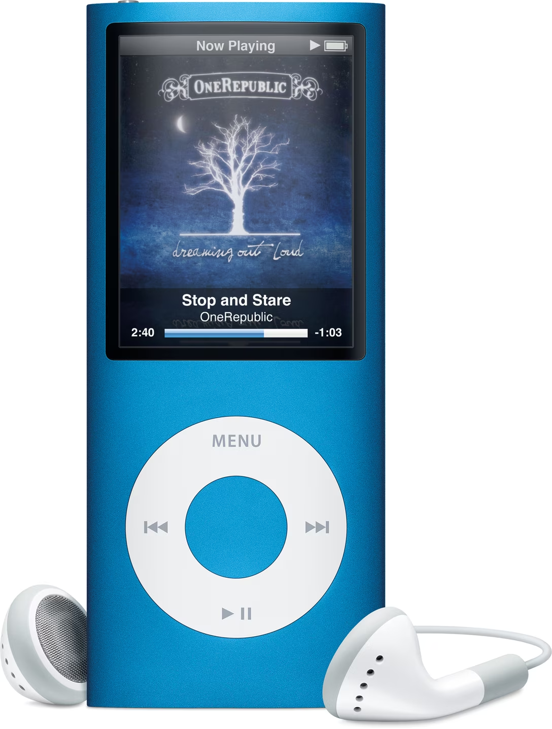
In all the other models, the buttons were integrated around, or even within the wheel:
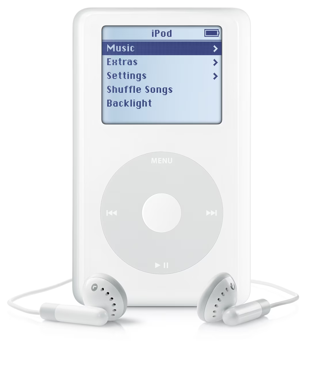
But the modern product only has one button, and that’s too few for all the necessary functionality. Now “going back” means an unnatural long press. The other necessary commands – like pausing, next track, and previous track – are offloaded to an onscreen menu, which means extra modes and focus states that the original iPod didn’t have. By trying to be simple in a naïve way, the creators of the Neo made their device more complicated.
As for the details? The new player has no acceleration curve when you scroll fast, which would help you traverse long lists as quickly as short ones. It has no scrollbar to give you a sense of how long the list is. It has no haptic-like beeps to help mesh the fluid rotation with discrete item jumps (your mouse wheel is doing the same thing!). It has no side-to-side transitions to help you orient yourself in the hierarchy. And, the reaction to every click seemed so slow that it made even me, the viewer, anxious.
This second aspect is similar to Photoshop vandalizing its dialogs, or CleanShot bulldozing its settings. Here, the new player also underestimates the sophistication and thoughtfulness of the things it aims to copy. The difficult truth is that while software needs to be simple to the user, that simplicity is nothing but complicated to people designing it.
I tried to find a good iPod click wheel explainer, but I couldn’t find any. (There have been a few web approximations over the years, but they also get a lot of nuances wrong.) I wonder if I should create an online iPod simulator, walking designers through all of its important interface details.