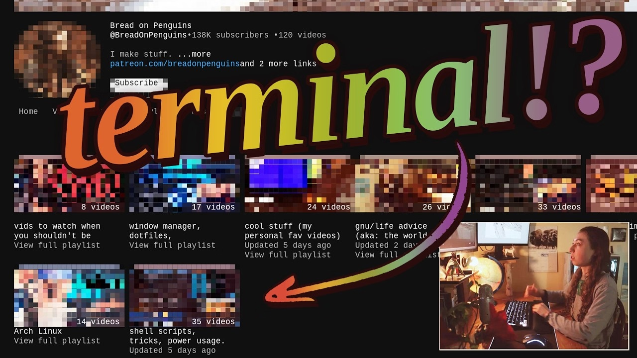
I am pretty sure this is nothing new for heavy command-line gurus (and heavy Raycast users, and so on), but I found it delightful to see someone so excited about creative uses of the terminal, and it made me realize how much time I do waste going through the browser, then Google Search, then scrolling. I am sure tightening some of these loops would feel great.
There is also something interesting in the argument about terminal being the ultimate “reading mode” of any website, chiefly because it cannot be anything else.
Mostly, this and Strudel before make me excited to see some new (to me) stuff happening with text-based user interfaces.
But it also made me think. I still strongly associate macOS shake with “wrong password,” meaning “you’re doing something wrong” – something the system has been teaching us ever since the late 1980s NeXT computer, whose windowing manager it inherited. Am I careful about the motion vocabulary and the semantics of shake, or am I simply overthinking it? Sometimes it is hard to tell.
(By the way, is it okay for me to link to random work by strangers, or is it weird? Don’t be afraid to let me know. One thing I want to practice on this blog is various ways to be a critic, in the sort of Roger Ebert sense.)
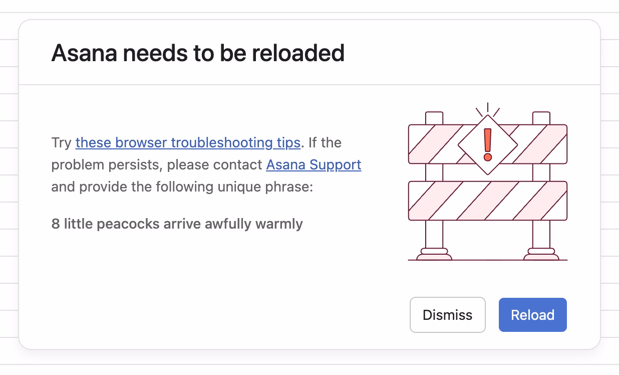
I spotted this interesting thing at work today, and was curious about that phrase at the end:
Turns out, it is basically a unique human-readable encoding of a 32-bit digit, I’d guess particularly for ease of voice/phone support communication. (Otherwise I imagine copy/paste would work well?)
What is novel in Asana is the form these IDs take. In most other applications, a customer-facing ID is usually a long jumble of numbers and/or letters. There are lots of small, subtle drawbacks to representing a number to a human this way, and so for the sake of curiosity—and to add a little levity to an otherwise frustrating situation—we tried something different.
Imagine representing 32 bits of information (numbers up to 4 billion) as a sentence instead of a jumble of digits. One possible sentence structure can be: count + adjective + plural noun + verb + adverb, e.g. “6 sad squid snuggle softly.”
I am very curious what data gets encoded this way since 32 bits is not really a lot. That detail, however, is not covered in the post.
When the project succeeded, her work had dissolved into the project’s infrastructure. The doc was just “the doc.” The tracker was just “the tracker.” The alignment was just how things were. People forgot it had ever been otherwise. That’s the thing about good coordination. I’ve realized that when it works, it disappears. You can’t see it precisely because it worked.
Even though Pandya didn’t call that out, it’s worth highlighting that his “founder friend” example wasn’t a woman by pure chance; often the invisible work becomes the second shift of women in the workplace. And then:
The problem is that recognition follows narrative. When a project succeeds, credit flows to the people whose contributions are easy to describe. The person who presented to the board. The person whose name is on the launch email. The person who shipped the final feature. These contributions are real, I’m not diminishing them. But they’re not more real than the work that made them possible. They’re just easier to point at. Easier to put in a slide. And I think that’s where the unfairness starts, slowly, without people really noticing.
However, I disagreed with these parts:
There’s no framework that fixes this. You can’t design a rubric that captures “held the project together.”
Wait, why not? This is a similar challenge to quantifying design contributions (some of which might not clearly map to KPIs or sometimes even OKRs). You can’t measure being in the flow, true user satisfaction and frustration, or world-class-adjacency of taste. But it doesn’t mean you cannot design a system or a rubric that recognizes and talks about them.
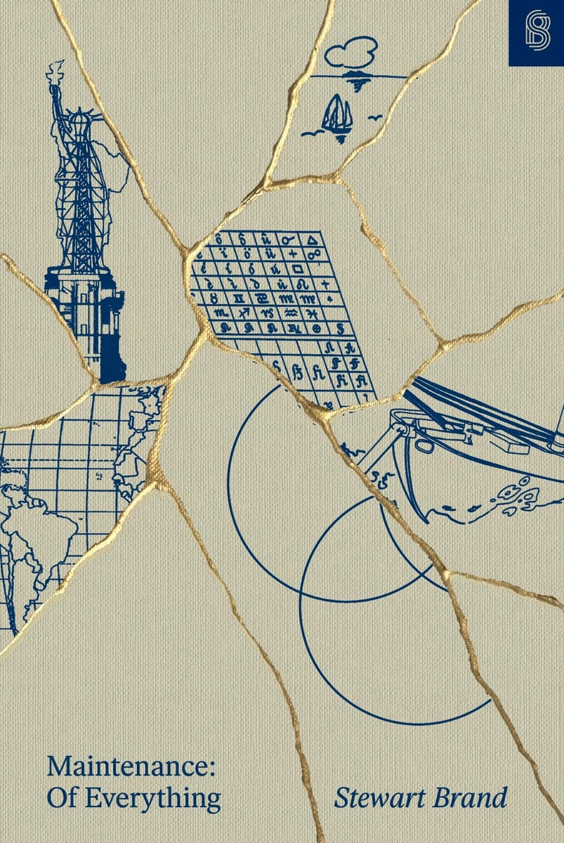
I learned from Diana Berlin’s always excellent newsletter Diagonal that Stewart Brand has a new book out, and it’s about maintenance, and it’s published by Stripe Press. From the introduction:
This book, I’m pretty sure, is the first to look at maintenance in general. It asks: What can be learned if you think about all the varieties of maintenance at the same time? I doubt if there are any non-trivial “laws” of maintenance to be discovered. All I can offer here is to muse across a representative sample of maintenance domains and see what emerges.
Very excited to give it a go, somewhat worried about “Part One” appearing in the title, disappointed in Stripe not caring enough to ask one woman for a blurb.
This is incredible – a story of a museum exhibit that replicated an experience of being a tech support person for a videogame company some time in the early 1990s:
You knew hint lines existed, right? 1-900 numbers, long-distance charges, hoping whoever answers actually knows what they’re talking about. They had incomplete documentation, contradictory notes, whatever the previous shift scribbled down. Nintendo’s Power Line is probably the most famous example. There’s a few great videos floating around about them.
The team invented a few new games (“We weren’t just making a game about hint lines. We were making the games that would’ve required hint lines to exist in the first place”), a few personas, and put together a 300-page realistic binder:
The entire story is so worth a read.
Looking back, we think ACMI said yes because we pitched infrastructure, not nostalgia. If you’re old enough, you probably remember that hint lines existed. We wanted people to experience what it was like to be part of that system.
[…]
Next time you tab over to a wiki page or watch a YouTube guide, spare a thought for hint line counselors of the early 1990s, armed with incomplete documentation, good intentions, and hope that the person on the other end was asking about a game they’d actually played. They were unsung heroes of gaming’s most chaotic era, and now, for a few minutes at least, you can experience their particular brand of helpful desperation firsthand.
The exhibit is still available at ACMI in Melbourne until March this year, “along with a life-size usable corporate cubicle (with a dead plant!) and matching hardware straight from the ’90s.”
You can also play it online, although the team warns: “Online is not the intended experience. Flipping through the physical artifact is half the fun.”
If I remember the story correctly, this was neither a bug, nor an Easter egg, but instead a joke’y punishment for not delivering the correct asset on time.
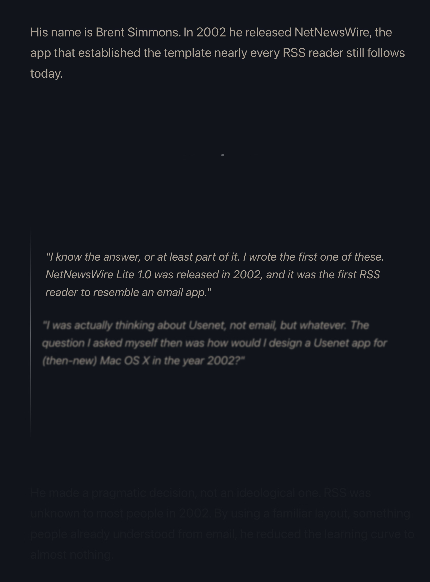
Many people already linked to Terry Godier’s thoughtful essay about email and RSS and the dangers of skeuomorphism by default:
Email is where the metaphor made its jump from atoms to bits. “Inbox” was borrowed legitimacy. It sounded like that wooden tray, so it inherited its psychology. But the wooden tray had a constraint: physical space. A desk could only hold so much. The digital inbox had no bottom. Still, mostly real obligations. Humans writing to you, expecting responses.
This all resonated me, although only to a point. I long stopped paying attention to those unread counters in Gmail and even though I know they exist, they feel wholly meaningless. And I personally would prefer my RSS reader to work more like email, because worrying that I cannot catch up if I wait too long and old entries get recycled is actually adding stress for me.
But I’m thankful for someone else pushing back on the barrage of red dots and fake urgency, and just thinking about it all is worthwhile. I’m very open to the idea of building something that eschews numbers to begin with, and for trying different operating models. (I deleted Threads from my phone after it was pushing me toward the algorithmic timeline filled with outrage, which was detrimental to my mental health.) I could even imagine choosing different RSS feeds to have different rules – this one “cannot miss,” the other one “casual.”
I also want to talk about the essay’s presentation.
The site makes heavy use of scroll effects. Okay, heavy subdued use, but like most of these, this is presentational rather than semantic. In this story at least, it feels a bit more thoughtful and it does feel like it enhances the experience and atmosphere, starting with the ticking number at the very top.
Yet, there are challenges. First, it does seem like there’s a lot of subtle movement going on and at some point that becomes a distraction. Also, I don’t know if it’s a bug or a particular stylistic choice, but things do not reveal themselves until they are almost off the screen. As an example, this is not a screenshot in the middle of animation – this is the page in a resting state, where the bottom is impossible to read:
This property, combined with the fact that all these are always reversible (something that even the recent Death to Scroll Fade page that ridiculed these avoided) makes the essay fiddly and harder to read than it needs to be.
To author’s credit, there is an alternative static version provided and linked to at the very top. But that version is also styled differently, and has more of a “terminal” look.
Thinking out loud and building a set of principles out of these observations, I would personally do it this way:
a static version should be stylistically indistinguishable from the dynamic version
ideally, there would be an easily accessible switch between motion/no-motion, similarly to how some sites allow you to switch to dark/light theme regardless of where you are in the story
if the user specifies “prefer reduced motion” in accessibility settings, a static version should kick in automatically
make the text effects finish as they scroll in, continuing the momentum on their own – don’t make them stop in the middle
unless the animation is particularly important or gimmicky (by the way: I love a good gimmick!), going back and forward again should not replay it
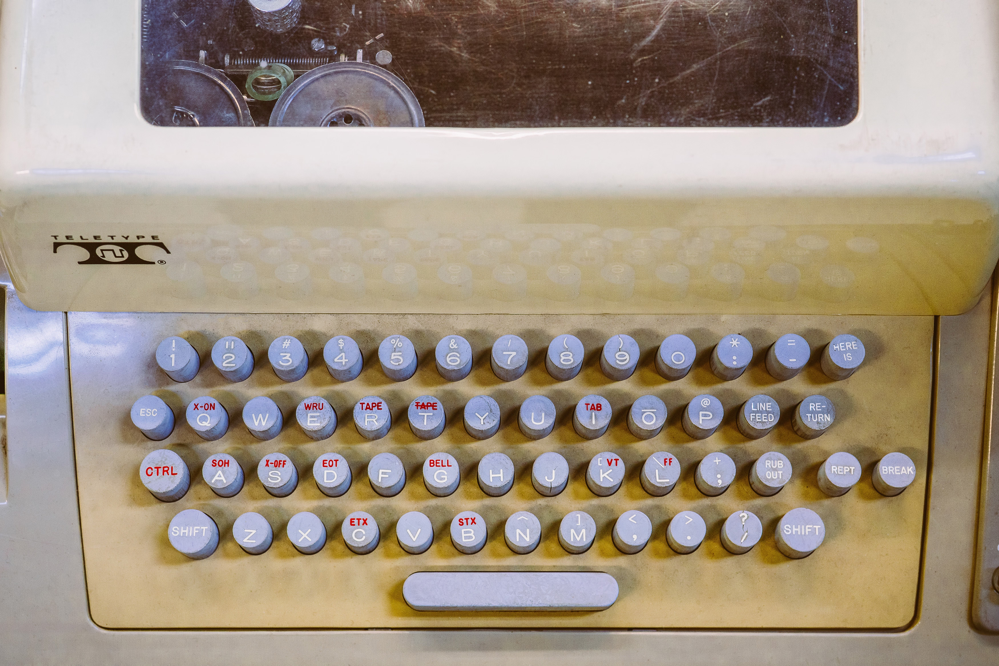
I’m slightly suspicious of this story that Unix commands were made so short (cp instead of copy, mv instead of move, ls instead of list, and so on) because the console keyboard had really unpleasant keys.
I imagine it must be a confluence of many things, not just this one. Shorter means faster even with amazing keyboards. Shorter also means the commands travel quicker over the slow modems of the era. The downsides were limited: the early nerdy user base of Unix could handle the extra confusion.
On the other hand – no pun intended – I typed on the keyboard on the picture and I can confirm it is absolutely, positively atrocious, with the tallest keys you have possibly seen:
At any rate, it’s a good a reminder of the power of motor memory, and the difficulty of change management. Even the worst keyboards imaginable are so much better now, and the modems so much faster. And yet, the short and confusing commands remain to this day.
What makes the AI chatbots and agents feel light and clean, here and now in 2026? Is it an innate architectural resistance to advertising, to attention hacks, to adversarial crud? No — it’s that they are simply new! The language models in 2026 are Google in 1999, Twitter in 2009. Their vast conjoined industry of influence hasn’t yet arisen … though it is stirring.
And I believe their architecture makes them more susceptible to adversarial crud, not less. I suppose we’ll see.
It’s interesting and useful to imagine — really visualize — the chatbots and agents in ten years or twenty … barnacled with gunk … locked in a permanent cat-and-mouse game with their adversaries … just as a platform like Google is today. In 2036, you send your AI agent out into the internet, and it returns battered, bedraggled, inexplicably enthusiastic about a bargain flight to Bermuda.
This is no criticism — just an observation about the way things go.
The AI community tends to say “this is the worst this will ever be” in response to criticism, but in a very learned sense, in many aspects it is also the best it will ever be.
Or maybe, to steal words from another person smarter than me, Ted Chiang:
I tend to think that most fears about A.I. are best understood as fears about capitalism. And I think that this is actually true of most fears of technology, too. Most of our fears or anxieties about technology are best understood as fears or anxiety about how capitalism will use technology against us. And technology and capitalism have been so closely intertwined that it’s hard to distinguish the two.
I remember The Master Switch being an excellent book that taught us how to spot and anticipate these patterns. It might be worth a re-read.
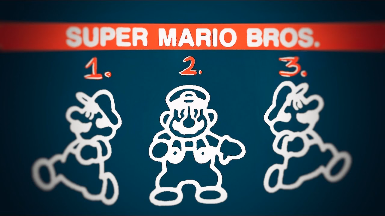
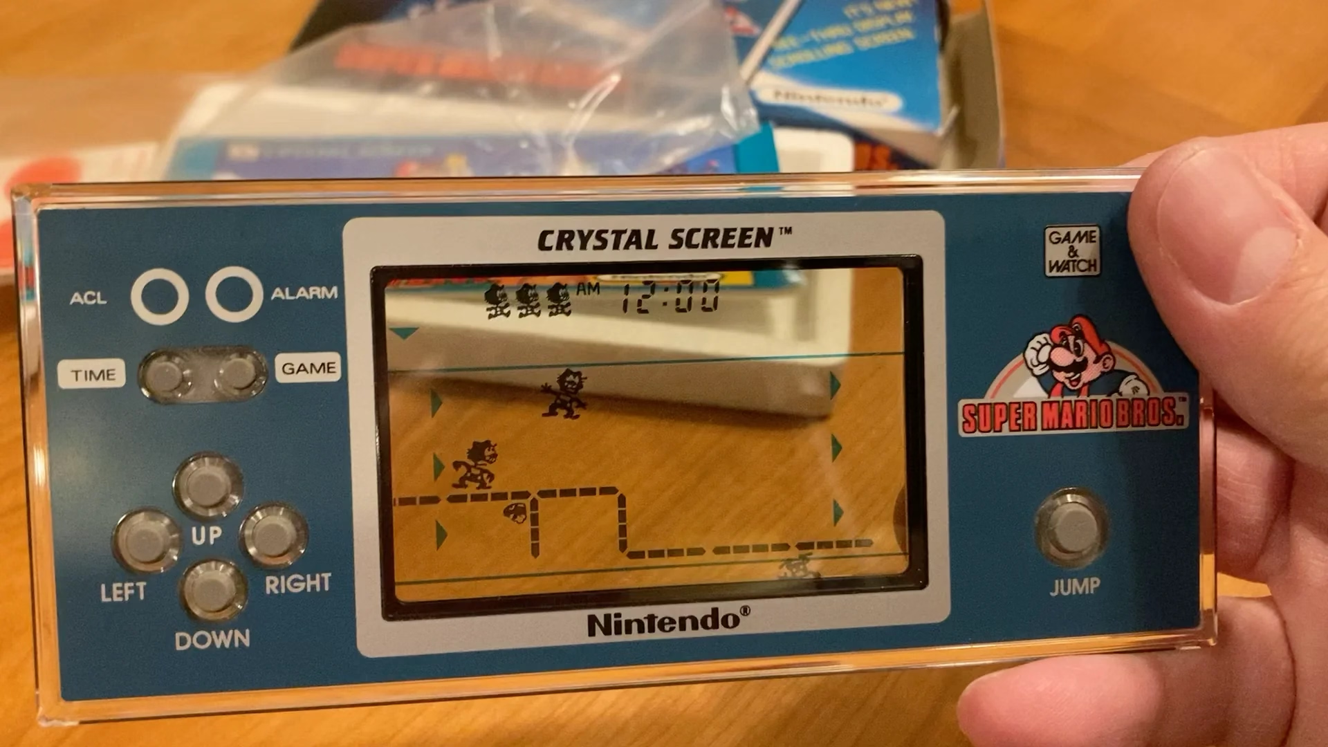
It serves as a bit of design history and even critique of early Mario games, and then in the middle it turns into an analysis of the Mario port on Game & Watch – an obsolete technology even in the 1980s, and something that could have been an easy cash grab, except someone cared.
Translating Mario’s mechanics to a much inferior tech is an interesting design challenge, plus there’s just this universal pleasure of seeing someone go extra. And the video has a nice ending message, too.
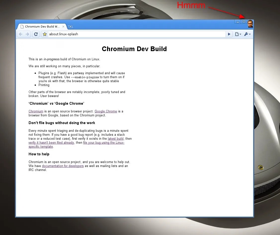
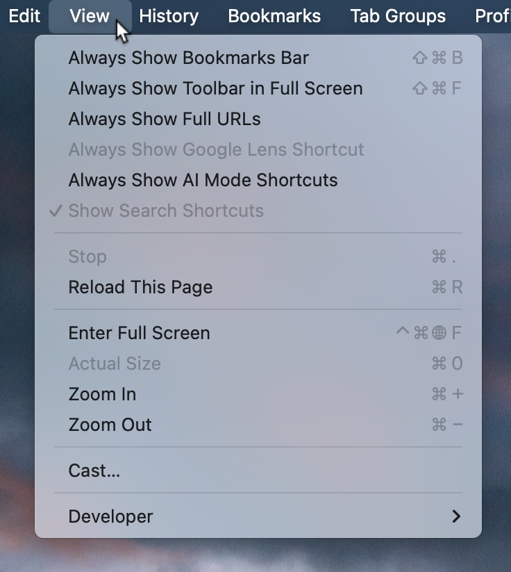
This menu in Chrome feels like a surface running away from its creators:
I think cerebrally I understand the subtle difference between Show and Always Show, but is that difference worth it? Because at some point the repetitiveness and heaviness of that top section is casting a huge shadow over the rest of the menu.
I have an internal rule for adding a new menu item that happens to result in the longest string yet: think about the volume – the literal amount of pixels – you’re adding to the whole surface. Big menus are scarier, wide menus separate items from their shortcuts, submenus become harder to jump into, and so on. The economy of words can benefit in more ways than just the obvious ones.
But what made me a little nervous were the two grayed out options. What does it mean for something starting with Always Show to be grayed out here? What does it mean for something to be grayed out and enabled? My guess is that someone wired these without thinking too much about all the states, but it results in a stressful tension. Software should be making it very clear about what is under my control, and what is not.
Lastly, and this is almost funny: Full Screen is either F or ⌃⌘F, in all standard Mac apps. This alone is already confusing, as is Apple’s entire horrible Globe/Fn strategy (this is a story for another time), and I verified they both work independently in Chrome. How did they get conflated into one shortcut from hell is probably a really interesting bug somewhere – but also a sign no one is seemingly paying attention.
This is neither the first nor the last time I’m sharing David Jonathan Ross’s work; today I want to link to a really fun glyph explorer he put together recently:
That’s it. That’s the tweet. On this blog I generally want to capture the meaning of well-made things, deeper thinking, going beyond cheap sugary delight, the discomfort of rigor meeting joy and craft colliding with function, and the “why” of it all – and a lot of that is actually all here, too, as long as you keep clicking on things.
But: sometimes it’s also just so nice simply to look at beautiful letterforms for a while.
1.
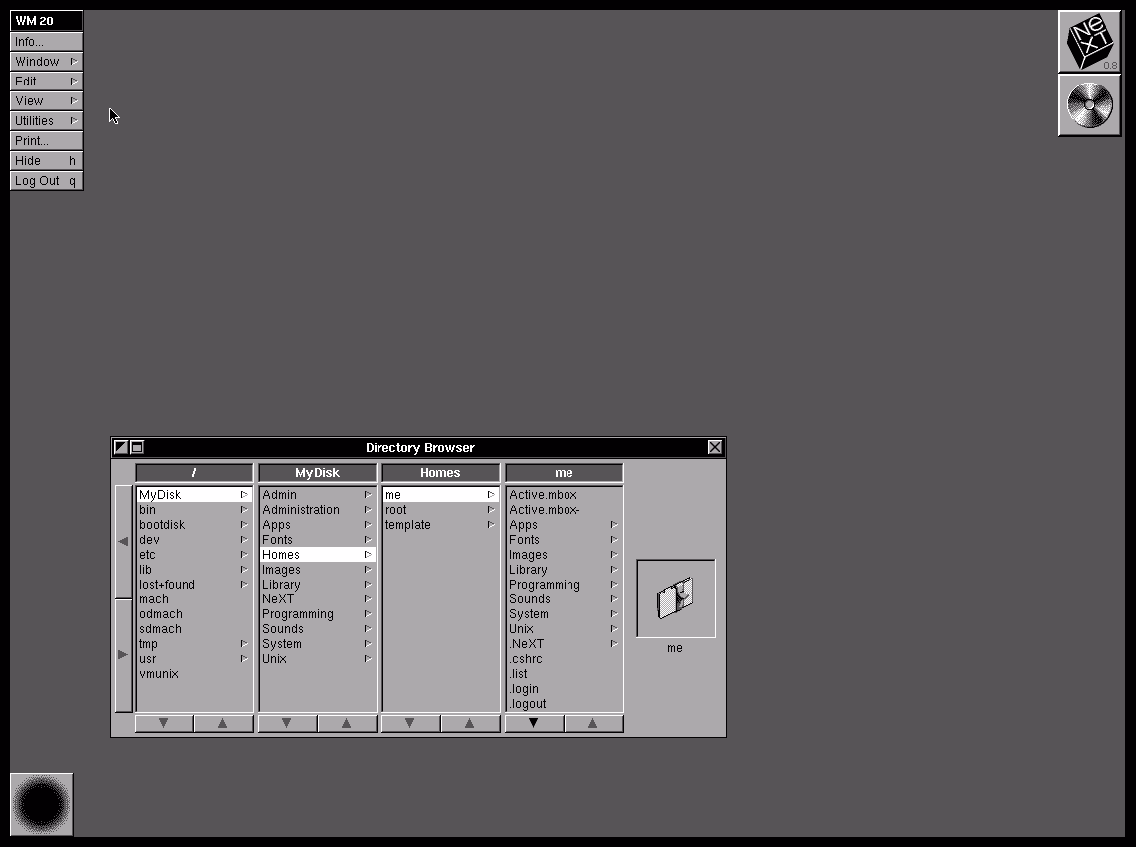
Column view as a concept and when done well deserves to be in the UI hall of fame. It flew and still can fly high in the Finder, and it was the unsung hero of both the iPod and the iPhone. It’s really fun to fire up NeXTSTEP 0.8 in Infinite Mac and see its first incarnation.
2.
Apple decided not to ship the auto-sizing columns a few years ago, hiding it under a “defaults write” incantation as a sort of a beta, but then seemingly just launched it this year without any changes. There are some charitable explanations – perhaps the beta was hard crashing Finder and the released one no longer does? – but in the current zeitgeist I’m feeling that it’s something more like this: the people with taste who were stopping it from getting launched in the bad state were either sidelined or are no longer there.
3.
And it is a bad state. It’s a first draft made public. Like anyone who deals with layouts learns over time, things like this one need careful min and max widths to have certain good pleasing and stable visual rhythm. They might even need a scale or a grid on top. And the fact that the width accommodates only visible objects doesn’t seem to make sense.The top hand doesn’t know what the bottom hand is doing, and it feels the feature is incompatible with itself.
This feels like an old Unix windowing feature, a sketch of an idea for GUI nerds who get excited about just the cool concept alone, ignoring the execution. Although, to be fair – this is opt-in and buried as the last checkbox inside a pretty obscure window. This might still be GUI nerd territory.
4.
So Apple really did think we’re going to love Liquid Glass, huh?
83% of participants associated the floppy disk icon with saving. […] Another 13% described this object literally with responses such as “disk,” “disc,” or “this is an SD card for storing information.” These responses were not coded as “save,” but still suggest familiarity with the image.
What a fascinating journey! The icon didn’t change at all, but its perception went from being a literal representation of a familiar object, to a skeuomorph once floppies were replaced by hard drives, to then a symbolic representation of physical media in general (a lot of people think it’s an SD card – or perhaps even that floppy disks and SD cards are one and the same), to increasingly just an abstract symbol that represents saving as a concept, registering similarly to the circular arrows for syncing, and an arrow pointing south for downloading.
NN/Group is itself kind of a floppy disk, trying to walk a fine line between their legacy and reinventing themselves. They’re dismissed by many as old-school, academic, boring enterprise software aficionados, relics of a different era. I see some of that and often disagree with them, but I also sometimes appreciate their rigor, reliance on user studies, and outright dismissal of fashion in UI design. I want to revisit their site in more detail and see how I feel about it today, 30 years after Jakob Nielsen’s books rocked my world.
Everybody who routinely takes screenshots on a Mac knows very well the motor memory heaven and hell that are the screenshotting shortcuts: ⌘⇧3 to grab the whole screen, ⌘⇧4 to grab part of it, hold ⌃ ahead of time to put the result in the clipboard, press space at the right moment to select a window, hold ⌥ at a different time to remove a shadow, and so on. (Yes, there’s more.)
It’s strange to talk about those shortcuts, because the world is divided into two groups: people who have never used any of these because they are the scariest shortcuts that induce RSI if you just think about them, and people who have used them for so long that their fingers do all the work. Either group would struggle with writing the above paragraph – as did I, needing to watch my hands first, and then take notes.
But: why do the shortcuts start with 3? After all, ⌘⇧1 and ⌘⇧2 don’t seem to do anything.
That wasn’t always the case. Turns out that once upon a time Apple was trying to create a larger universe of nerdy shortcuts for your Mac. The effort is so old – they were introduced in 1986 – that ⌘⇧1 was added as a quick shortcut to… eject the floppy disk. And, since you could also have an external floppy drive, ⌘⇧2 was assigned to eject that, and the shortcuts for screenshots followed in sequence: ⌘⇧3 to save the screen, and ⌘⇧4 to send it straight to your printer. (Even then, there was already Caps Lock thrown into the mix, too, switching between the entire screen and the current window.)
Early BASIC programmers knew to separate their line numbers by 10 because there will always be a line you want to insert in between, but keyboard shortcut designers do not have that luxury.
And so the nice system backfired immediately. Some Macs started coming with two built-in floppy drives, but still allowed you to plug in an external one. What would you press to eject that?
Well, of course it had to be ⌘⇧0, since ⌘⇧3 was already taken.
(In an absolutely delicious bit of rhyming, the 0 key itself is on the “wrong” side of most keyboards – except Hungarian – because it was added to keyboards before the 1 key was! It felt more natural to put it after 9 than right before 2.)
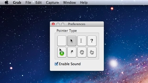
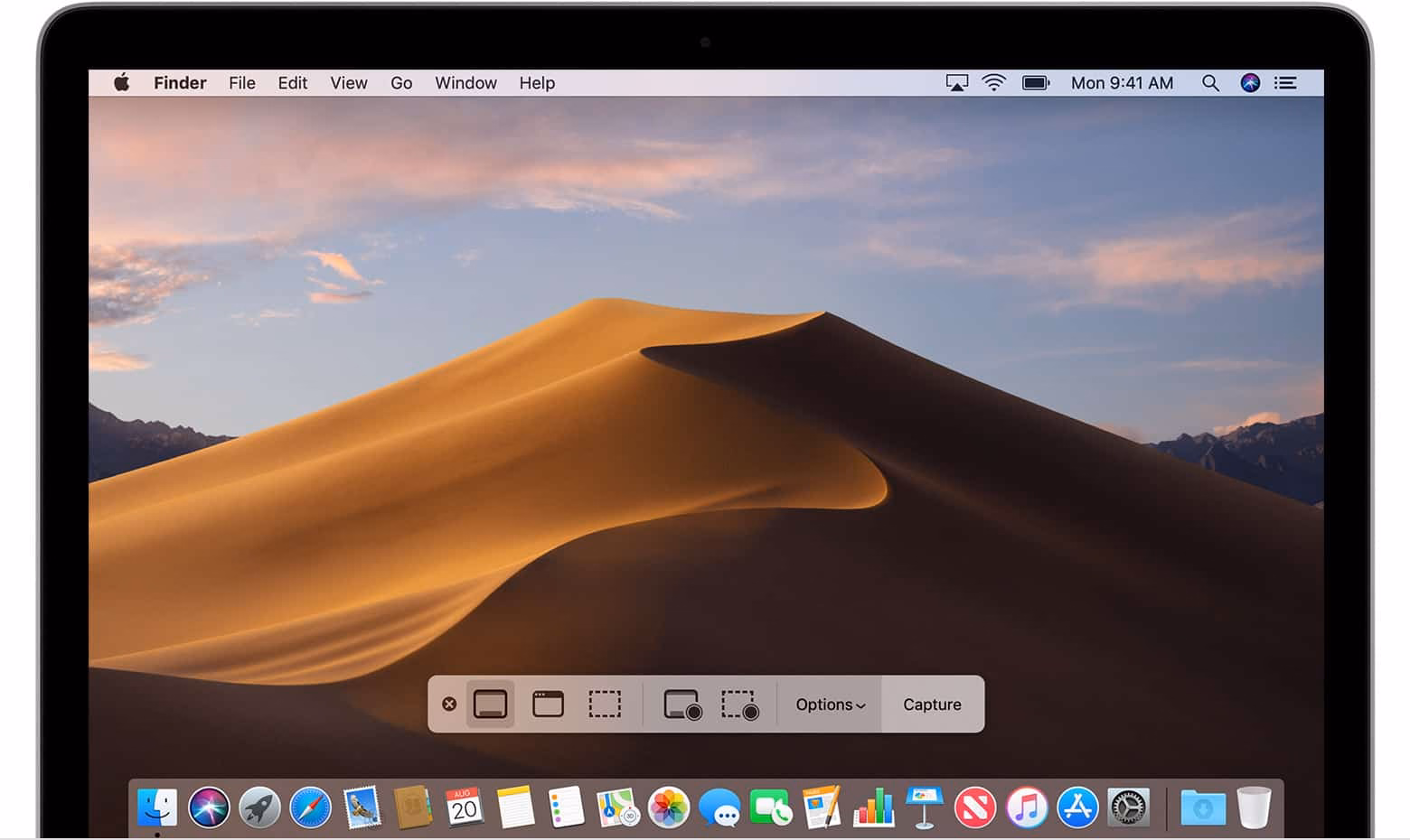
Things were quiet for a while. Floppies disappeared over time. Only in 2018, Apple evolved the old Grab app that it inherited from NeXT into a Screenshot app, and assigned it a new shortcut, ⌘⇧5. That was a nice improvement – video recording, a very helpful timer, a few smaller options, and a bit of a GUI thrown atop for convenience.
There are a bunch of system and change management lessons in here, but I want to talk about something else I just learned about.
Acorn 8, a graphic app, has a delightful screenshotting feature parked under ⌘⇧7 that does something incredible: it takes a screenshot, but does so in a way where windows are separate layers, grouped by app. It’s amazing; you can re-compose stuff afterwards, reveal covered stuff, remove windows, even change the wallpaper. A mouse cursor arrives too in its own tiny layer, like a cherry on top.
I’m sharing this both because I gather people who read this blog take a lot of screenshots – but also because this is software craft. I know “delightful” is (mis—? ab—?)used to refer to beautiful but slow transitions, and cute but distracting UI copy, but this is the stuff of true delight: using newly abundant technology to actually do something useful, and rewrite the rules of something that hasn’t been touched for ages, in a way that feels magical. There is still room for improvement – notably, you cannot just fire and forget a screenshot straight into your filesystem – but I find this kind of stuff inspiring.
I also know what you’re thinking: hey, what happened to ⌘⇧6? I’m not going to tell you. It’s probably not that hard to google it, but maybe you’ll enjoy trying to guess like I did. What was a feature of Macs that arrived after 2018 that Apple would want you to forget about even more so than the floppy disks?
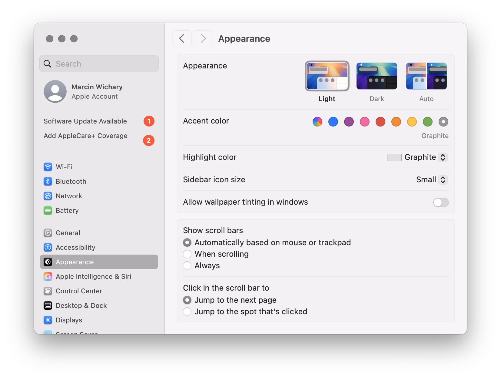
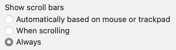
Many designers and engineers have Apple products with their flawless and praise-worthy trackpads. By default on macOS, trackpad means only “shy” (iPhone-like) scrollbars are shown. Shy scrollbars become half-visible when two-finger scrolling, and only fully visible when hovering over them.
To anyone working on front-end, I encourage you to toggle this setting to “Always,” and convince half of your team to do the same. Your macOS will now pretend you have a mouse connected, and show more traditional scrollbars, all the time.
Why? Because you might already be accidentally generating spurious scrollbars without realizing. Here’s something I just spotted in Coda today:
This scrollbar serves no purpose, so it will become visual noise for a lot of your users. But when you yourself use “shy” scrollbars, you might not even realize.
Of course, the scrollbar is just a symptom of a bigger problem – an accidentally scrolling surface that will be janky to everyone regardless of their scrollbar visibility status.
Always-visible scrollbars make it easier to spot these, not to mention also being helpful in spotting:
scrollbars mismatched in theme (e.g. light scrollbars on dark-theme surfaces) or accidentally left unstyled
scrollbars not fully nestled into their correct edge, accidentally being offset from the top or the right
using a wrong CSS setting for overflow (or not knowing about the -x and -y variants), and consequently showing both scrollbars when one will suffice
the loading state or skeletons not anticipating a scrollbar appearing later
that most frustrating occasional math/measurement issue where the appearance of vertical scrollbar reduces the horizontal space, and as a result also makes a horizontal scrollbar appear (see also: scrollbar-gutter)
An entertaining 9-minute video by Shloop that starts with a common mistake of typing in an English mode on a Korean keyboard, but then goes through a bunch of other fun and light input internationalization stories:
This first one – in response to pressing the volume buttons – feels world-class. Subtle responses to buttons being pressed, nice haptics, good physics:
This one – stretching of the control center – made me incredulous. The performance and physics of it all are good and fluid, but this feels like absolutely the wrong thing to do here. I think it’s as designed, but it feels buggy to me. Maybe I’m oversensitive to stretching type and shapes like this, but I can’t stand how icky it feels. I am not sure I have seen another place in iOS 26 where elements would stretch in such a cheap way:
And this one – tapping on the album cover to make it show and hide – is bad in perhaps every possible way. It feels designed poorly and engineered poorly, like an HTML approximation of a real thing. All sorts of bad curves and sudden switches, slight reorientations of UI, even some flickering of interface elements at the bottom. It feels so rough I would probably just do a hard switch, no transition, until I got this right. After all, no animation is better than bad animation, and this is not responding to fingers in real time (when the user controls the “speed,” and you absolutely need a transition):
Ultimately I don’t know if this is “as designed,” or rushed, or what are the causes. But It’s interesting and a bit hard to realize that these days even animations in iOS 26 – once, I believe, a staple of good design and execution – are all over the place.
This is a really funny story happening in the online universe of Final Fantasy 11:
Once killed, a notorious monster shouldn’t respawn until after the next monthly tally, but lately defeated notorious monsters in Limbus have been reappearing early. That’s because, Square Enix said, “the server-side data recording the defeat status of notorious monsters is unexpectedly being cleared.”
Thus, there’s only one way to guarantee no players are robbed of hard-earned Limbus loot: Square Enix is dispatching Game Masters to personally murder every notorious monster in Limbus so the FF11 servers can properly verify that they’re really, truly dead.
“To achieve this, Game Masters will visit each World in sequence and defeat each motorious monster individually,” Square Enix said. “We apologize for the inconvenience.”
I know this is not a bug fix per se, but it’s interesting to be doing some bug cleanup from the inside.
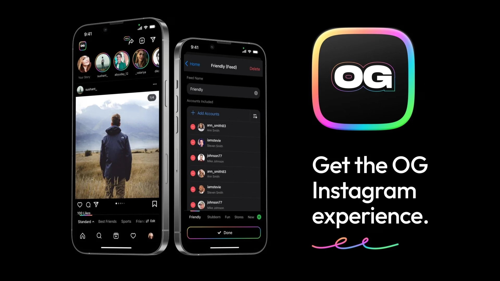
I recently learned of the OG App from 2022, which offered an ad-free, simpler experience to users frustrated with Instagram changes.
The app didn’t last – it couldn’t last – but it was a fascinating statement.
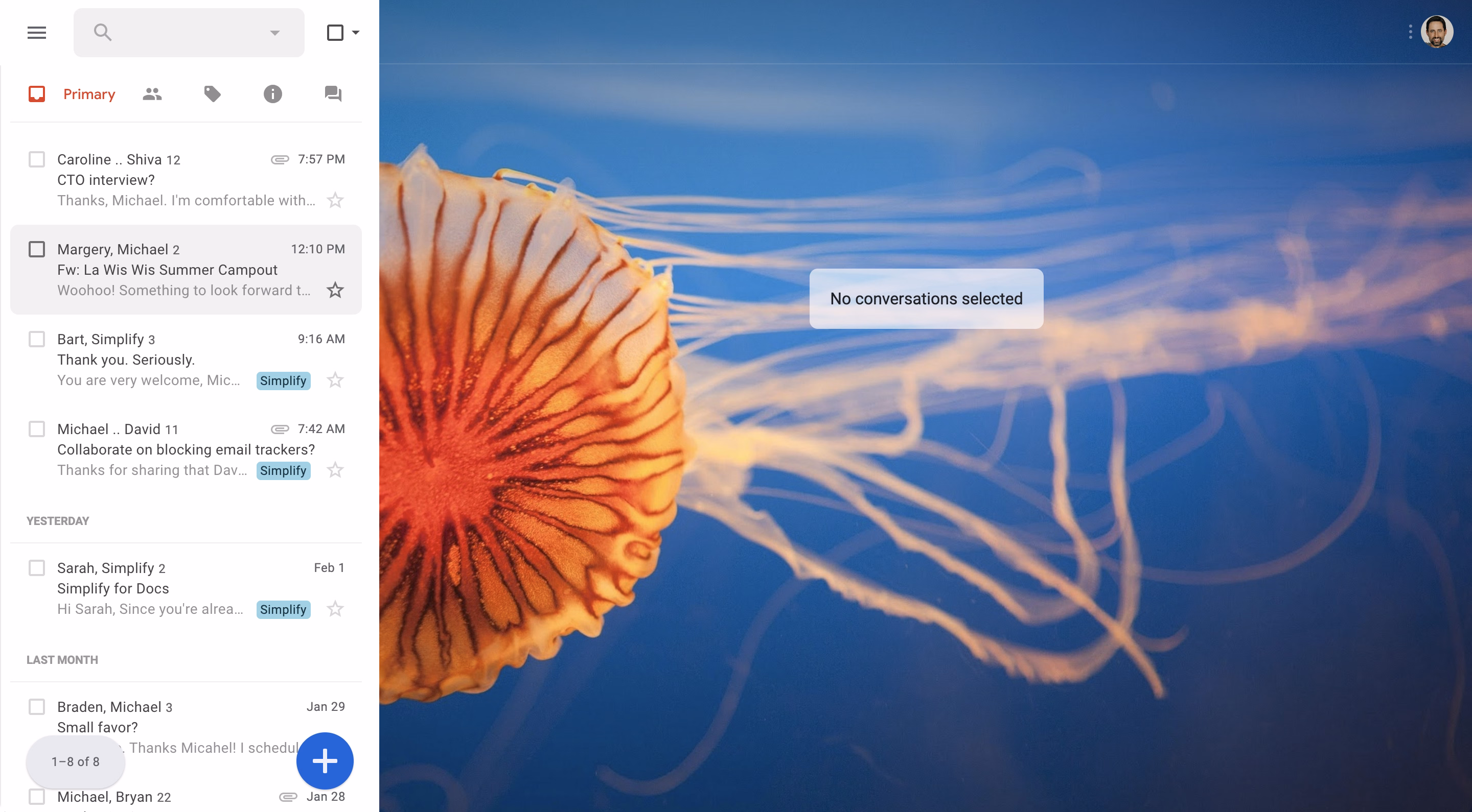
In a different corner of the internet, Michael Leggett, one of the former Gmail designers, created Simplify – an alternative “shell” to Gmail:
Hundreds of improvements (small and large) to streamline, simplify, and enhance Gmail’s design and functionality. Hide the features you don’t use, customize the ones you do including setting the list and message width and fonts.
Bad design can occur for a number of reasons including but not limited to:
Our needs as users are not well understood, prioritized, or aligned with the company’s goals.
Entropy: The natural decline of products over time as the vision decays or blurs and new features are conceived without consideration of the whole and added faster than the system’s overall design and architecture can evolve to support them.
Good design is hard. Good design is more than making a product pretty. It is about having the right capabilities in an intuitive, respectful, and well-crafted offering. I hope to expand on this topic in future posts.
I know ad blockers and “reader modes” exist, but these alternative shells go much further and change the original app’s design. I wonder what other examples of that are out there.
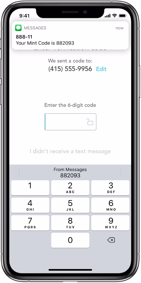
After James Moylan’s death in December, we were reminded again of the Moylan Arrow, the little arrow telling you which side of your car has the little fuel door:
I started wondering: what would be the conceptual equivalent of this in software? My best guess would be iOS offering to fill the one-time code from a recent SMS:
This is what it has in common with the Moylan Arrow:
everyone benefits from it
it happens all the time
it solves an actual little (but not too little) frustration
it’s there at the right place at the right time
it is relatively low-tech (it’s not an overdesigned or an overengineered solution)
once you know it’s there, you will love it forever
Curtosis on Mastodon unearthed the original 2019 Twitter thread from one the creator of the iOS feature, Ricky Mondello (link to XCancel), which I‘m reproducing here:
The idea for Security Code AutoFill came out of a small group of software engineers working on what we thought was a much more ambitious project. It wasn’t a PM, it wasn’t just one person, and it wasn’t what we set out to do initially.
It started as a small side idea we had while designing something very different. We jotted it down, tabled it for weeks, and then picked it up after the “more ambitious” project wasn’t panning out. It was hard, but I’m so glad we changed focus.
Even with a gem of an idea, it was still just an idea. Ideas are obviously super important — they’re necessary, but not sufficient. Here, the end result came from the idea, teamwork, and execution.
Years later, I’m still so proud of the team for making this feature happen. The team combined expertise from several areas to ship magic that worked on day 1, while asking nothing of app and website developers, without giving anyone your text messages. This still inspires me!
To every one of the folks who made this happen, I’m still in awe. Y’all are the best. <3
Addendum: FAQs
- “SMS is bad.”
↪ I know.
- “MITM.”
↪ I know.
- “FIDO is better.”
↪ It’s complicated, but acknowledged; I totally get it.
- “Android did it first.”
↪ Nah. Details matter. Privacy matters. And clipboard != AutoFill.
- *negativity*
↪ Not now. :)
I asked others on social and here are some other contenders I liked:
The indicator that alerts you of Caps Lock when typing passwords
I read Mike Monteiro’s book of pre-pandemic essays called The collected angers. The book has less to do with the subject of this blog, but I grabbed a few quotes that resonated with me and seemed relevant.
In order not to make it too reductive, I’m also linking to the original essays for those who want to follow up:
The worst feedback you can get from a client is “Wow. It looks like you worked really hard on this!” Stop using your work like a time card. If you did it right, it looks like it was effortless. It looks like it’s always existed. And the client will probably be irritated that they paid you for 30 hours of work to do something that looks like it took an hour. Which it did. They’re just not seeing the 29 hours of bad design that got you to that one hour of good design. And for the love of god, please don’t show them those 29 hours of bad design. A presentation is a shitty place for a sausage-making demonstration, and you’ll just come across as a defensive, unsure person needing validation.
Learn how to steal. Be aware of your history. Design is the oldest profession in the world. You’re not the first person to tackle whatever design problem you’re tackling. See how others tackled it. Take the best solutions you find and improve on them. Don’t burn time solving things from scratch. Make use of what others have learned.
I liked the angry website Bugs Apple Loves because it’s hitting on something that got me worried in recent months: Apple has been bad at bugs for a while now, but we might be overfocusing on giving them crap solely for some of the most visible – even visual – Tahoe stuff.
This is a condensed list at the time of writing, as the site itself doesn’t make it easy to see it:
Mail search doesn’t work
Autocorrect won’t take no for an answer
Apple Pay: card icon changes address
Google Contacts sync is a black hole
AirDrop: Looking for devices...
iCloud Photos: ‘Uploading X Items’
Spotlight: ‘Indexing...’
Personal hotspot won’t auto-connect
Apple Watch widgets won’t let go
iOS text selection is pure chaos
AirDrop shuffles targets mid-tap
macOS 26 window resizing doesn’t work
There are themes here: “the interface doesn’t remember my preference,” and “things move around as I interact with them,” and “some process gets clogged up,” and “a thing gets stuck and doesn’t respond to interface actions.”
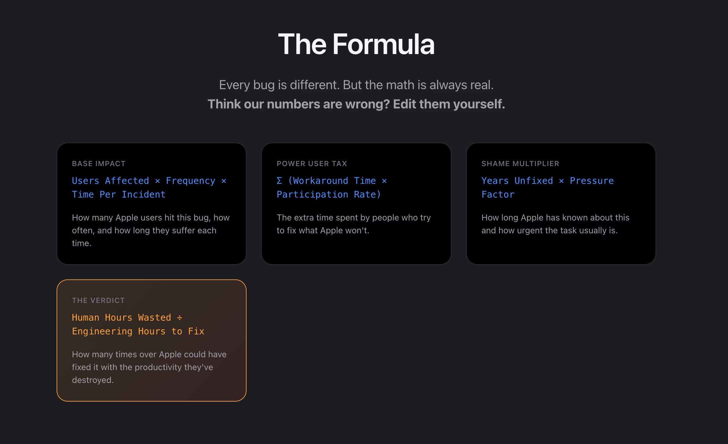
What I appreciate about this is that none of this is very “visible” stuff, but the insidious things that add up and bother on the daily basis, chipping away at your flow first and sanity second – which the site tries to quantify via a formula:
I think this is really interesting, even as a satire.
I found it’s really hard, if not impossible, to justify design or experience bugs using the same frameworks as other engineering bugs. As Mike Swanson wrote: “You cannot easily measure the resentment. Or the rage clicks when they smash a button to dismiss another […] pop-up.”
A lot of it is utterly subjective. Various small frustrations add up in non-linear ways. A lot of it doesn’t subscribe to binary “data loss or not” or “does it function or not” classifications. A lot of it feels heavy to fix in terms of context switching, so it’s timeboxed and then discarded when the time box overflows.
I have seen engineers say “Oh, it’s a long-standing bug, it’s been like this for 3 months” as a justification to deprioritize something, while to me it feels like that should be an accelerant. The users have already been suffering for 3 months!
So maybe metrics like these could actually help? Quantifying at least the blastradius (affected users + usage per day) seems valuable, not to mention the embarrassment of seeing something like “9.1 years unfixed by Apple.” (And yes, internal embarrassment and shame should also be a metric.)
This would be harder to do for creators of the site, but easier inside Apple: I would also try to quantify vocal user frustration. One of my tricks when thinking about bugs has been “Notice when your users are really angry about invisible stuff.”
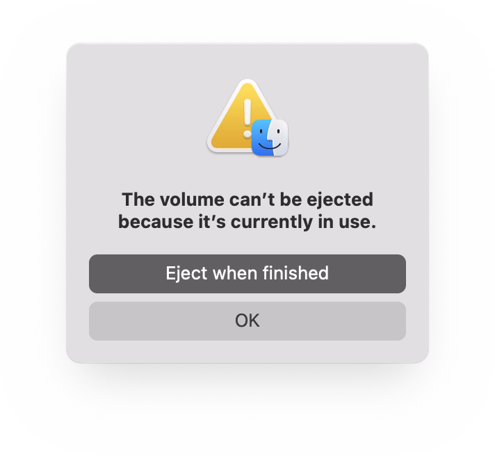
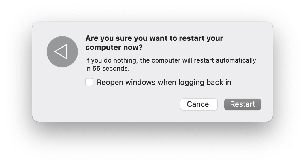
If you plug in a CD drive (he said with a straight face in the lord’s year 2026), and then eject too soon, the system offers this dialog, which allows you to say: Eject whenever you’re done with whatever you have to do.
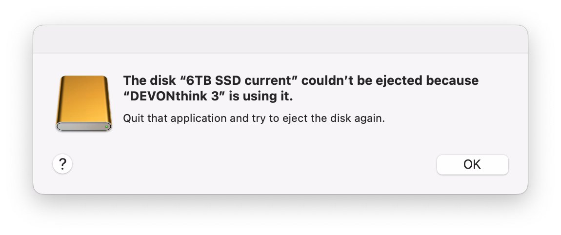
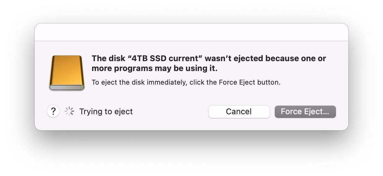
But more modern media, like SSD drives, don’t show that window. The best case scenario is that you get a dialog box like the 1990s never ended:
It gets worse. Often, you get zero help in identifying what the “programs” actually are. (The word on the street is that it might be stuff like Spotlight indexing, which you can’t really control.)
More often than not I just click Force Eject or jank the drive cable out, which feels really unpleasant. I would guess many people do the same.
So at this point we are two steps worse than the original CD experience, which… wasn’t even that great! A pretty clear improvement on this already exists elsewhere in macOS, and could be reused here – “hey, you don’t have to do anything, just give me a second while I finish up here.”
(Can’t help but notice the discrepancy of visual styles of these windows, and even the inconsistency between calling things “applications” vs. “programs.”)
One of the most potent themes in Stanisław Lem’s writing was the fallacy of first contact.
Lem argued that we are just not ready for an actual meeting with something truly alien. That the most open-minded of us are close-minded on a cosmic scale. That sci-fi made us think that aliens will look like human with prosthetics when good, and insect-like creatures when evil, but sci-fi needs to be self-constrained for all the same reasons; showing us something actually inhuman will immediately render it utterly incomprehensible.
He wrote about it in Eden, and Solaris, and The Invincible, and Fiasco. The last of these is a book I was once so angry at that I threw it at the wall.
It also happens to be my most favourite book, ever.
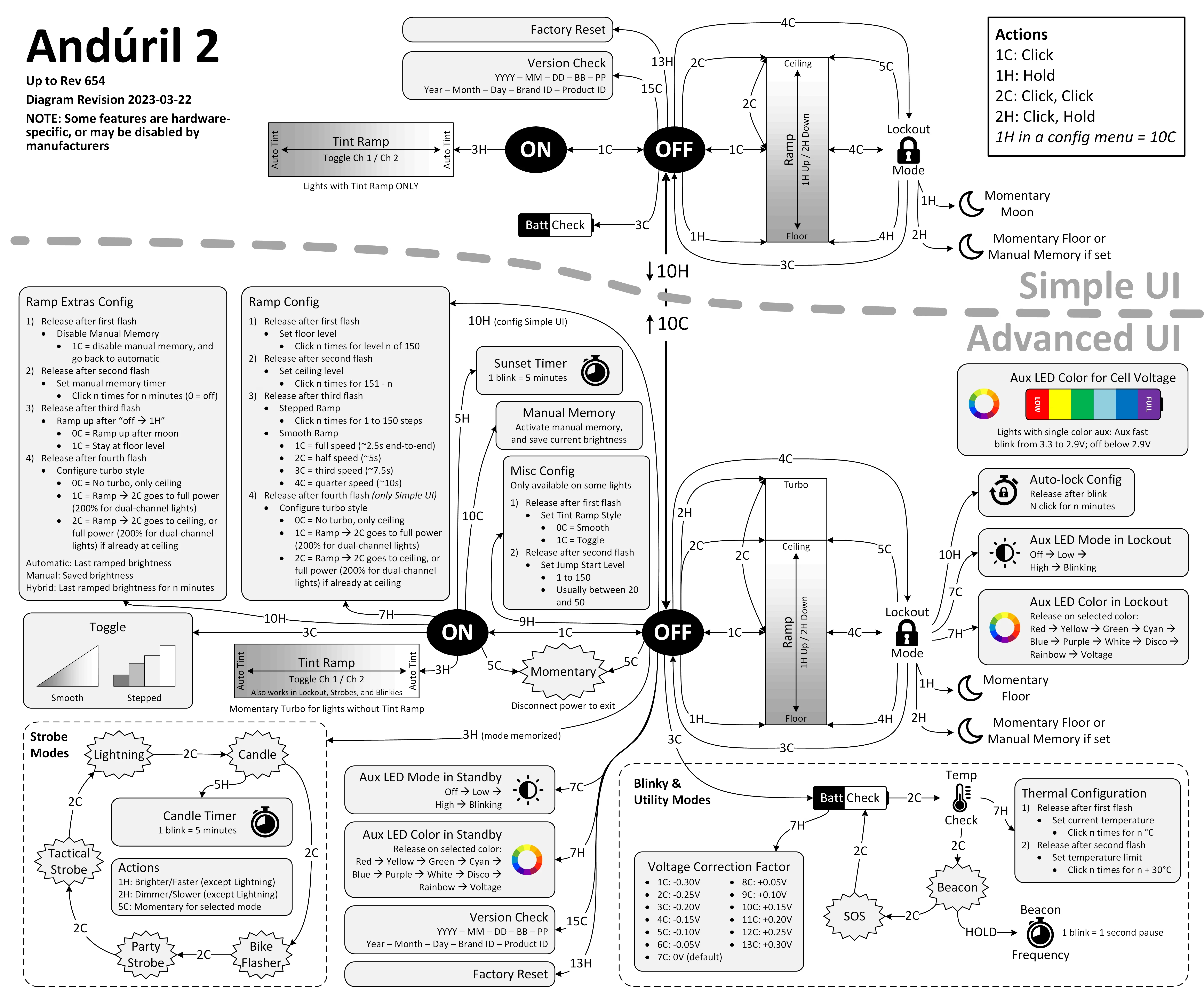
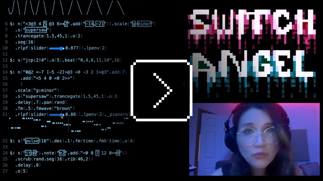
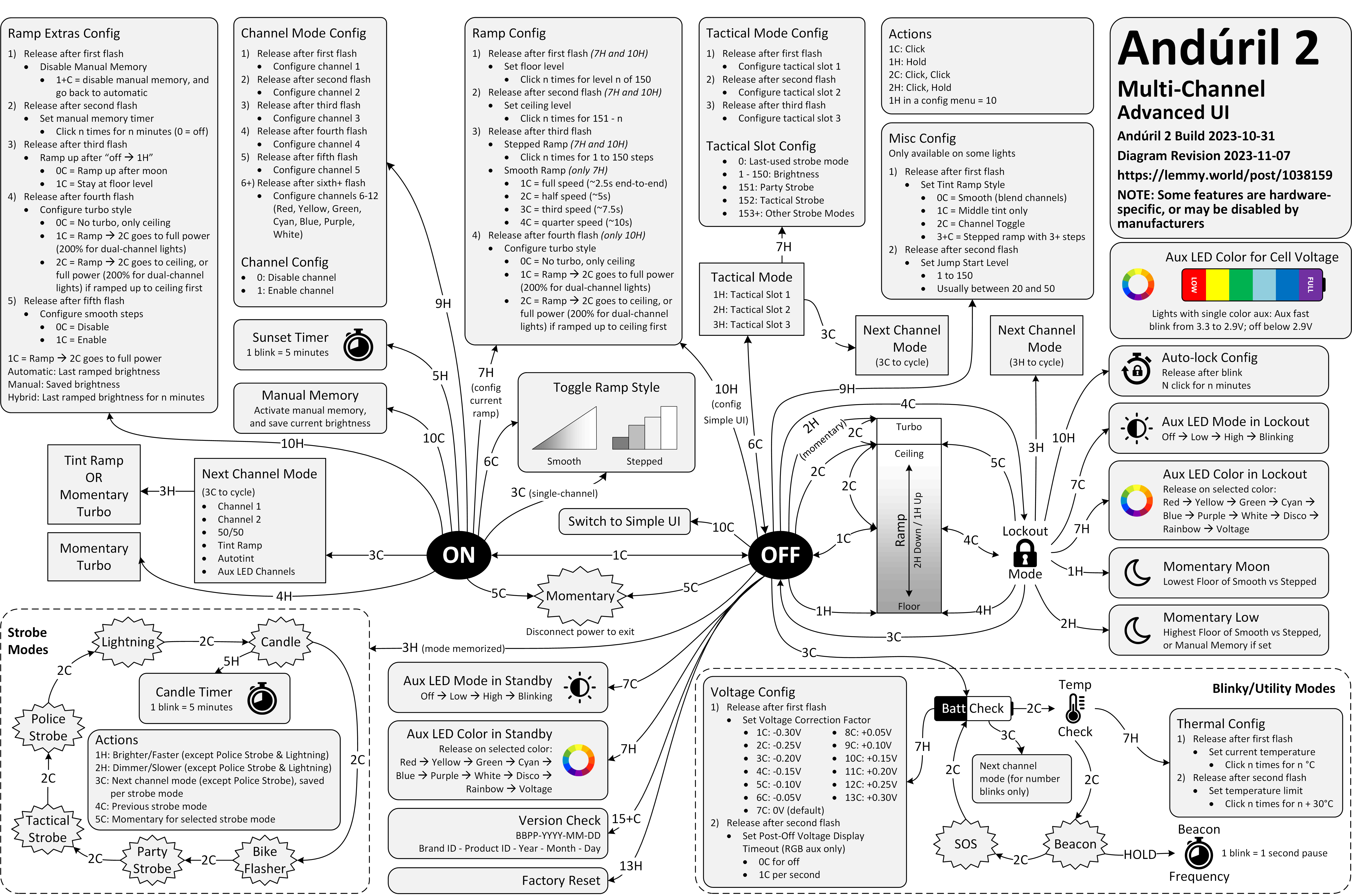
Anyway. This is a diagram for a single-button flashlight called Andúril 2 (larger version):
I saw it for the first time earlier this week. I was speechless. Maybe a little bit in awe. I know I’m supposed to hate this, but this feels so profoundly… alien, that I don’t know if anything I know applies here. I don’t want to judge it by the wrong set of rules. I want to understand the dividing lines between the UI and its explanation. I want to study it more.
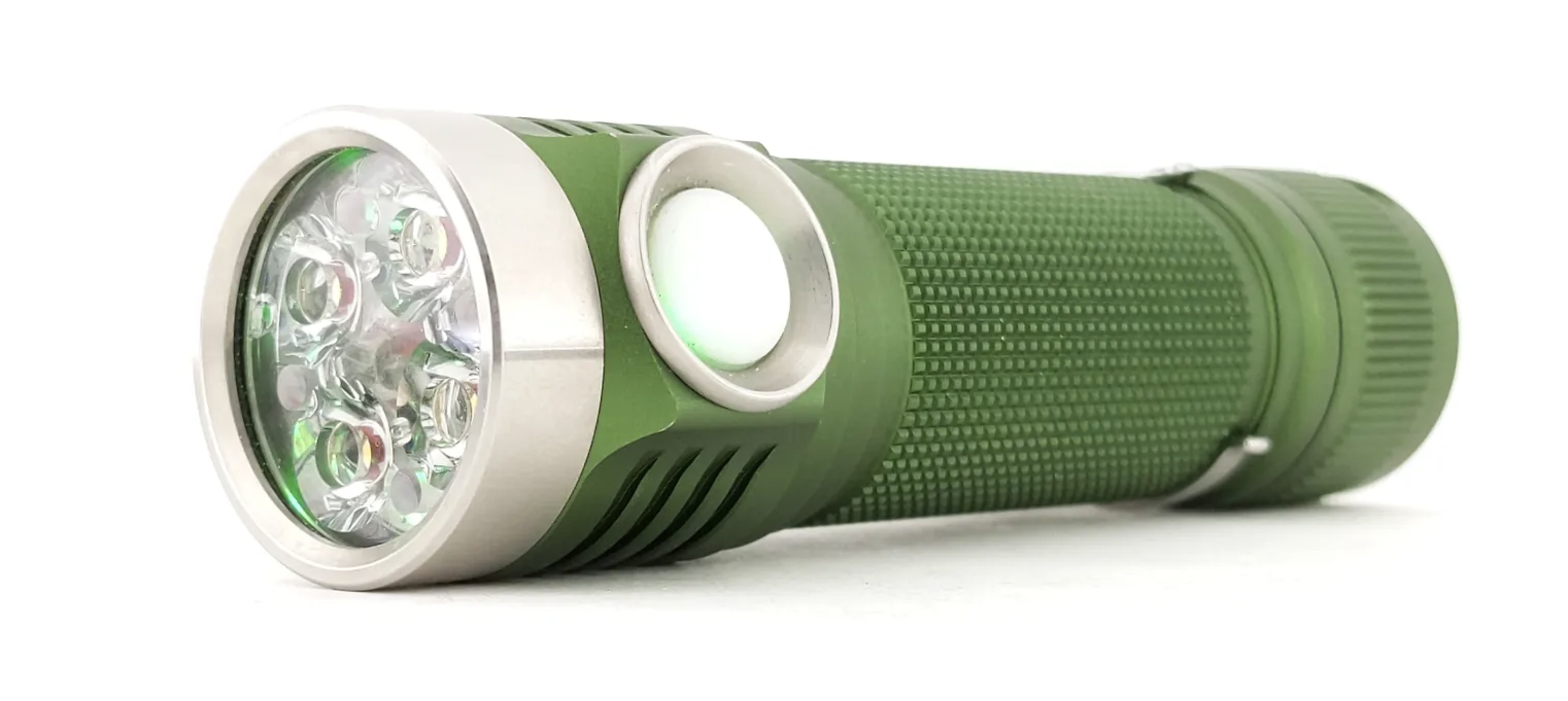
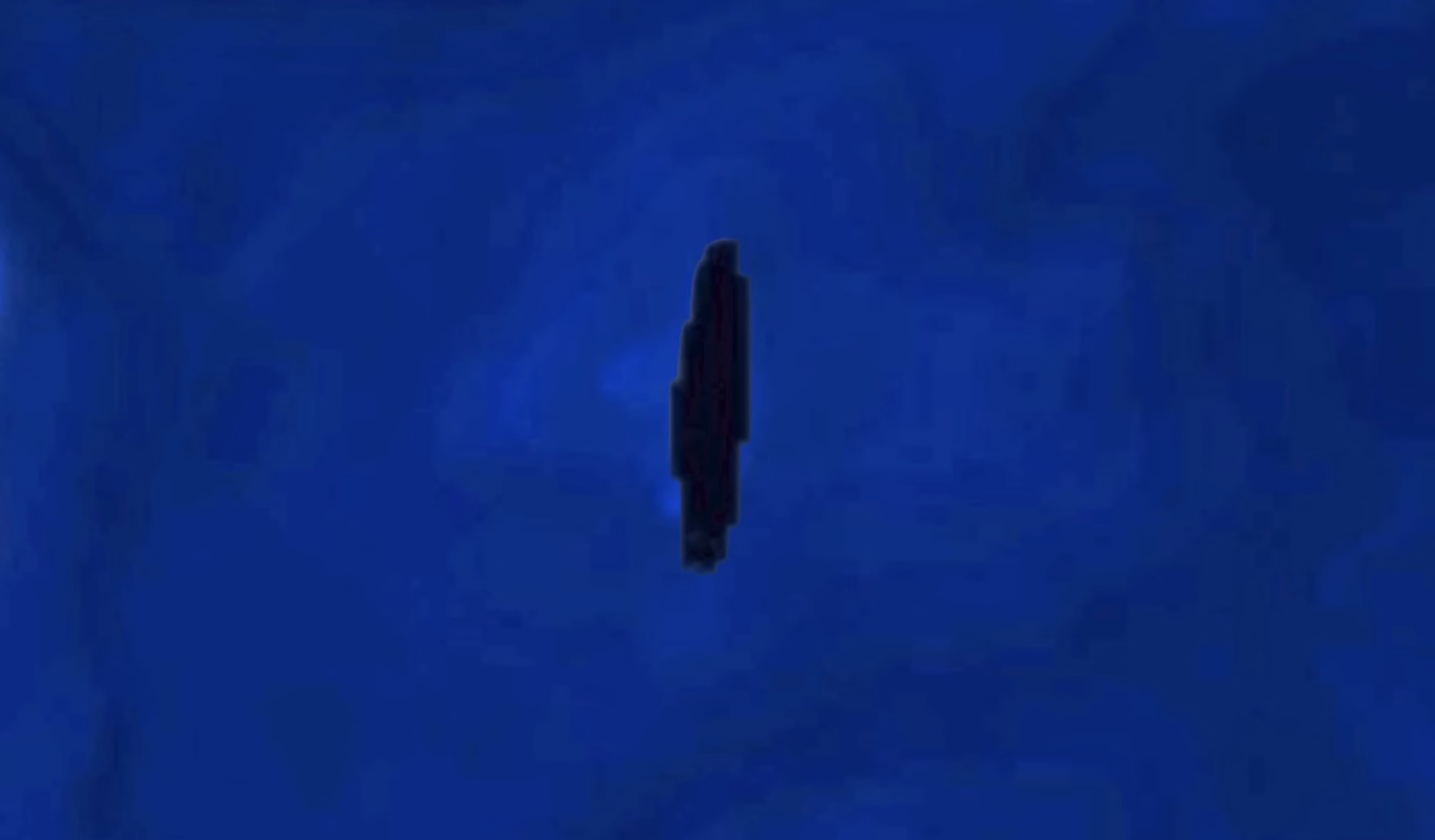
Oh, and because I was curious too – this is the flashlight:
This is of course competence porn, made even better by the dry Polish lektor-like delivery. But it’s also a puzzle. I watched this so many times. There are so many great UI lessons in here:
You can absolutely put graphics inside a textbox
Sparklines rule
Slider is still the best UI element in history
Previews don’t have to feel like training wheels
Synchronizing sounds to visuals is so powerful (see: turn signals on a car dashboard)
I found myself thinking about how you’d design something that feels real-time, but also needs to be resilient against typos, and has a distinct “commit” moment (which is what I think those yellow flashes are); some of the best moments in the video are the quick fixes that aren’t narrated.
Ultimately, this also shows how powerful and underrated plain text can be as interface. It’s a bit like designing straight in CSS, operating at the weird intersection of motor memory, creativity, and abstraction. (Is there a CSS editor that feels more like this?)
On top of all of this, the act of building the track this way is also how the finished track would sound like. Amazing stuff.
Remember all these jokes that went like this?
[God looking at a pug dog for the first time] What the hell did you humans do with my bad ass wolf I gave you?
Imagine sitting the creators of the typewriter in front of YouTube and having them watch this video.
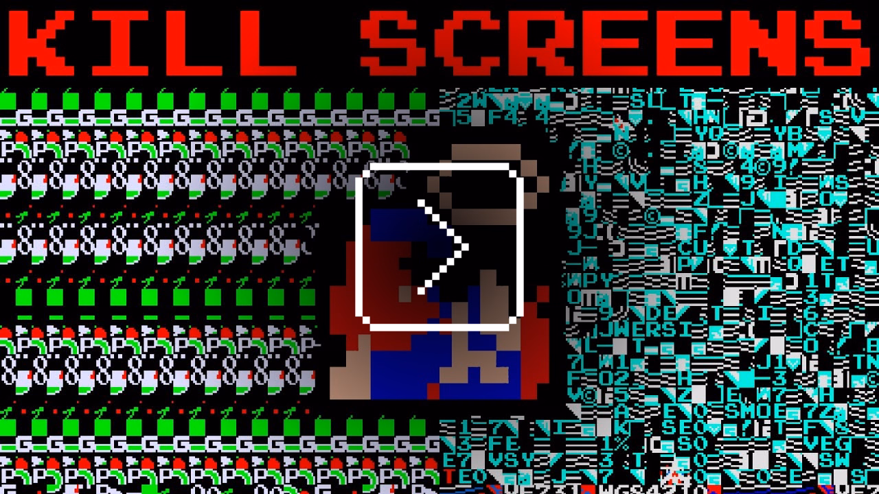
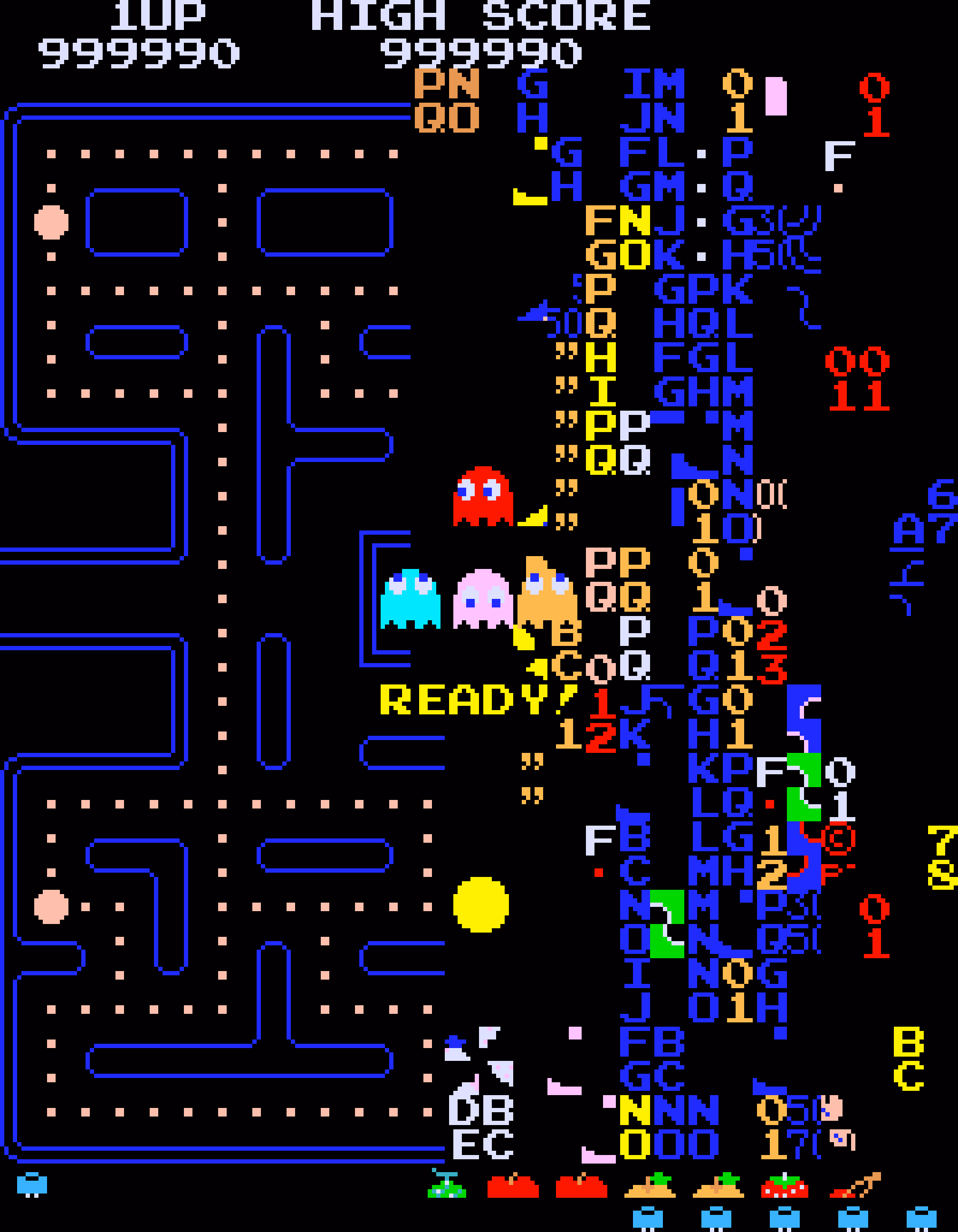
I’d guess a lot of people know that the original 1980 Pac-Man ends accidentally with an iconic, glitchy, and impassable “kill screen.” Many people will also nod with recognition at hearing the kill screen is level 256, a number that immediately gives some ideas on what might have happened.
But this fun 11-minute video from 2017 by Retro Game Mechanics Explained doesn’t stop there. It shows, step by step, exactly what is going on when you reach level 256, and how each one of the glitchy things appear on the screen.
It’s a little mesmerizing, like watching a building demolition in slow motion.
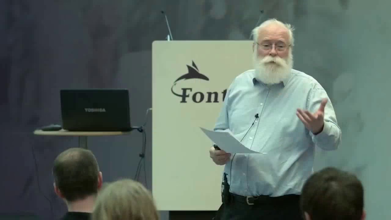
Ross designed Input, a coding font superfamily which was very inspiring to me in the day, and taught me that coding fonts could be a place of surprising creativity and innovation.
First of all, Input has four width options: from regular through Narrow to Condensed to Compressed – this not only allows to avoid the “blocky/squareish” nature of many coding fonts, but also, pragmatically, to squeeze in more stuff on mobile screens.
Secondly, since a lot of coding environments didn’t (and maybe still don’t) allow for fine-tuned typography settings, you can bake them into a font upon download – choose a different default line height to be there in the font itself, or have your favorite style of zero just hanging there in the default slot.
Thirdly, serif versions of Input coexist with sans serif, and so does italic, and you can mix them together.
But most important thing comes at the end: you can imagine coding in non-monospaced fonts! What seemed like blasphemy before made so much sense once I put it to use – I still code in Input Sans Narrow (non monospaced) to this day:
Of course, since the release of Input in 2014 a few other coding fonts did interesting creative things in this (mono)space. But to me this will always be the original that opened my eyes to what’s possible, and the talk captures so well a lot of deep thinking that went into the font. To quote Ross:
Type design is design and design is about solving problems.
No, I do not want to install your app.
No, I do not want that app to run on startup.
No, I do not want that app shortcut on my desktop.
No, I do not want to subscribe to your newsletter.
No, I do not want your site to send me notifications.
No, I do not want to tell you about my recent experience.
No, I do not want to sign up for an account.
No, I do not want to sign up using a different service and let the two of you know about each other.
No, I do not want to sign in for a more personalized experience.
No, I do not want to allow you to read my contacts.
No, I do not want you to scan my content.
No, I do not want you to track me.
No, I do not want to click “Later” or “Not now” when what I mean is NO.
One particular thing that stood out to me was a discussion of shame and embarrassment and pride that all come with shipping software. And looking to Apple itself for direction that the company is not really providing, as many of their apps are not using the new Liquid Glass interface – or when they do, they use it in ways that are inconsistent or disappointing.
Some other good themes:
it’s okay not to change something if the alternative is change for the sake of change, a posture Apple’s hardware team feels more comfortable with than Apple’s software team
internal Apple politics and the story of the Control Strip
loved this phrase from Gruber about the macOS’s Tahoe release: “they vandalized it.”
Also, this:
A fair criticism of Apple over the years is that sometimes fixing 50 little misaligned text boxes or divider bars… using your time to do that, is time better spent than adding another user feature.
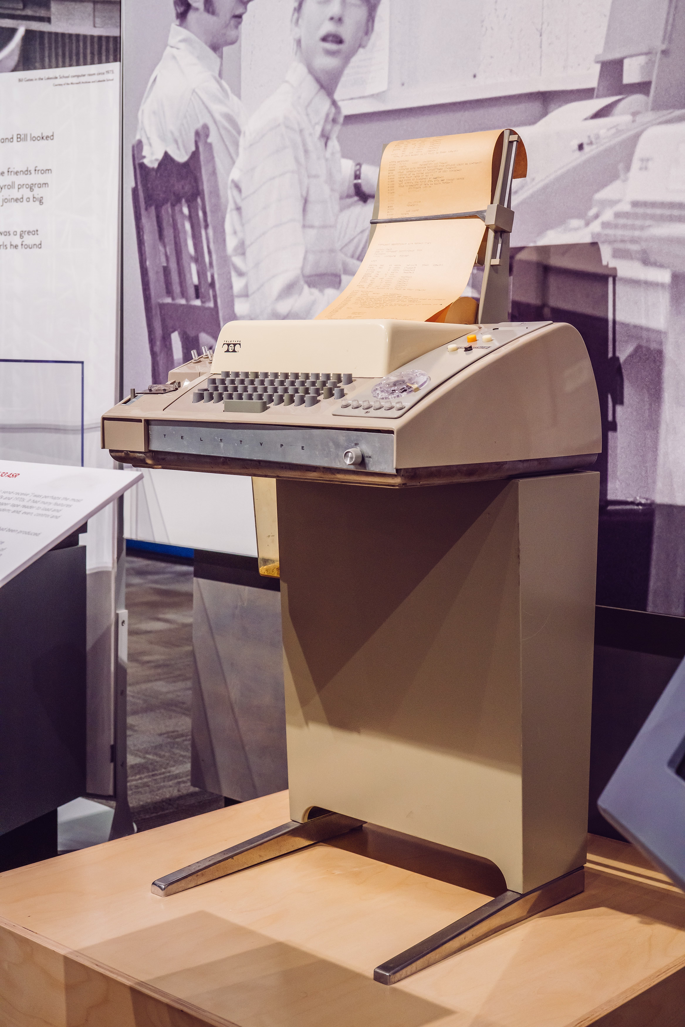
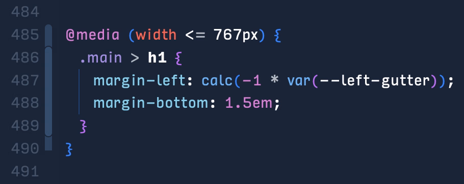
We went to quite a few stores in the week or so after the introduction, and found that, without exception, every Mac’s floppy disk had a garbage name! They were all named something like ”;lkakl;rt;klgjh”, as if someone had just randomly typed characters to see what would happen. Which is exactly what they did.
In the Finder, the startup disk would appear on the desktop, in the top-right corner, ready to be opened. The Finder would initially select it; once selected, typing would replace the current name, following the modeless interaction model that I had learned in the Smalltalk group from Larry Tesler. This meant that whatever anyone typed when they first came up to the Macintosh would end up renaming the disk.
On the early Mac, just typing with any item selected renamed it, which caused all sorts of trouble.
The eventual solution for renaming that survives until today was: click to select and then click again to rename… but don’t click too fast, because that’s double-clicking, and that means something else. Windows, starting in Windows 95, did something similar, but also put rename under F2 – so at least you didn’t ever have to wait.
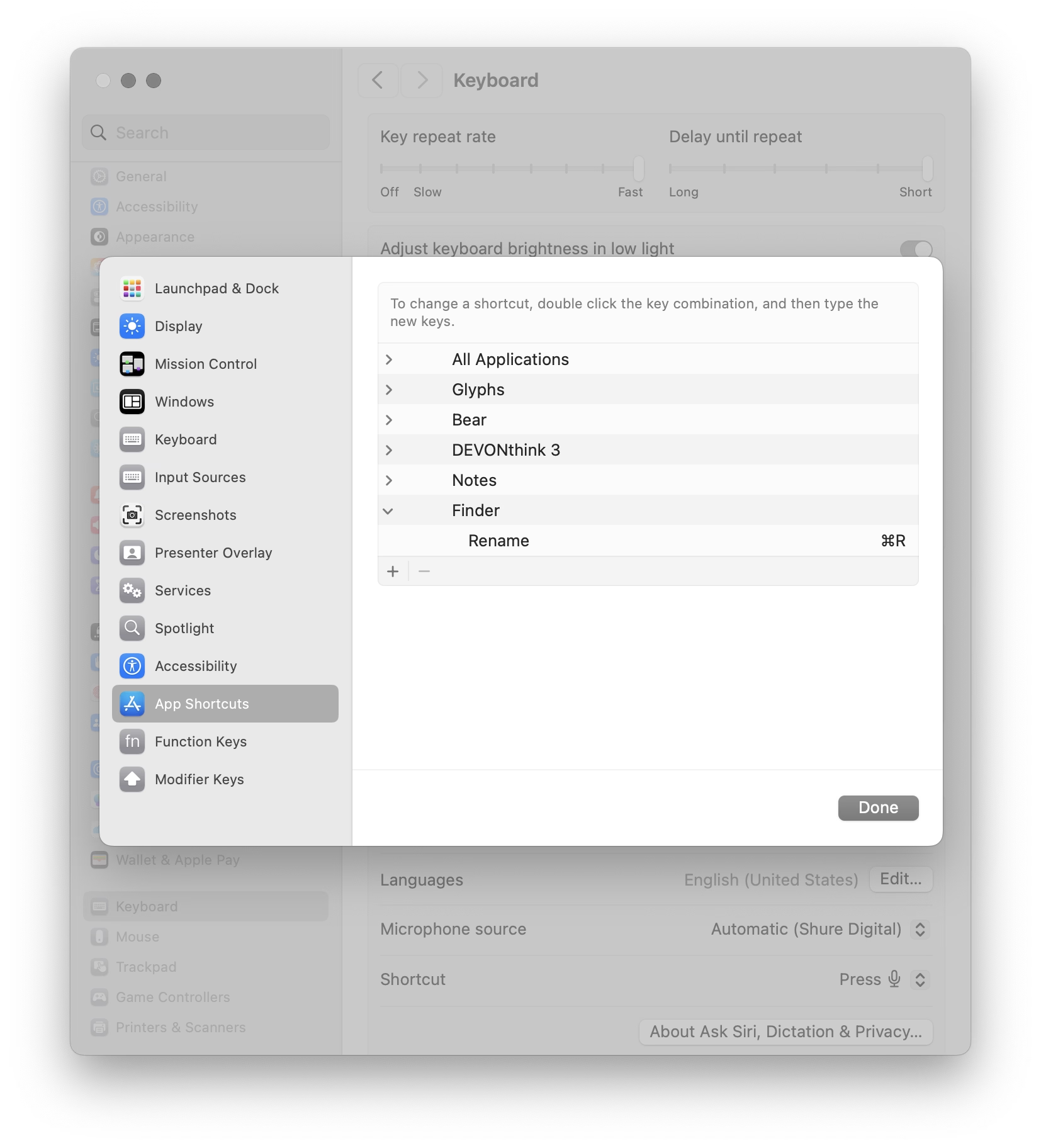
I liked the emergent behaviour from some graphic apps which put rename under ⌘R. It’s not that hard to make Finder work that way – see below – but I have always been curious why Mac or Windows didn’t steal this solution.
(Added later: People reminded me that of course Enter also renames, and does so immediately. I wonder why it slipped my mind in this context – possibly because in any other list or similar place, Enter would be the equivalent to opening? Maybe I’m discovering in slow motion how unusual Finder can be in its details compared to conventions we established after.)
The house is a masterpiece. It is perched on a hill overlooking Bordeaux. It’s made of glass and concrete and seemingly nothing else. It has pipes cleverly hidden to the side, a cantilevered roof that seems to defy the laws of physics, and a beautiful center elevator platform for a wheelchair-using owner who commissioned it by telling the architect – Rem Koolhaas, by the way – “I do not want a simple house. I want a complex house, because the house will define my world.”
The house is also a nuisance. The platform gets stuck. The back staircase is frustrating to navigate. Parts of the physics-defying roof started to rust years ago. The glass needs cleaning and very occasionally shatters whole as the house slowly sinks into the hill. In the summer, the garden door gets too hot to touch. In the winter, rain and snow leak between holes in the walls – holes whose very presence cannot fully be explained.
The documentary is sort of a human-centered flip side of How buildings learn, the absolutely fascinating book written by Stewart Brand (this is the good part; the book is really smart and you can learn a lot from it) and designed by Stewart Brand (this is the bad part; the book’s typesetting is so terrible I literally cannot stand to open it). The movie follows Guadalupe, the person who takes care of the building and sees it not in the first day’s pristine light, but a decade after it was finished, and years after the figurative cracks showed up, and then literal cracks, too. She knows it so intimately that she struggles in explaining it.
My design team watched this documentary during an offsite. I couldn’t attend the showing for reasons I no longer remember; afterwards multiple people came to me and told me “You should watch it. It’s actually about you.”
I watched it yesterday as I’ve been thinking a lot about this recently. Towards my later years at Medium, more recently at Figma, and increasingly when it comes to UX design as a whole, I feel like a caretaker, a living historian, a person tasked with the sometimes-sisyphean work of preserving the past but not gatekeeping the future, tending to something mostly taken for granted, and knowing something so intimately that you develop a sense of it that is increasingly hard to explain to others. “I don’t know how I know it, but bet $20 this is related to this,” I hear myself saying at work with strange regularity. (I’m far from always being right, but it still surprises me how often I get to be.)
Caretakers burn out, of course. It happened to me a few times. You can take too much care. You can fly so close to the details you forget the color of the sky. There’s enough minutiae for all of the minutes in every day.
And even outside of burnout, things can get weird. Medium’s editor then and Figma’s editor now feel like strange beasts, so complicated that it exceeds any single person’s understanding. One learns about their moods and the good days and the bad days. One can try to placate them, but only partially, and learn to understand them, but only partially. One develops a strange relationship with them, and only gets to observe them even as others assume one controls them; I once gave a talk about a singular keyboard shortcut, one of possibly 5,000 details that could each be a subject of its own conference talk.
But it can also all be wonderful, and beautiful, and meaningful, being what I sometimes jokingly describe “caretakers of undo” – the phrase itself a shibboleth, as I’m always watching whether someone thinks it derogatory or laudatory – and carrying with you that calmness and quiet satisfaction of keeping the strange beast alive and perhaps even happy.
It doesn’t matter that Guadalupe cannot explain how the building’s award-winning architecture works, or why one staircase is designed so differently than the other. The best parts of the movie is watching her own shorthand with the house, that special years-in-the-making universe of tips, and tricks, and hacks, and nods of understanding, and frustrations attenuated by the passage of time, and quirks internalized so long ago that they their sudden disappearance would today itself register as a quirk.
You can develop a relationship with a sophisticated piece of software, like you can with a strange house that has a life of its own. “I want a complex house, because the house will define my world,” said the owner just before his untimely passing, but the house defined someone’s world, anyway.
The house is not beautiful because of the stories of people inside – we never get to see them, by the way, and there is only a 30-second quiet glimpse at the building actually being lived in, at the tail end of the movie. The house is not beautiful because it was designed by a starchitect, or because of the views, or the clarity of its form, or the cantilevered roof, or the cleverly operated portholes. The house is not even beautiful because of all its flaws, although you could find beauty in them, too.
The house is beautiful because you show up every day and try to stop it from getting worse, and occasionally, you show up and make it better.
There won’t be a documentary made with you in it, so no one might ever know. But you will.
I have recently stumbled upon two websites that try to do something interesting and inspiring when it comes to showing scale.
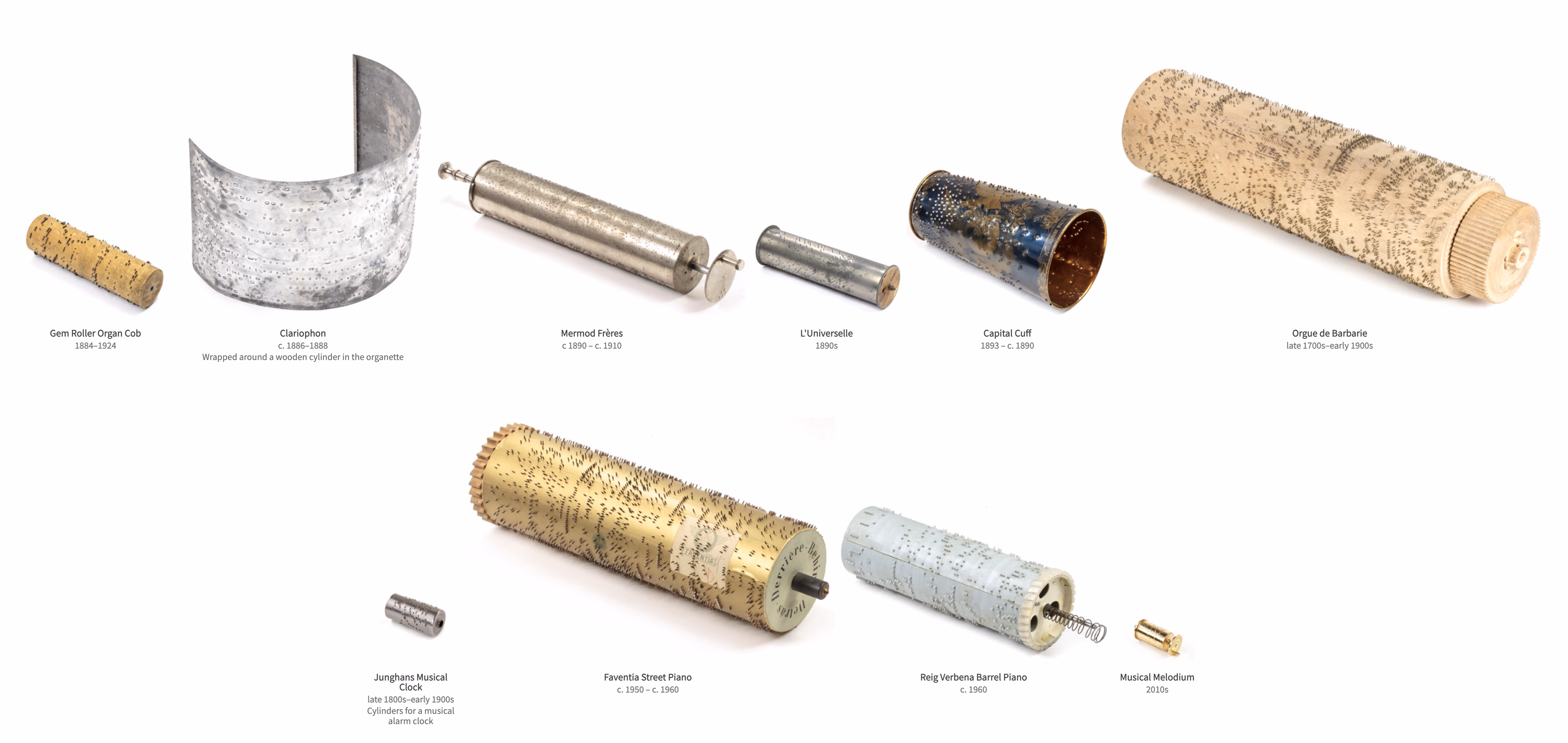
John Wallace’s Tangible Media Connection’s initial appearance might not feel very well-crafted, but jump to any page (for example this one) and it’s astonishing how great the photos of the objects are.
They’re great not just on their own (it’s really hard to photograph metals and plastics!), but also consistent with each other when it comes to angle, style, and – most importantly – scale. I am not sure if I have ever seen on online museum do this before. It’s very well worth checking out.
The other example is Neal Agarwal’s recent Size of Life. The whole website is delightful, with subtle music and sound effects, great handling of keyboard navigation and swiping, and so on. And the way it resizes objects and uses transitions to always keep you oriented is something a lot of other interfaces, even for productivity apps, could learn from.
Of course, now I wonder what the first website would feel like with the user interface of the second.
I have been thinking about this a lot since the pandemic, and Rob Napier on Mastodon summarized this really well:
I spent a lot of time in the 90s working on Y2K. It wasn’t a huge panic. It was just a slice out of everything else we spent auditing code. It wasn’t “spend 80 hours a week fixing this.” It was just boring. Incredibly boring. And we made it be ok by being bored and fixing stuff.
And the one thing I never thought would happen was that people would say it was never a problem. Oh good grief, it was a problem. All over. We just fixed it. Like we thought grownups should do when there’s a problem.
There are some good responses to the post and the original post it quoted. This one was brilliant in its vulgarity:
My analogy for this is that I work to maintain a kind of public sewer system. You never think about sewers... until you’re up to your neck in shit.
This isn’t just about Y2K and COVID, of course. It’s also about the invisible work of people who make well-behaved menus, and all the other things like that.
The state of menus on Google’s search result page: all inconsistent, most ugly, ignoring UI mechanics learned decades ago (for example understanding the importance of diagonal movement or supporting mousedown-drag-mouseup in addition to just clicking), with easily triggered buggy states, bad animations, and even clicks falling through.
I wouldn’t be so angry, but I use – or at least see – these all the time. I wouldn’t be so angry if we hadn’t learned how to make GUI menus well 30 or so years ago.
I don’t want to pin it all on browser makers; if the designers and engineers cared above, there are ways to make great menus in custom JavaScript. But I wonder why the web tech didn’t evolve quicker to provide well-built and stylable and accessible primitives for this kind of stuff. I would love to understand more why that didn’t happen. Even scrollbars and sliders still feel unfinished on the web, and those are much easier than multi-level menus.
Also, Gemini:
Are the mechanics of menus on google search page working well?
In terms of technical execution, the mechanics of Google’s menus are a masterclass in Interaction Design (IxD). They are designed to feel “snappy” even on low-powered devices, using a blend of instant feedback and carefully timed animations.
I am still figuring out what this blog is, and I hope I’m not going to make this part too awkward, but I’d love once in a while to point to someone whose work I admire or find inspiring.
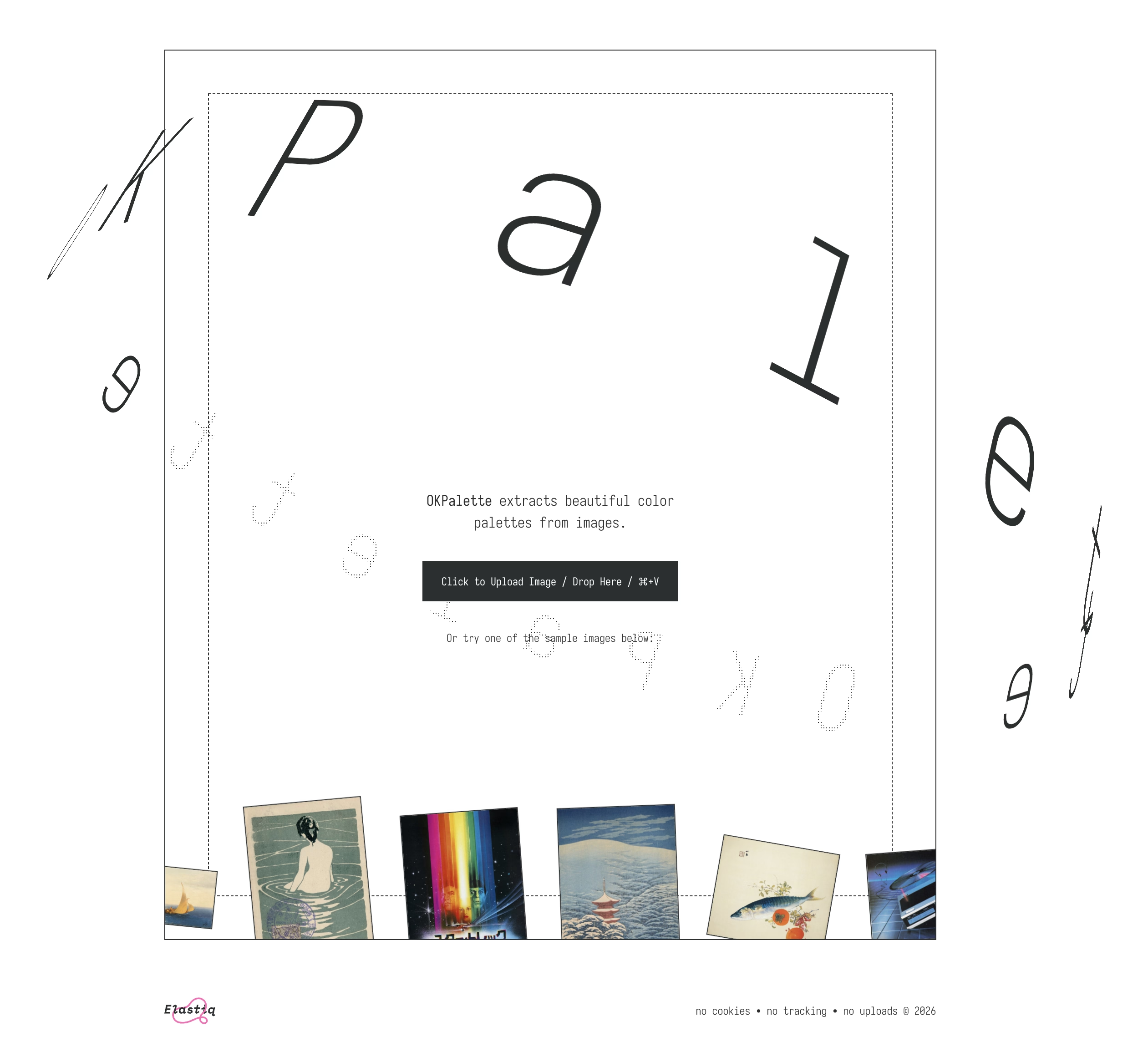
I just spent an hour or so simply scrolling through David Aerne’s Bluesky feed, and I felt it was just so much fun for me. David is interested in color and works on various small refined tools – one recent example is OKPalette – and reposts other people who work in this space, but is also very generous with sharing his creative process around tools and their details.
I’ve always been more of a “functional” designer and less of an “artist” (please excuse labels in progress), and this kind of stuff feels like connective tissue and expands my horizons.
It taught me many things and it clarified that things were more complicated than they seemed. Windows Vista (widely seen as failure) perhaps wasn’t so bad, and 7 (quoted by many as the best Windows ever) was not that far away from Vista, down to its internal version number being 6.1 to Vista’s 6.0.
It’s also interesting to reflect on this today, when macOS is having its own Vista moment.
There is also a follow-up video on Windows 8, the possibly most consequential Windows release of that era, with product decisions that reverberate still today.
Main takeaway: An entire book could be written and a lifetime of lessons learned from Microsoft’s “.1” releases.
If you’ve ever read about “choice architecture” and nudging, this will feel familiar. The modern language for it was popularized in the late 2000s, and the core idea is simple: how choices are presented changes what people do, even if nothing is technically forced.
Then product teams go one step further. Instead of just shaping choices, you can shape timing. Prompts start showing up in the middle of workflows because that’s when the user is “most engaged.”
The industry also has a whole discipline around persuasive design and how to move someone from intention to action with prompts, friction removal, and well-timed triggers. B.J. Fogg’s behavior model is one of the more cited frameworks in this space.
Some nudges are genuinely helpful. But the same machinery that helps you discover a feature can also be used to push you into something you didn’t come here to do. And once the machinery exists, it gets reused.
I am finding myself wanting to quote most of it.
You cannot easily measure the resentment. Or the rage clicks when they smash a button to dismiss another “did you know” pop-up. You cannot easily chart the moment a user thinks, “I used to like this product, and now it feels needy.” You cannot easily quantify the slow erosion of trust.
I have long been frustrated by how the “growth” interfaces haven’t really evolved past cheap and loud pop-ups and defaulting to “let’s just show it.” One of the behaviours that bother me a lot that’s not listed in the post is, for example, installing an app and receiving one or even more “here’s what’s new” onboarding callouts. Hey. I just installed you. Everything is new.
Anyway, maybe one more quote:
Optimize for trust, not just return visits. Short-term engagement can be increased by annoyance. Long-term loyalty is harder and more valuable. The best products I use don’t constantly remind me to use them. They quietly do their job so well that I come back when I need them. That’s what tools are supposed to do.
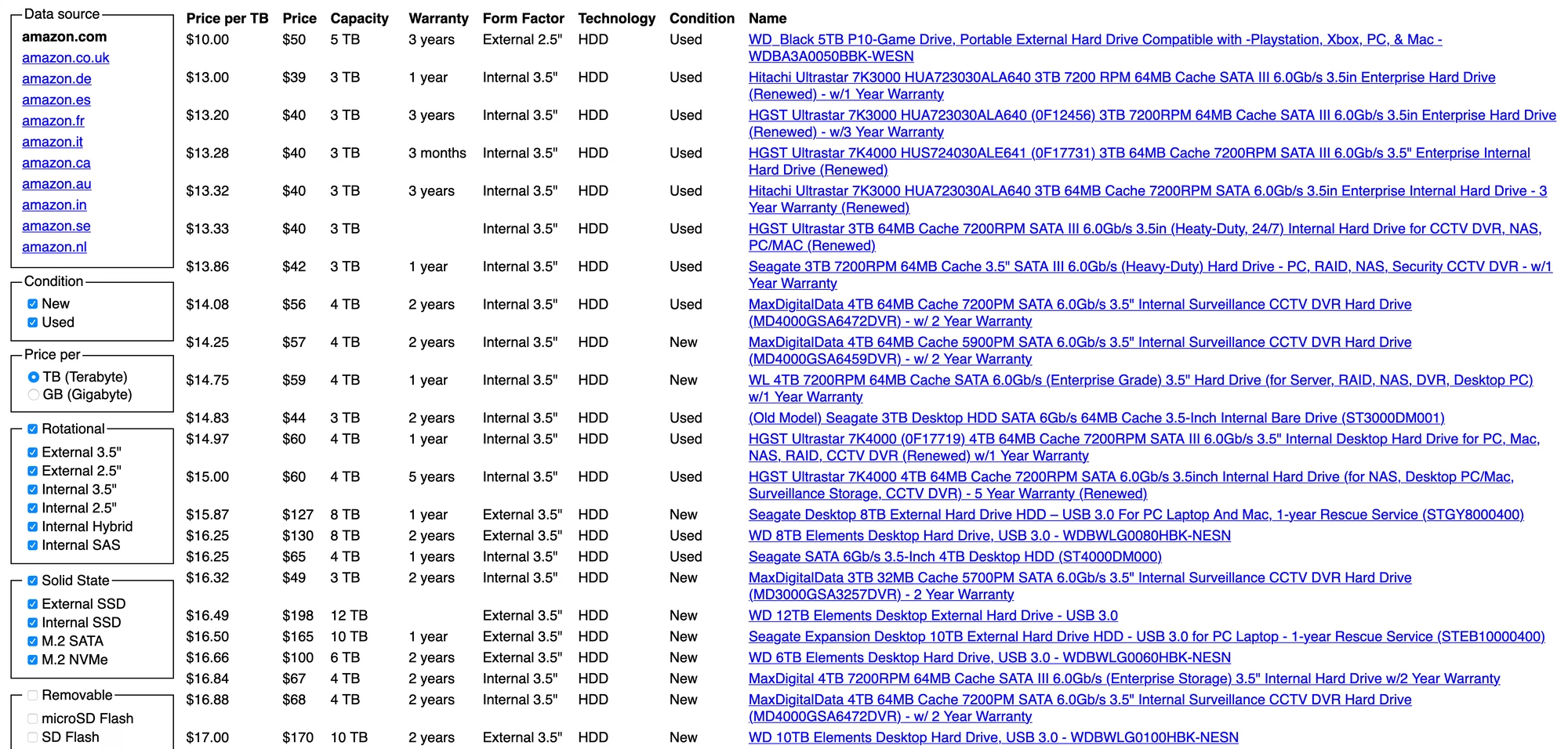
The performance of this website is stellar. It loads almost instantly. And the list (although it’s not sortable) gets the job done, it is sorted by price already which is the most important attribute.
Diskprices.com deserves the UI/UX award of the decade. We’ve lost our ability to design user interfaces laser-focused on the user. Instead, we have purple gradients, scroll jacking, responsive bullshit, emojis, animations, and many other things designers do today. The utilitarian approach of Diskprices.com is refreshing, although the contemporary designers cast it off as ‘brutalist design’, thereby marking it as a statement of fashion.
But both the creators of the page and Panchal might be getting this wrong:
Do you need a graphic designer?
No. This site is designed to maximize information density, accessibility, and performance. More whitespace, colors, and icons won’t help.
I think this is incorrect. The creator of the page is a graphic designer, that just happens to be the perfect graphic designer for the job.
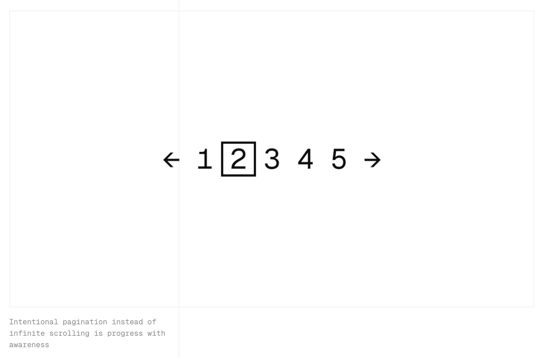
I stumbled upon this small page about friction by Carl Barenbrug. I found myself vehemently disagreeing with one example listed; I don’t think Undo Send is an example of friction, as to me it actually feels like the exact opposite (“Are you sure you want to send this email?” dialog box would be friction – just like the last example Barenbrug showed).
But this paused me in my tracks:
“Intentional pagination instead of infinite scrolling is progress with awareness.”
It made me realize that the only implementation of infinite scrolling I know is basically pretending the page has already been there the whole time… if it’s done well, and if you move slow enough, and if you don’t pay attention to the scrollbar, it really feels like the page goes on and on forever.
But… it doesn’t have to be that way. You could turn off the smoke or hide some of the mirrors. You could uncouple the gesture from what follows. You could add milestones (in the traditional sense of the word) after every X results. You could make the scrollbar react differently. Instead of frictionless scroll, you could force the user to bounce off of a bottom of the page in a similar vein as pull-to-refresh forces them to bounce off of its top.
I’m curious now. Did anyone ever experiment with infinite scrolling that feels… closer to pagination?
I love how this Byte magazine archive by Hector Dearman tries to do something different. It inspired me, and reminded me of the excitement of what Internet was supposed to be. I think we all wanted the web to feel more like this – fast, with infinite information right at your fingertips, the biggest library you could imagine at the comfort of your home.
I hope seeing everything in single, searchable place offers a unique perspective.
(The details of the zoomable UI are a bit wonky in practice, but one can imagine fixing all that.)
[For] the extra work to create a custom SF Symbol, our experience is 8-10 hours per symbol. This is also an expert level task: lots of knowledge on how SVG control points work and how to maintain compatibility across different sizes and weights.
If you’re paying a designer to do this, the cost will be somewhere in the $1000-2000 range. For Apple this is an easy cost to absorb, for smaller developers it’s a big “nope”.
And, of course in the Mac menubar (and now iPadOS) you need a lot of them.
Another subtle example of how out of touch Apple Design is with day-to-day development.
So not only is the overiconification of menus in macOS and iPadOS a bad idea, but it’s also expensive. You could make an argument that it would push people into reusing SF Symbols – ergo “consistency” – but that would land better if we haven’t already seen even Apple is struggling with that on their own (previously, previously).
What are you favourite well-made apps or sites? Phones and computers alike.
Doesn’t have to be “pretty,” but well-made according to whatever definition works for you.
I specifically made it kind of vague, and these are the answers I got. I grouped them into categories and added links. I am excited to dig into these and study them, but wanted to share a raw list as well in case this inspires some of you, too.
Thank you to everyone who participated! (Numbers in circles like ② or ③ mean more than one person nominated a given site or app.)
Info sites:
Ian’s Shoelace Site ② “A «does one thing well» site. Great breadth and depth. Information architecture designed to help you discover/find information, not sell you something. Loads fast. Still maintained after decades.”
SCELBI Computer Museum. “Useful, tightly curated, organized, loads fast, no BS. A basic bootstrap thing, but there’s something magical about it. Small enough to be digestible in an hour, well set up for either research or just cool vibes . Partly bc subject itself is «small» but seems not only that.”
“I’m in love with Maggie Appleton’s site. The general design and the illustrations, the content (from quick notes to polished essays), the way it creates a visual and conceptual taxonomy with the #digitalgarden concept.”
Mimestream ③ “It basically stays out of my way? Which is about as good as it gets these days. Also, it has just enough customization options to handle my sometimes complex number of gmail accounts (personal/work, for various clients, etc.)”
Things ② “The fanciest, most attention-to-detail software I know of.”
Sup “Pretty niche. I’m thinking specialist interfaces for specialists here. Tools that become an extension of their users’ bodies and disappear in te use”
McMaster-Carr ④ “The best online catalog.” “Impossibly fast. Still in awe after all these years.” “It supports your cognition, including with contextual material, to find the thing you are looking for (or the thing you didn’t know you were looking for until you started looking). It helps you find the right part because of what they show, the right filters, and especially the contextual information (I think about the little scale they had to explain the different hardnesses of rubber, for example).”
Cars&Bids. “Fast, functional, and easy to use. Not stunning, just utilitarian.”
iA Writer ② “Simple and effective, using it I always wish to write more but I forget it again.” “Has been consistently great for years.”
“I’ve been using Bear ② by Shinyfrog for my notes for well over a decade now. Dependable, works great, no junk ware, and a reasonable price. Pretty to boot. The fact that in the 10+ years I’ve been using it, there’s only been a single major overhaul update is a feature, not a bug to me.”
“Notability! Haven’t found anything else that matches the flexibility for handling imported files & photographs, typed notes, hand-drawn diagrams and mark-ups completely seamlessly within a single document. Unbeatable for handling both notes in class (uni) and on site (trade).”
“Been using OmniOutliner daily for decades. Simple, focussed and matches the way I think. Lots of ways to make lists and outlines but this one works for me.”
“The radio station WFMU streams online, and also has a website where you can log in to chat with other listeners and interact with the playlist. The degree to which it does what you want it to do is stunning. It doesn’t get in your way or make you learn a new paradigm; it just makes it easy to do what you want to do. It’s a lesson in design for any UI/UX people.”
Ishkur’s Guide To Electronic Music. “This website maps out all the sub-sub-sub-genres of electronic music, with descriptions and samples. I think that the fine-grained classifications are comical, but they do an excellent job of what they’re doing.”
“Easy Metronome is a simple elegant loud phone metronome that is super easy to use even for weird time signatures.”
“Pro Metronome is also excellent. I’ve used it for over 10 years and it stubbornly refuses to abandon its skeuomorphic leather and big clicky scroll wheel”
“I really appreciate the Apple Music Classical app (even though it exists in this odd liminal space beside Apple Music) having spent many years frustrated about how traditional music streaming services handle classical recordings.”
“I‘m travelling with Deutsche Bahn quite frequently, and while their own App (DB-Navigator) is quite good compared internationally, I prefer to track trains on Bahn Experte for its bare, technical and valid information and performance.”
“The Man in Seat 61 is a goldmine for train travellers. At least in Europe, the information is really up to date and if you want to find pictures of the sleeper cars of the Romanian railway or the seat map of Prague - Berlin trains, it’s all there.”
“The kiosks in Costco’s food court aren’t the prettiest to look at but they are S tier for responsiveness. You literally just press a button and immediately the item is added to your cart. You can order a hot dog and soda in under 5 seconds.”
“WebWormhole for functionality, encrypted data transfer between your devices or to your friends without installing anything. (There’s also a similar magic wormhole CLI tool.)”
PairDrop. “Drop-dead easy file sharing on the local network.”
“LocalSend is well made, because until sofar it aleay works, even when AirDrop doesn’t. And it also works on non-Apple environments.”
Other nerdy tools:
RegExr. “A web-based tool to create or explain regular expressions.”
“The Sway compositor. A keyboard-driven tiling window manager with dynamic tiling layout. I can’t even imagine trying to use a computer with floating, overlapping windows anymore; everything lines up perfectly and adjusting layout is a matter of a few extremely quick keyboard shortcuts. They take a concept—laying out multiple windows on a display without gaps or overlaps—and build a fast, coherent interface around that concept, and it works fantastically.”
“The original HP 42S calculator packed a lot of power into a convenient and ergonomic enclosure, and Free42 is a very tasteful recreation and expansion of that device for modern platforms.”
“The Kanji Study dictionary on Android has a wild amount of polish, I’m consistently impressed by how much effort has been put into it, especially because it’s sold for a (admittedly high) one-time fee.”
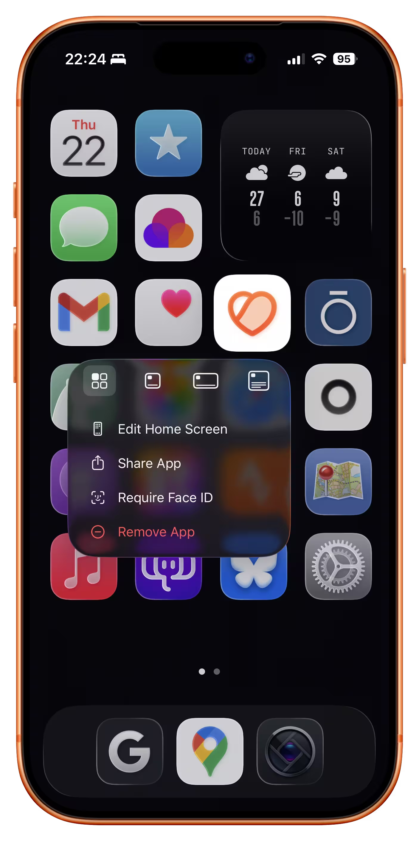
If you choose to remove the app names from the springboard, a small thing Apple could do would be to show the app name in the long-press menu here. Otherwise, I found it feels really easy to forget the name over time! (It would be a small riff on this disambiguation detail.)
Sensitivity is how finely you perceive—noticing friction, asking why a screen exists, catching the moment something feels wrong. Standards are your internal reference system for what “good” actually looks like. Both can be trained.
The post is great and I nodded all the way through. But I found the linked Medium post very hard to parse – like it was written by AI for LinkedIn – and I haven’t yet opened Rick Rubin’s relatively famous book quoted inside because I am worrying it might be too pretentious.
So, perhaps I can offer a rare caveated endorsement: click on Roger Wong’s post, but not sure it’s worth clicking further.
A wildly fascinating 12-minute video from the always-hilarious YouTube channel Map Men about the reason for a surprising black spot that could be seen on Google Earth until 2012.
Reading the Wikipedia entry after watching the video adds extra color to the mystery, turning it more squarely into a “software quality” story:
Some scientists were initially skeptical that such an error could exist, since a signature was present in various global terrain data sets, such as the bathymetric data from the General Bathymetric Chart of the Oceans, which reported an elevation of 1 metre (3 feet) over the location of Sandy Island. Some data sets derived from satellite imagery indicated that sea surface temperatures were absent in the location, suggesting the presence of land.


